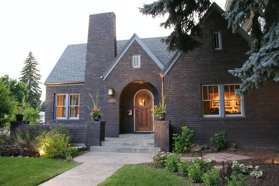
We’re excited to share before-and-after photos of Mari and Kelly’s newly remodeled home!
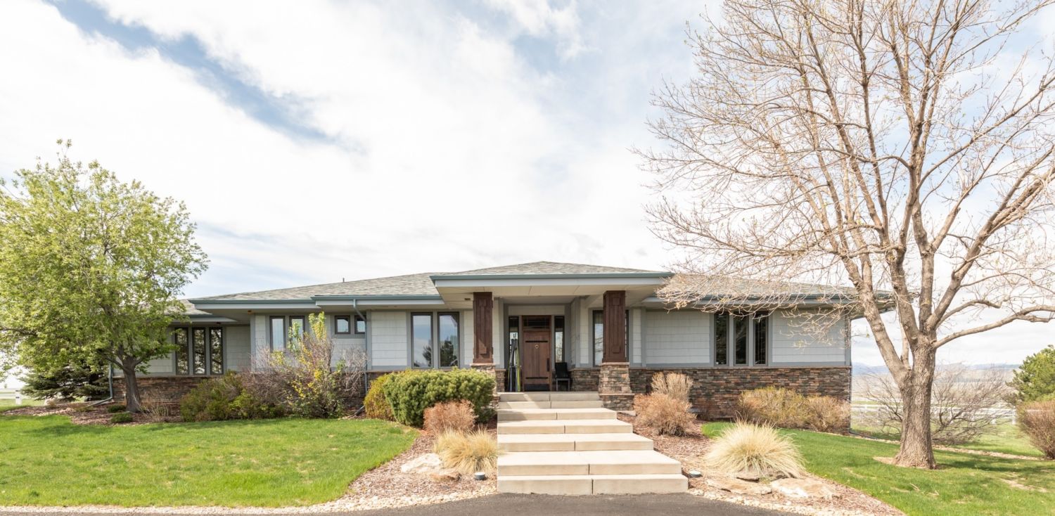
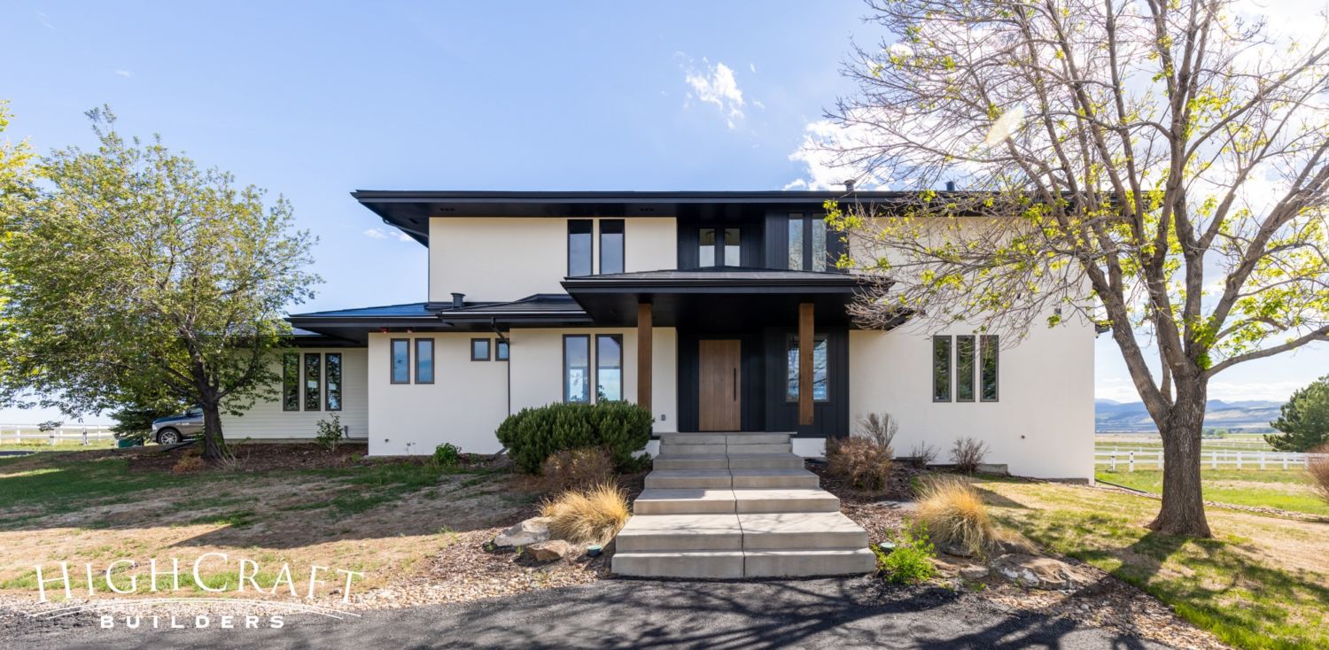
The original two-bedroom, two-bathroom house was built in 2000 (above, left). When Mari and Kelly bought the home in 2020, their original plan was to add a few bedrooms and complete some other cosmetic updates within the original one-story footprint. But after climbing a ladder and looking toward the mountains one day, they decided to pop the top (above, right).
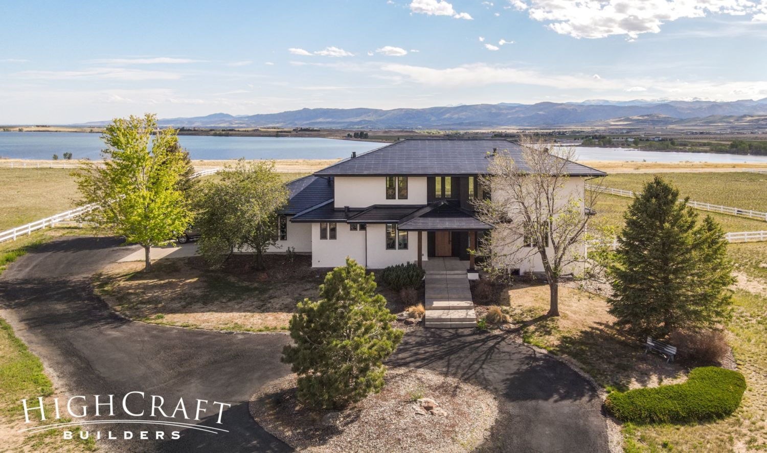
“When we saw the property and the view that it had, and saw what popping that second floor would do to that view … we just had to do a second floor,” Mari says.

EXTERIOR
Mari and Kelly wanted a contemporary design with clean lines, abundant windows, a mix of siding materials, and a state-of-the-art Tesla solar roof.
FRONT ELEVATION
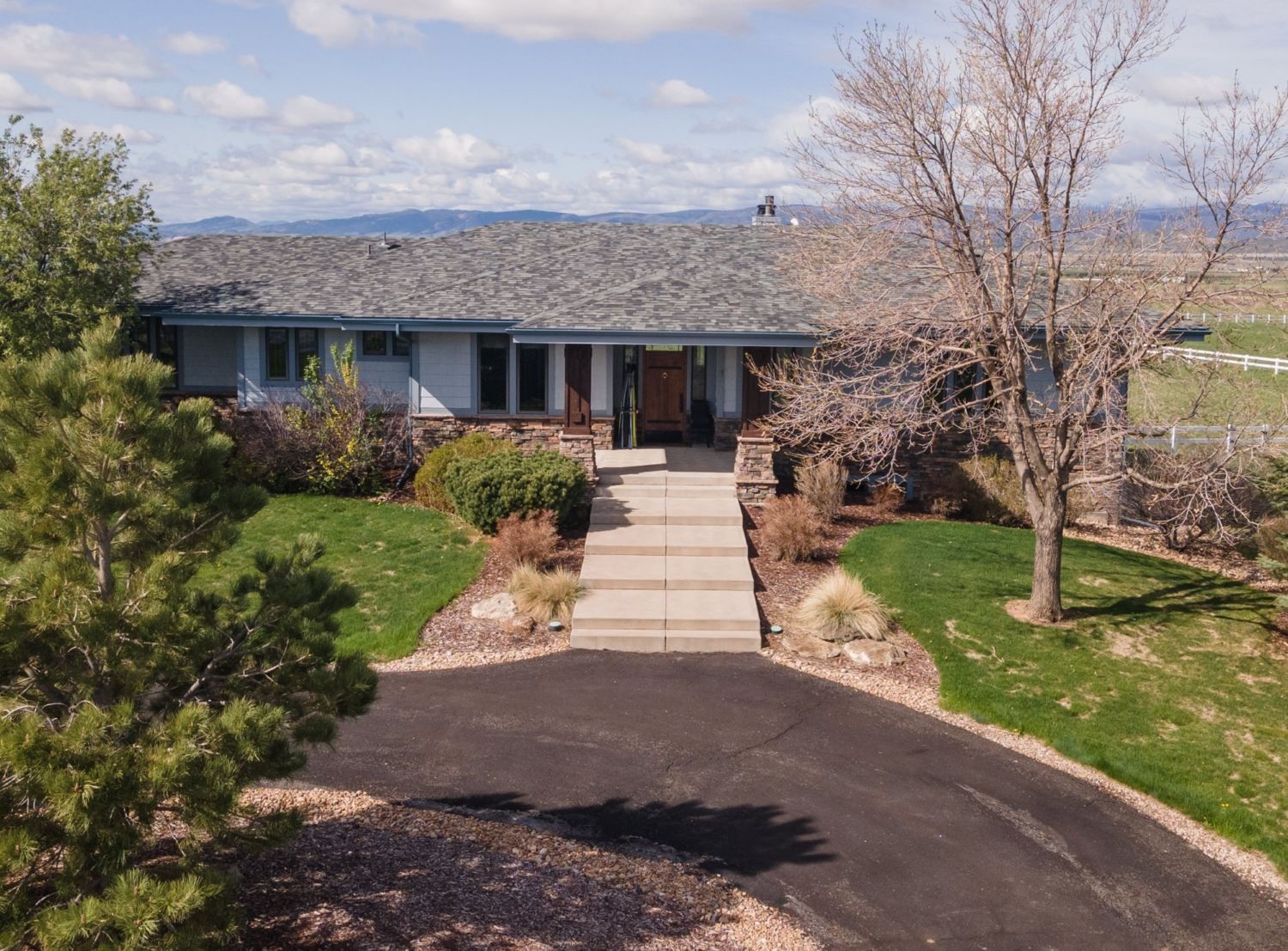
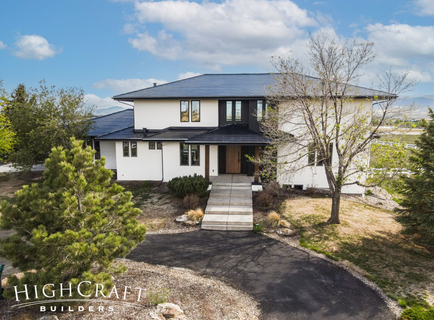
The new contemporary design and color palette (right) breathes new life into the original home (left).
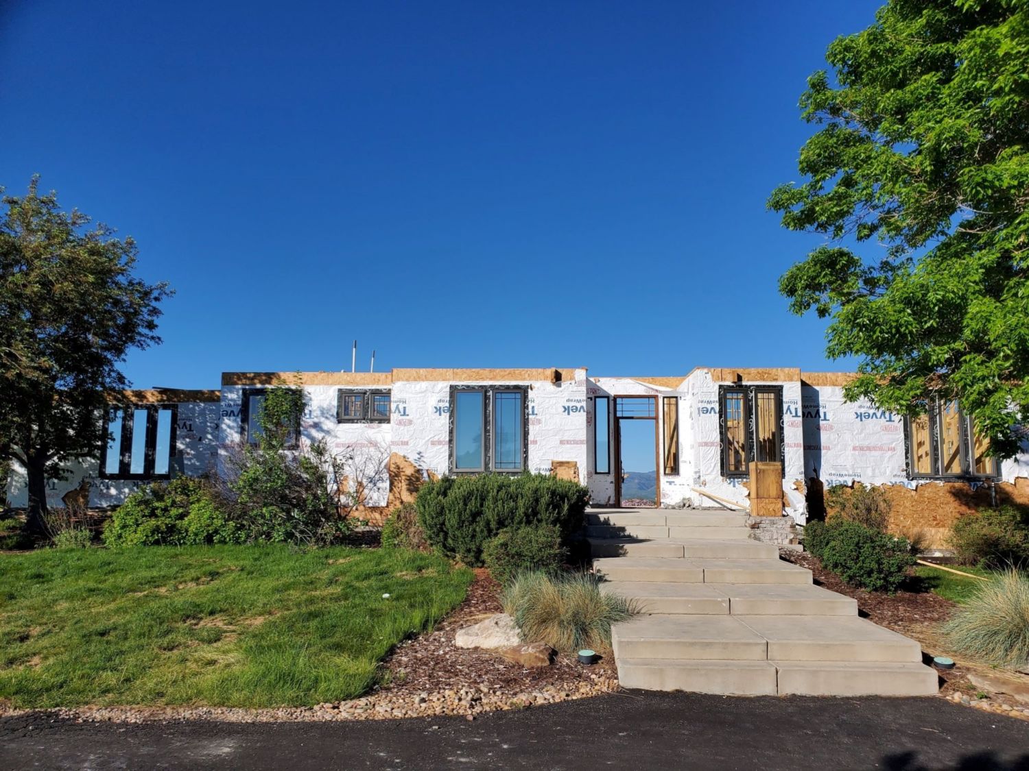
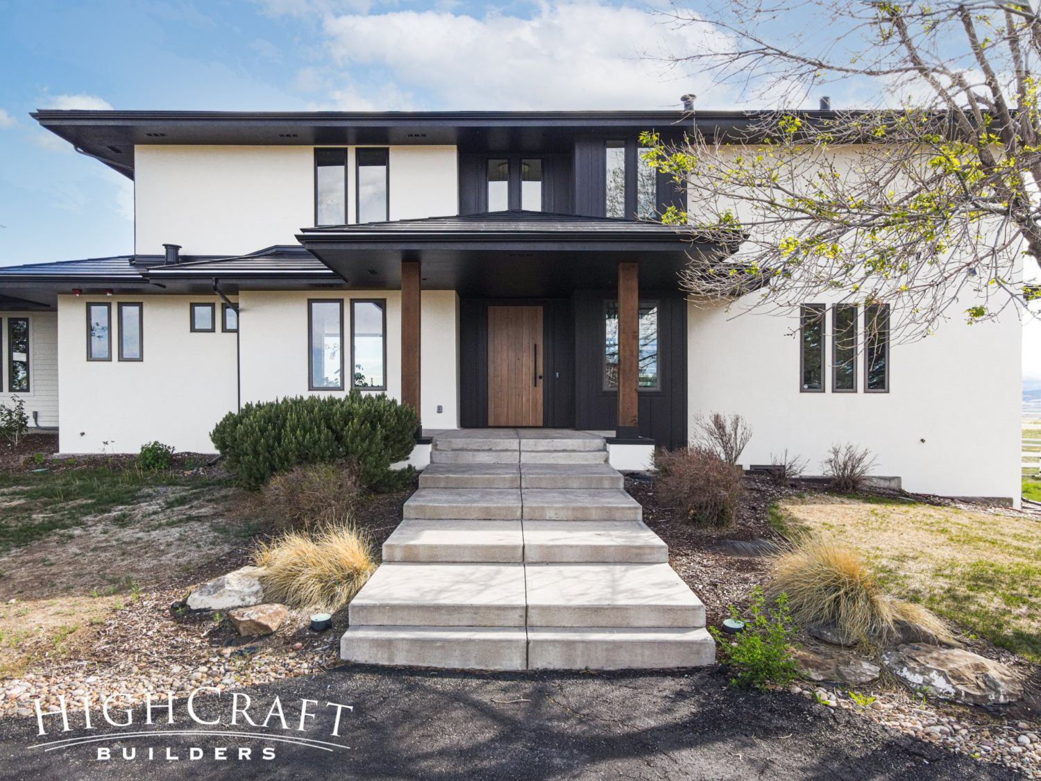
Mari and Kelly kept the outer walls and windows on two sides of their original home (left). The other walls were removed to accommodate the new two-story design (right).
BACK ELEVATION
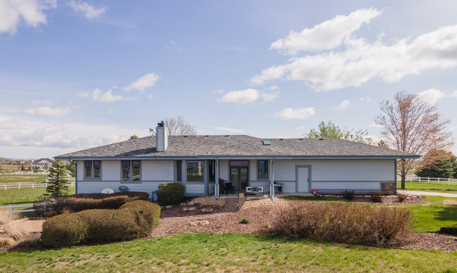
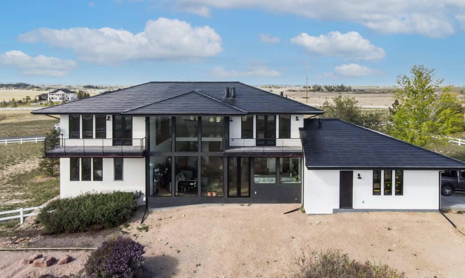
You can really see the transformation on the back of the home.
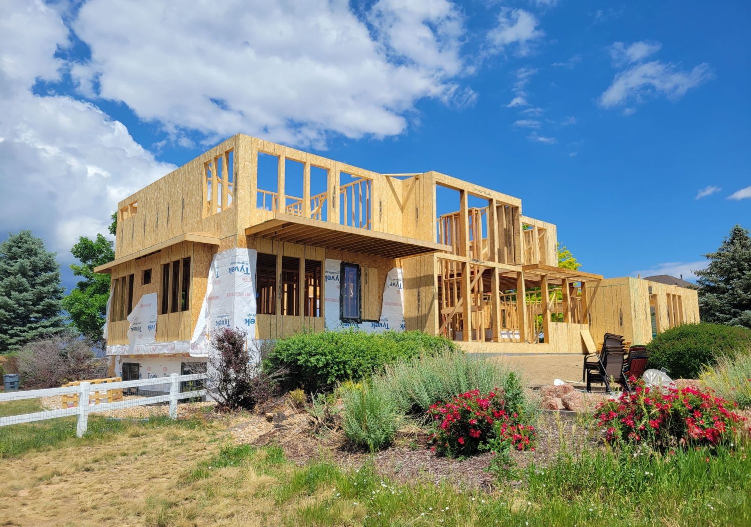
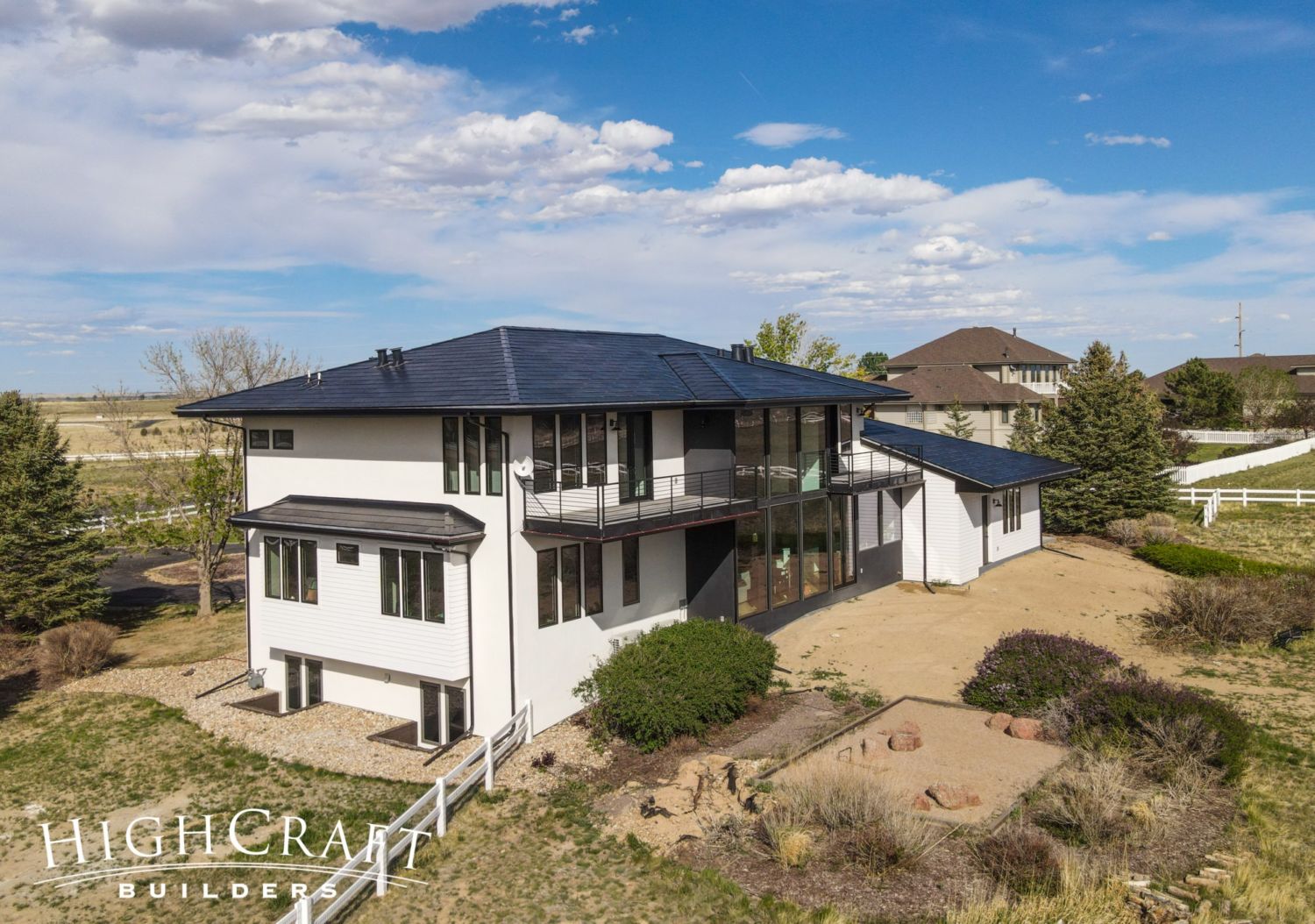
The home’s exterior is now a combination of lap, stucco, and board and batten siding (right).
Private Lanais
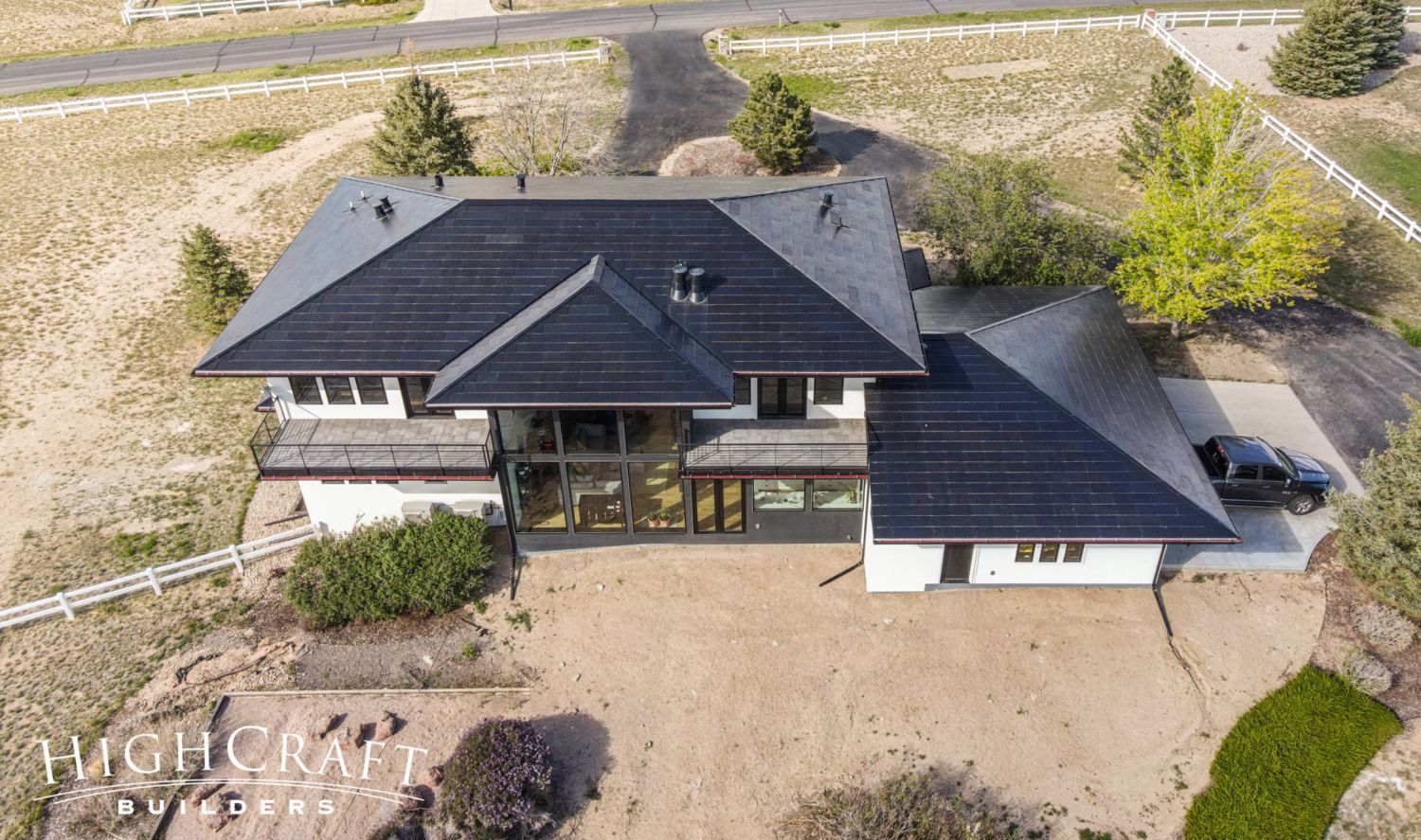
On the second floor, the master bedroom (left of the wall of windows) and office (right of the wall of windows) feature private lanais, or balconies, perfect for enjoying morning yoga or evening sunsets.
Tesla Solar Roof
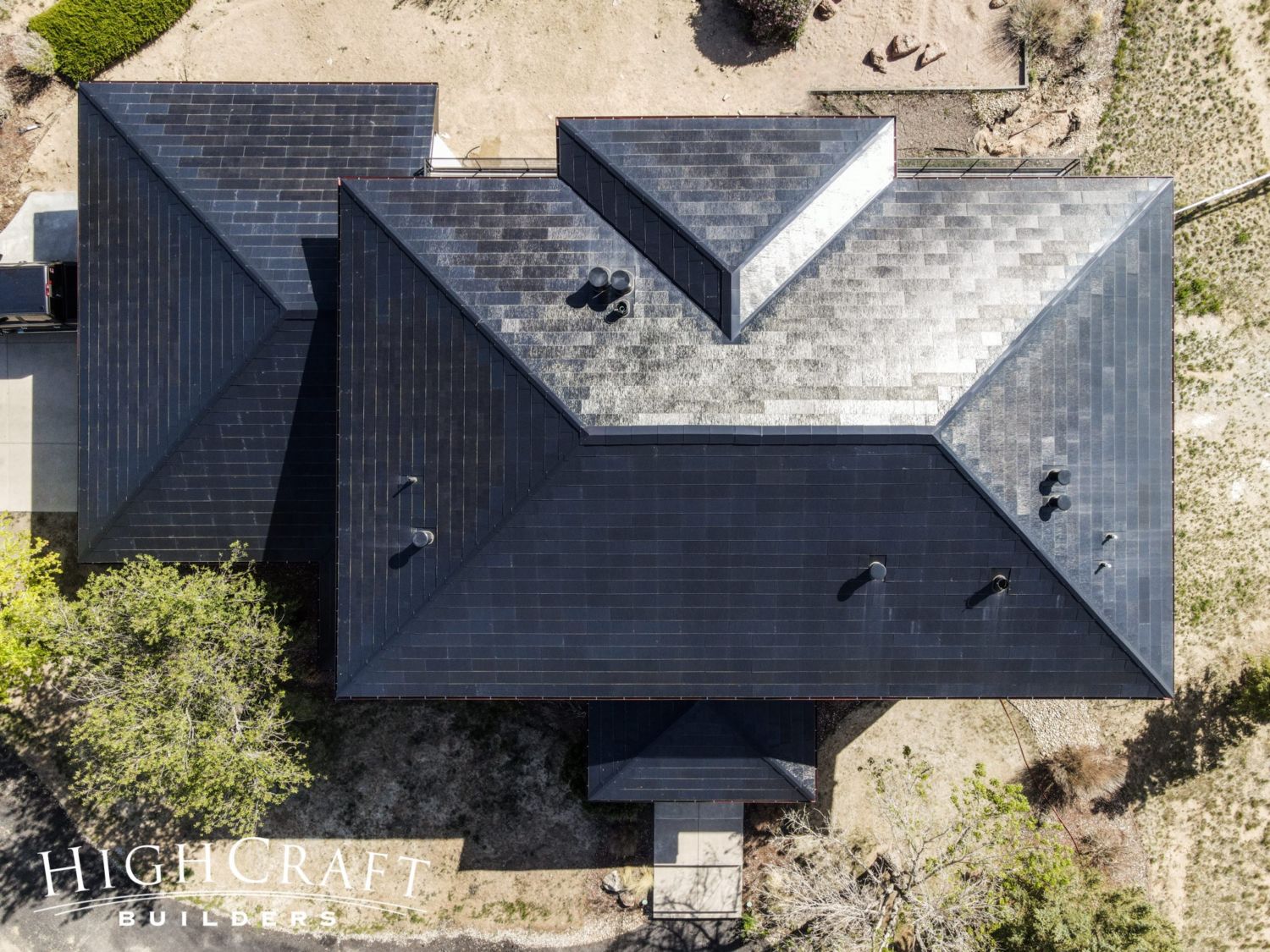
Mari and Kelly’s home is the perfect candidate for solar, so they installed a Tesla solar roof system to produce clean energy for their home.
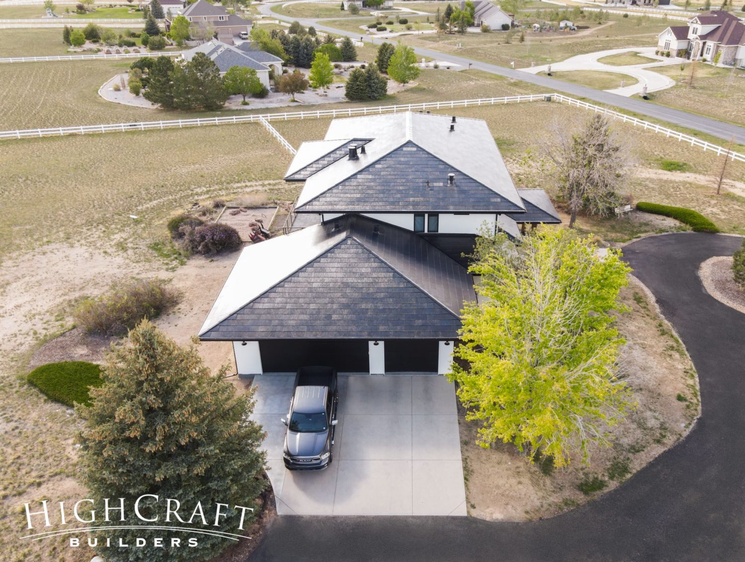
“It also looks very modern,” says Mari, who appreciates the esthetic.
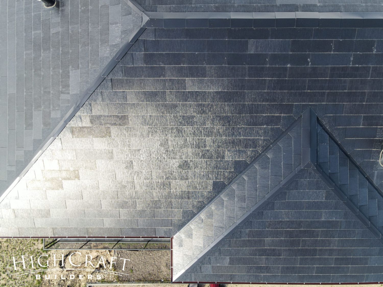
“The shingles that face the south side are solar shingles, but they look just like the rest of them,” she adds. “The Tesla shingles blend in, so there’s no ‘big square’ on the top of your roof like you see with traditional solar panels.”
INTERIOR
Inside the home, Mari and Kelly wanted plenty of windows to capture mountain views, lake views, and lots of natural light. They also wanted a floorplan with private spaces to recharge, and shared spaces that encourage family time. Mari dreamed of an amazing kitchen. And because both Mari and Kelly work from home, they needed a large home office to share.
FIRST FLOOR
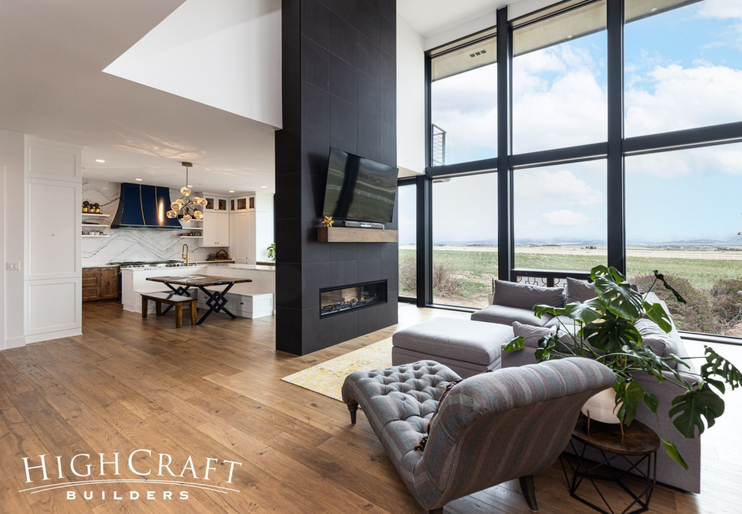
When you enter the home, the two-story wall of windows draws you in.
“Overall, Mari and Kelly lean toward modern, but they have an eclectic style and didn’t want the house to feel cold and stark,” says HighCraft Lead Interior Designer Jill Sanchez. “We blended several styles into one cohesive design that lets their personalities shine through.”
Guest Bathroom
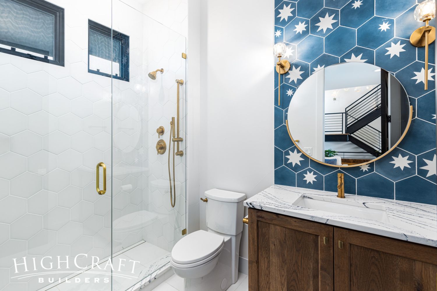
In Part 4, we talked about some of Mari and Kelly’s tile selections, including this gorgeous blue concrete hex tile with a mix of stars, installed in an organic pattern in the guest bathroom.
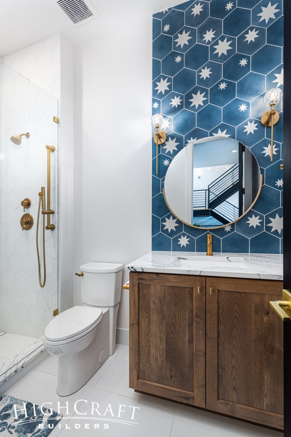
The warm gold of the brushed brass fixtures takes this bathroom design to the next level.
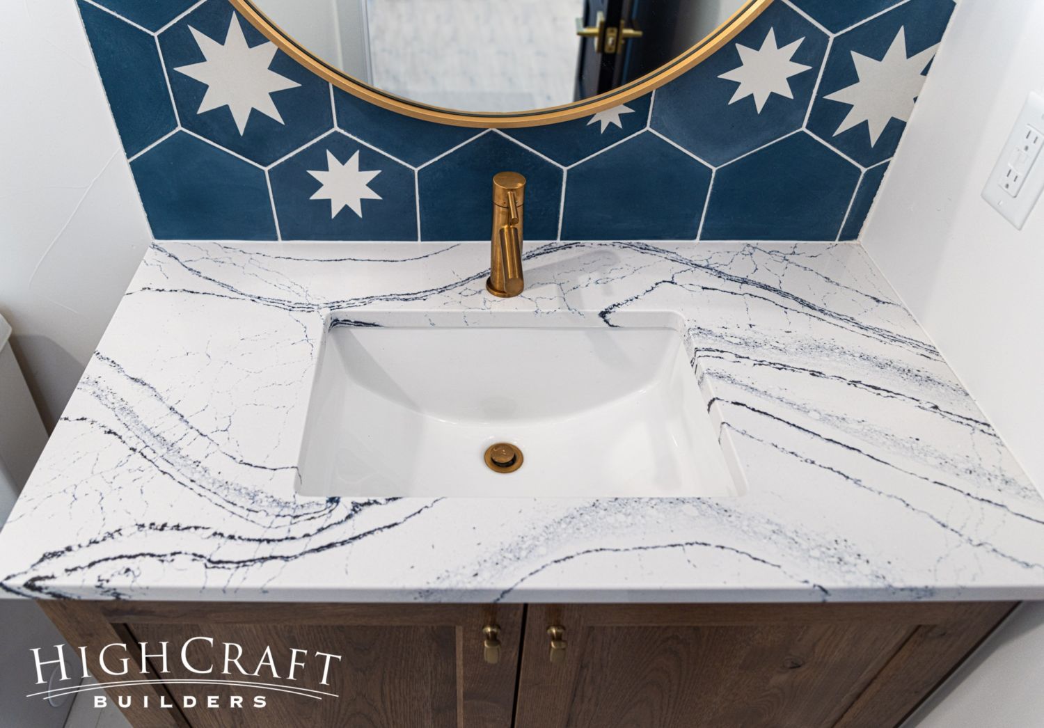
The bathroom’s white quartz countertop with flecks of metallic gold and navy-blue veining is called Portrush by Cambria. Watch for it in the kitchen and master bathroom, too.
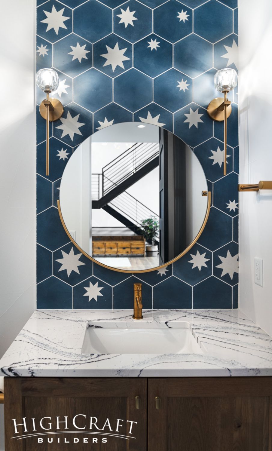
The twin lighting sconces with clear, crystal shades are modern interpretations of long-stemmed roses.
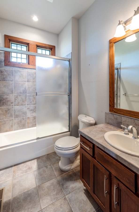
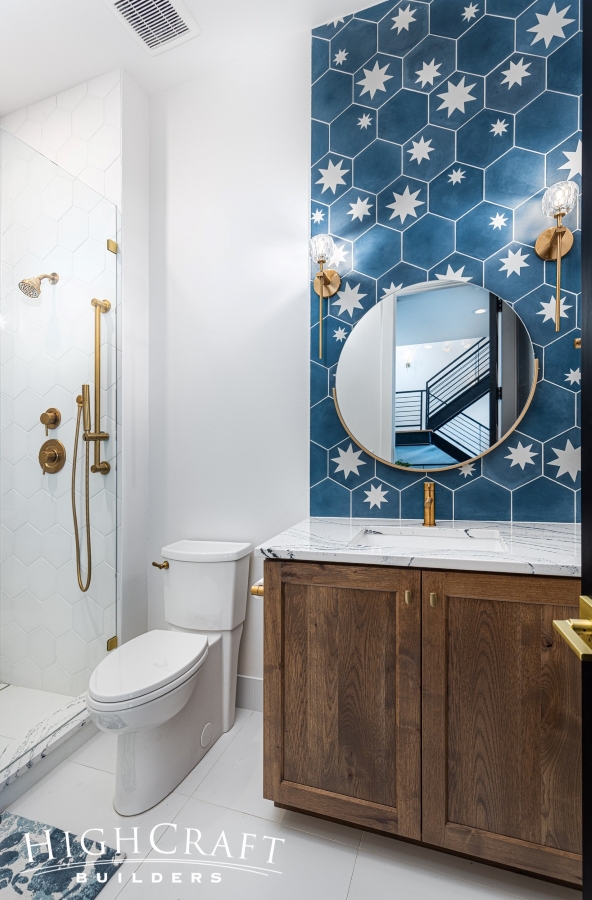
Here’s a fun before-and-after transformation. What a difference new tile, trim and accent finishes make!
Kitchen
“For me, it’s all about the kitchen,” says Mari. “I spend so much of my days and nights there.”

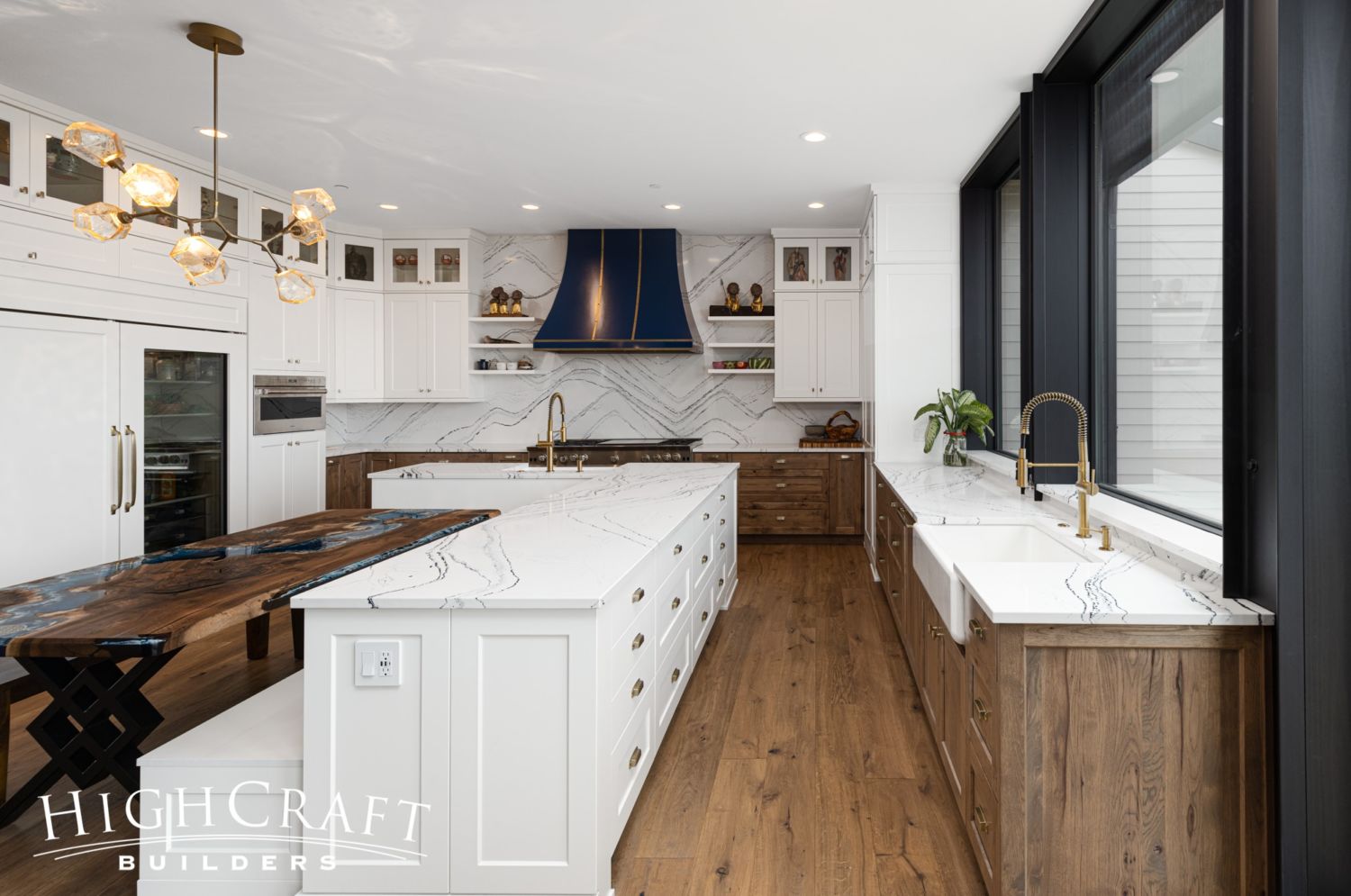
And what a kitchen it is, with two undermount apron sinks, plenty of storage, generous work surfaces, banquette seating on the center island, and expansive views of the western landscape.
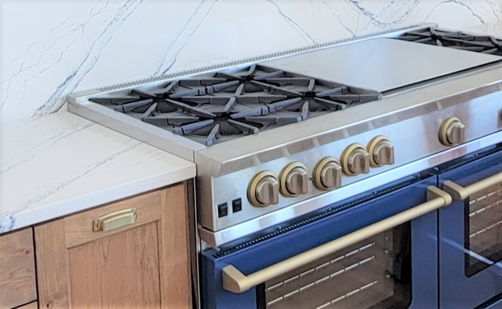
“I wanted a functional kitchen with an awesome stove,” Mari says. And it doesn’t get more awesome than a 60-inch professional gas range by BlueStar, with six cast-iron burners, two convection ovens, and a 24-inch griddle and grill.
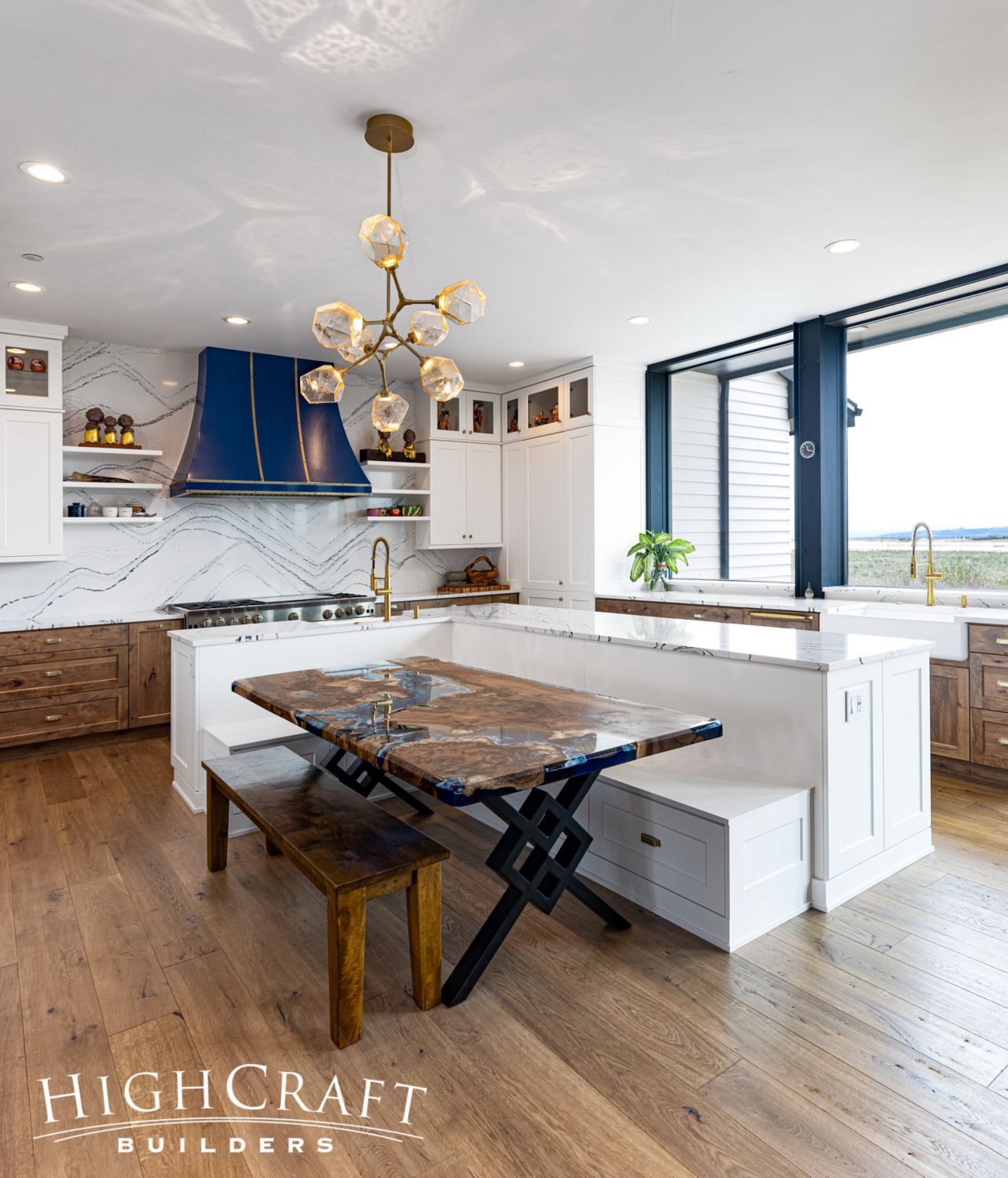
Mari calls the range hood “the jewelry of the space.”
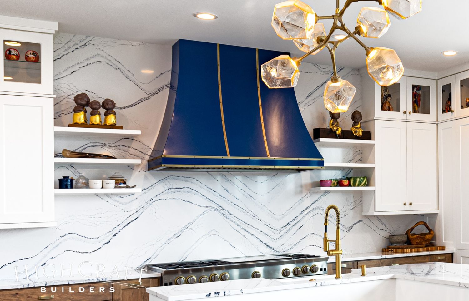
“It’s a brass and blue enamel combo by BlueStar.”
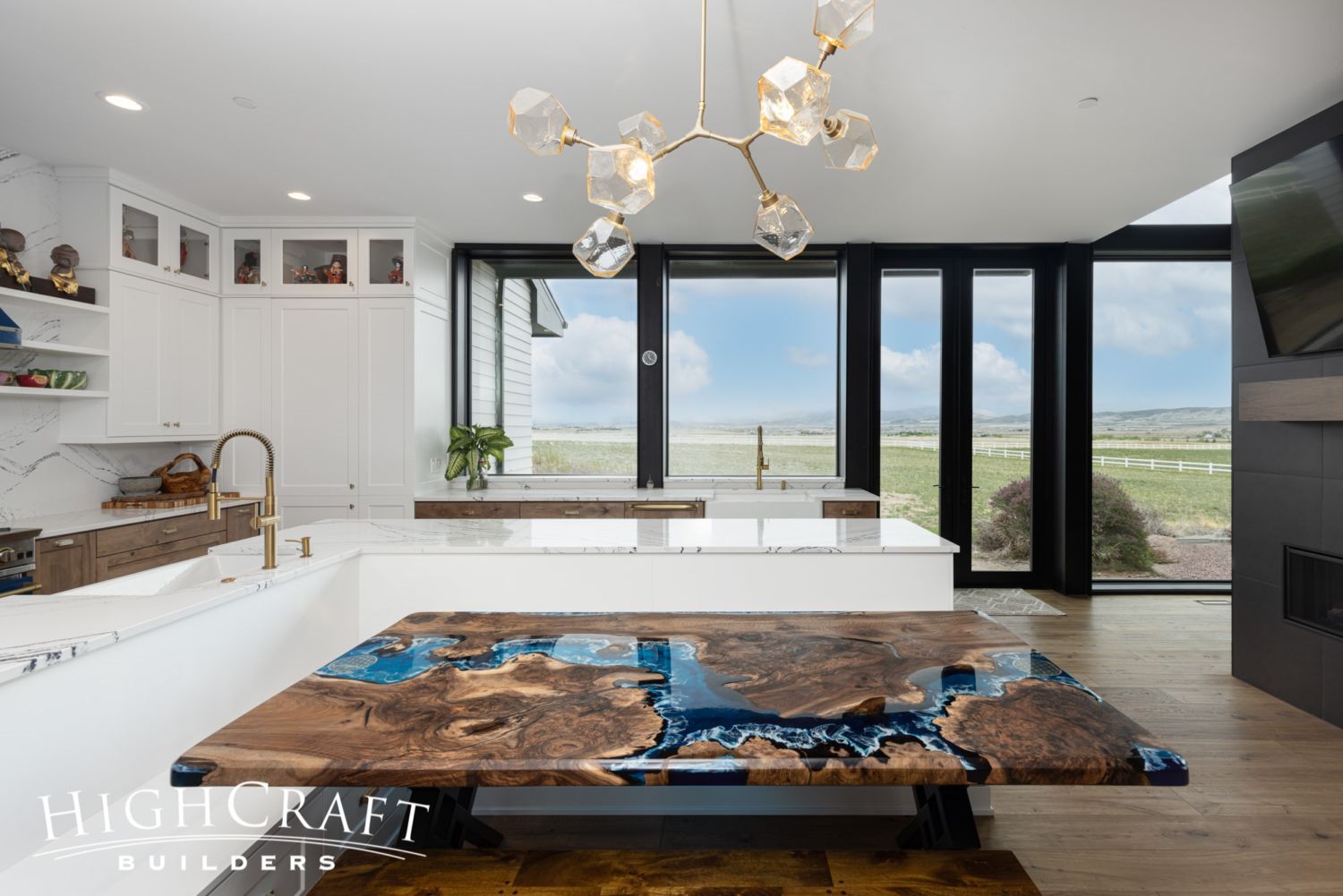
Mari and Kelly’s gorgeous kitchen table is a custom piece made in Turkey. It’s a rough-hewn slab of wood filled with blue resin and polished to a smooth finish. It reminds Mari of the coastline and beaches where she grew up in Hawaii.
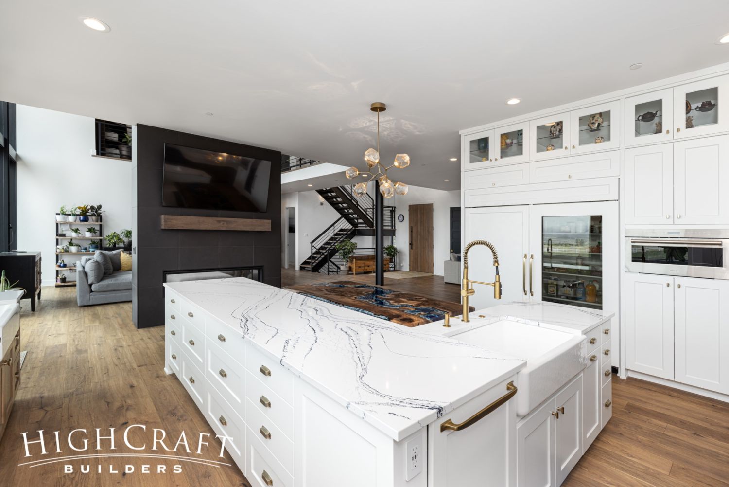
As we mentioned before, the kitchen also boasts the same beautiful quartz countertop used in the guest bathroom around the corner.

The kitchen’s gold faucets, light fixture and cabinet hardware pick up the metallic gold flecks in the countertop and backsplash. The blue resin of the kitchen table, and the colorful enamel of the range and hood, pick up the blue veining in the same quartz slabs.
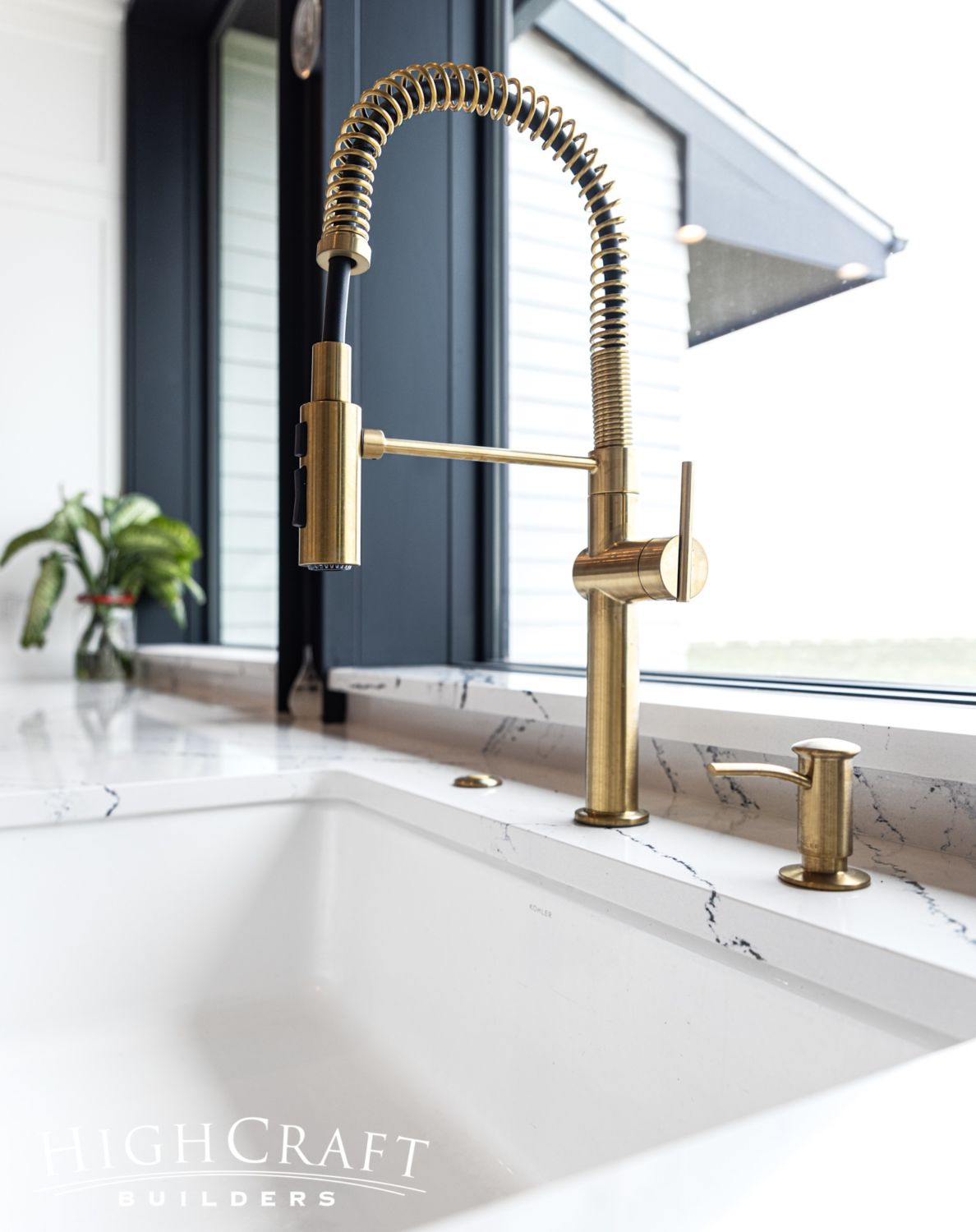
Gooseneck faucets are practical as well as elegant at the kitchen sinks.
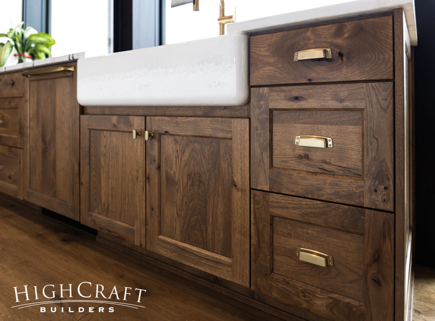
The perimeter base cabinetry is made from rustic hickory in a Spanish Pecan stain.
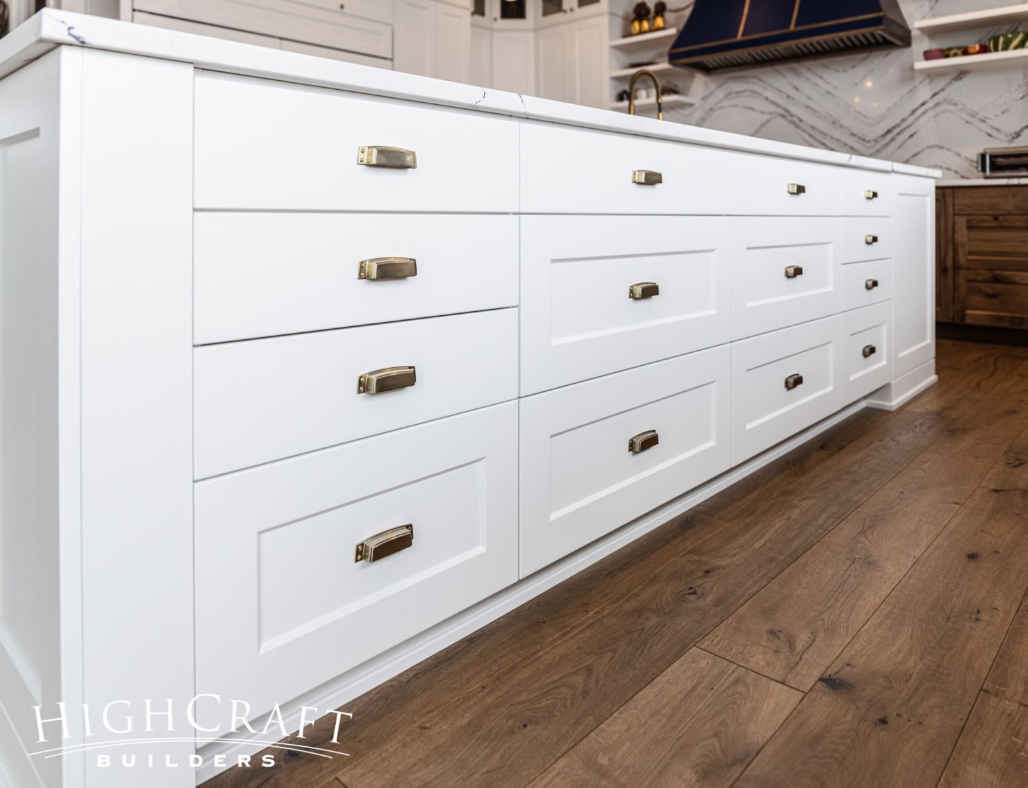
And the island base cabinetry and upper kitchen cabinets are painted a satin white. The bin pull finish is Golden Champagne.
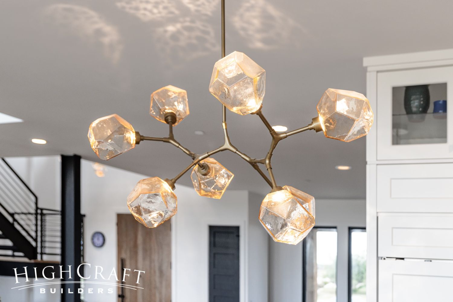
The light fixture over the kitchen table – a modern branch chandelier – has the same amber glass shades that provide such a warm glow in the foyer and stairwell. (More on that in a minute.)
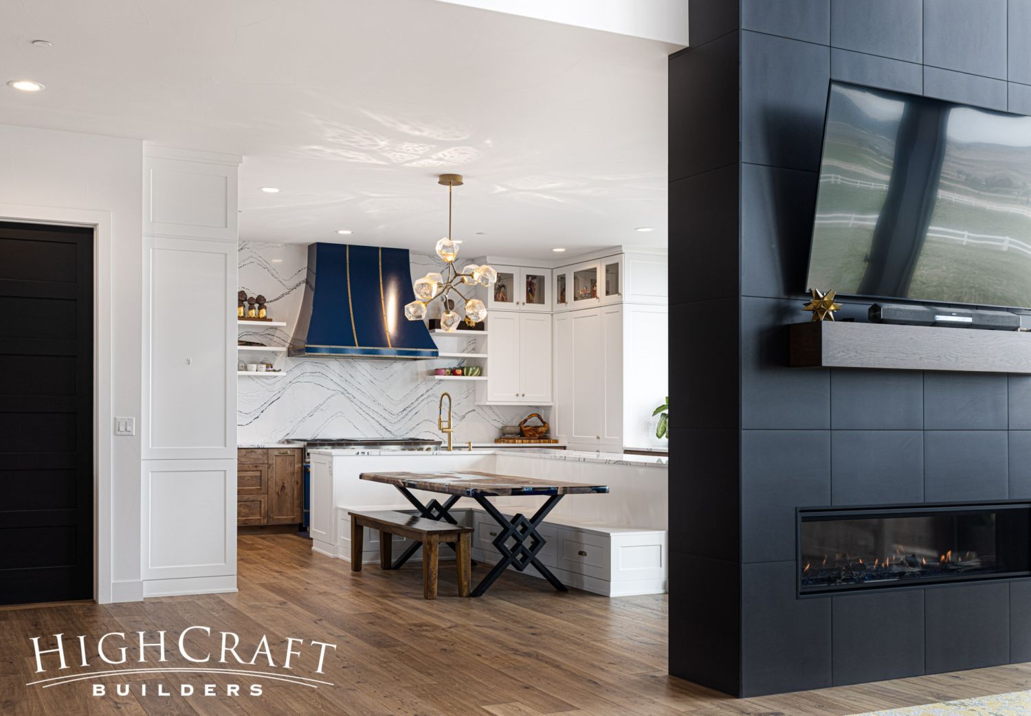
And speaking of warm glow, the see-through natural gas fireplace can be enjoyed from the kitchen as well as the living room.
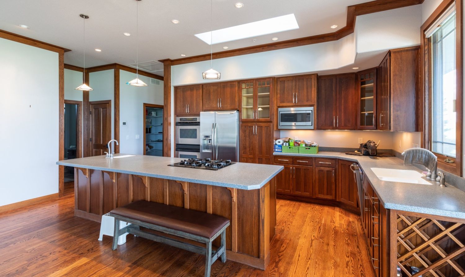
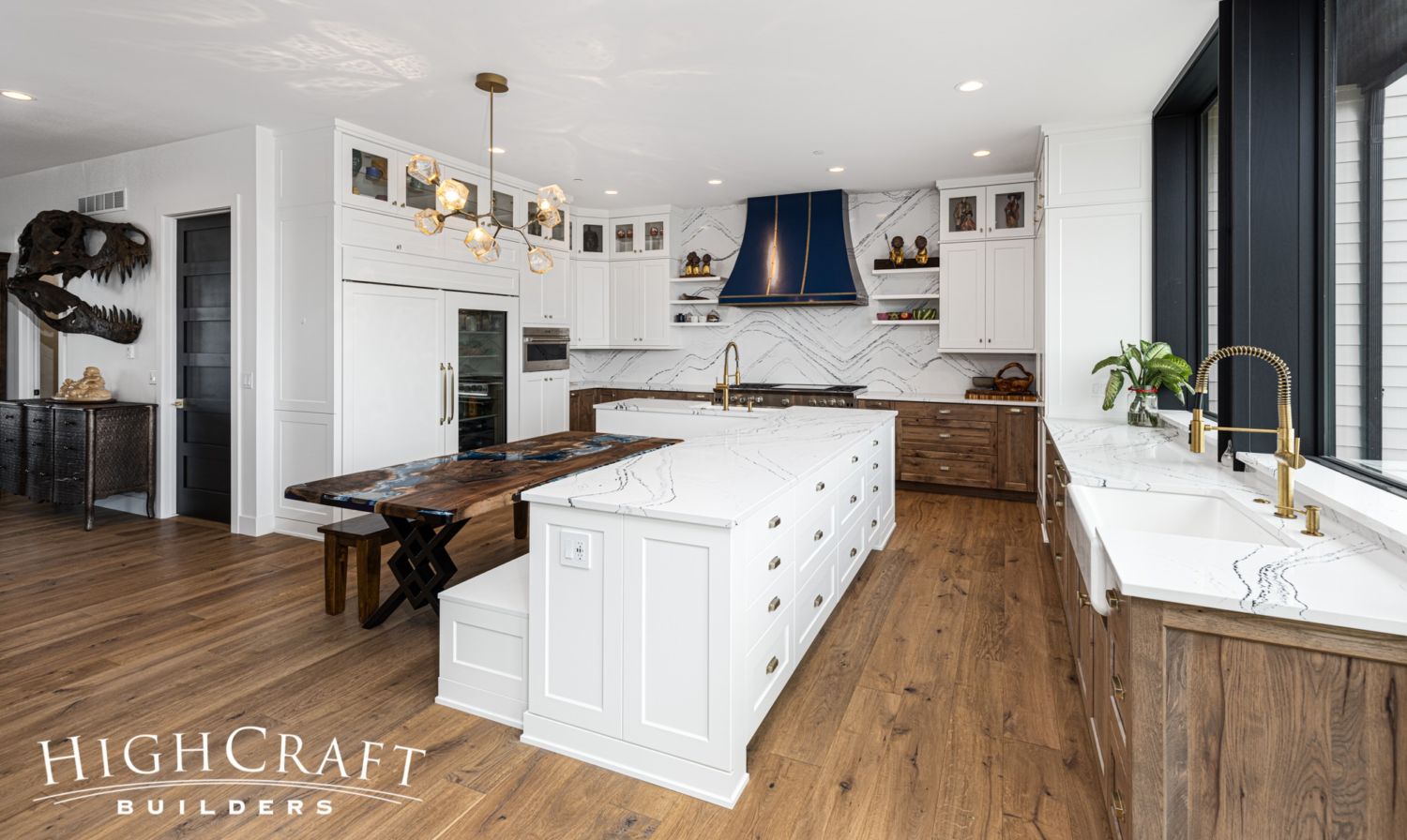
This before-and-after slider shows the addition of more storage, counterspace and personality in Mari and Kelly’s kitchen remodel.
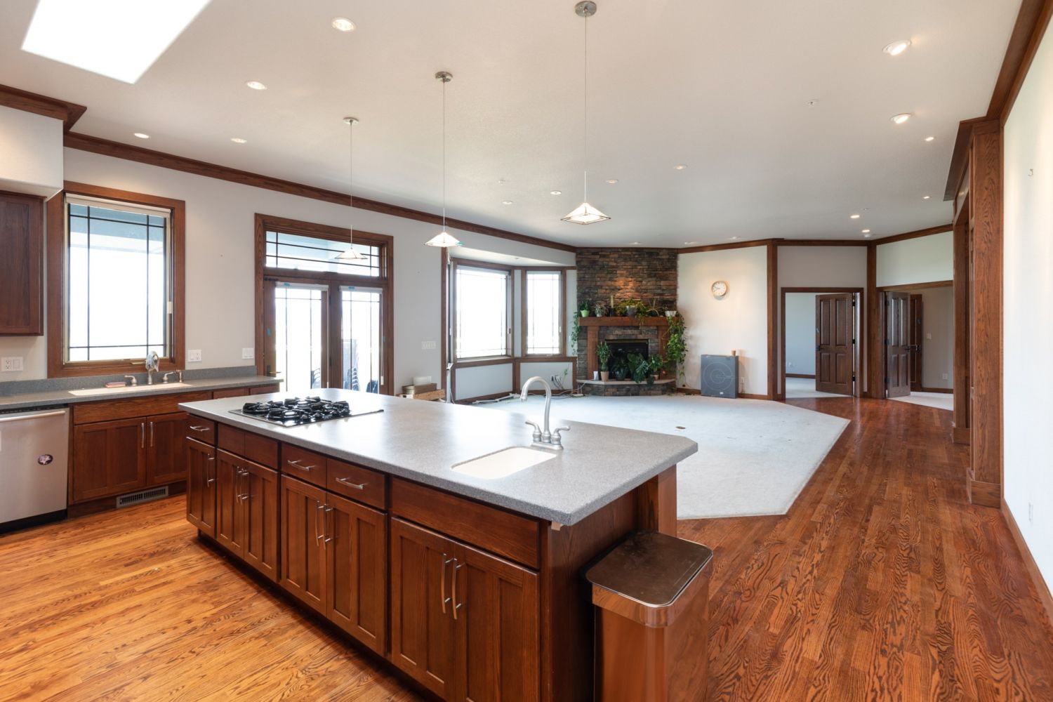
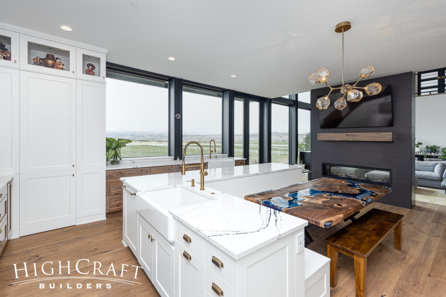
And the new windows completely change the character of the kitchen and living room spaces.
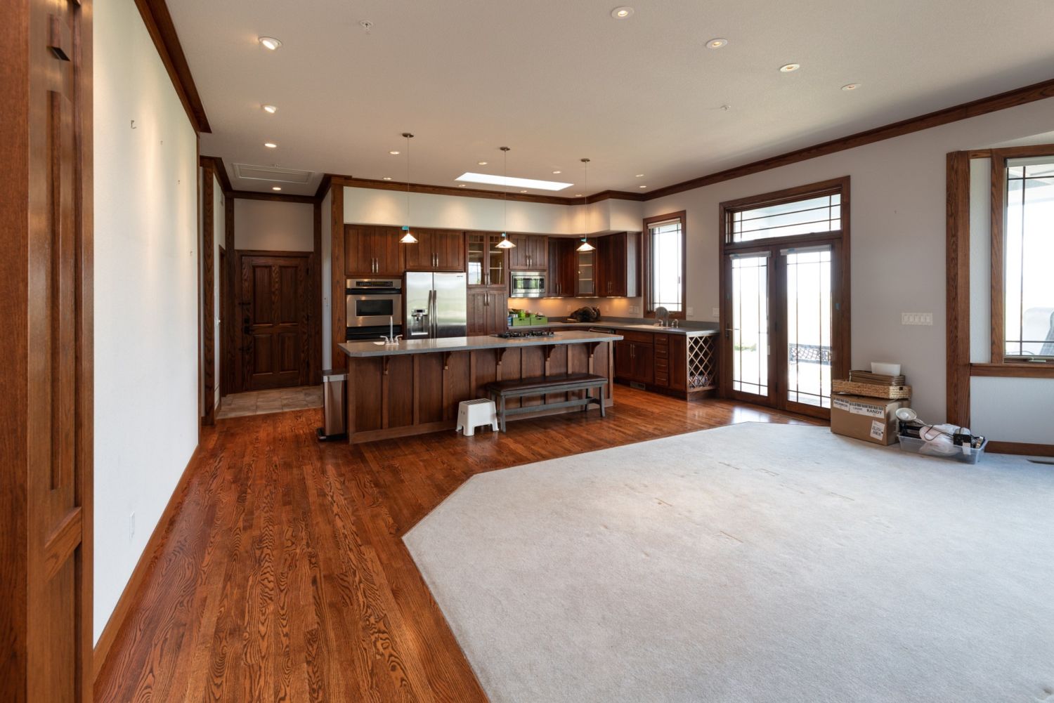
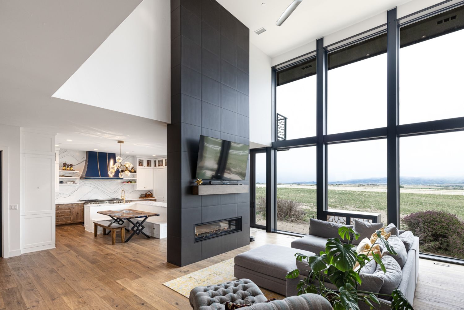
By popping the roof and building a second story addition, everything about the home feels more modern, open and expansive.
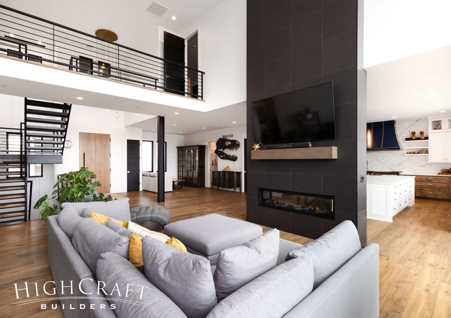
Living Room
The kitchen and living room areas are the heart of the home, located at its literal center. This view (above) shows how the foyer, stairs, kitchen and living room flow together in the first-floor layout.
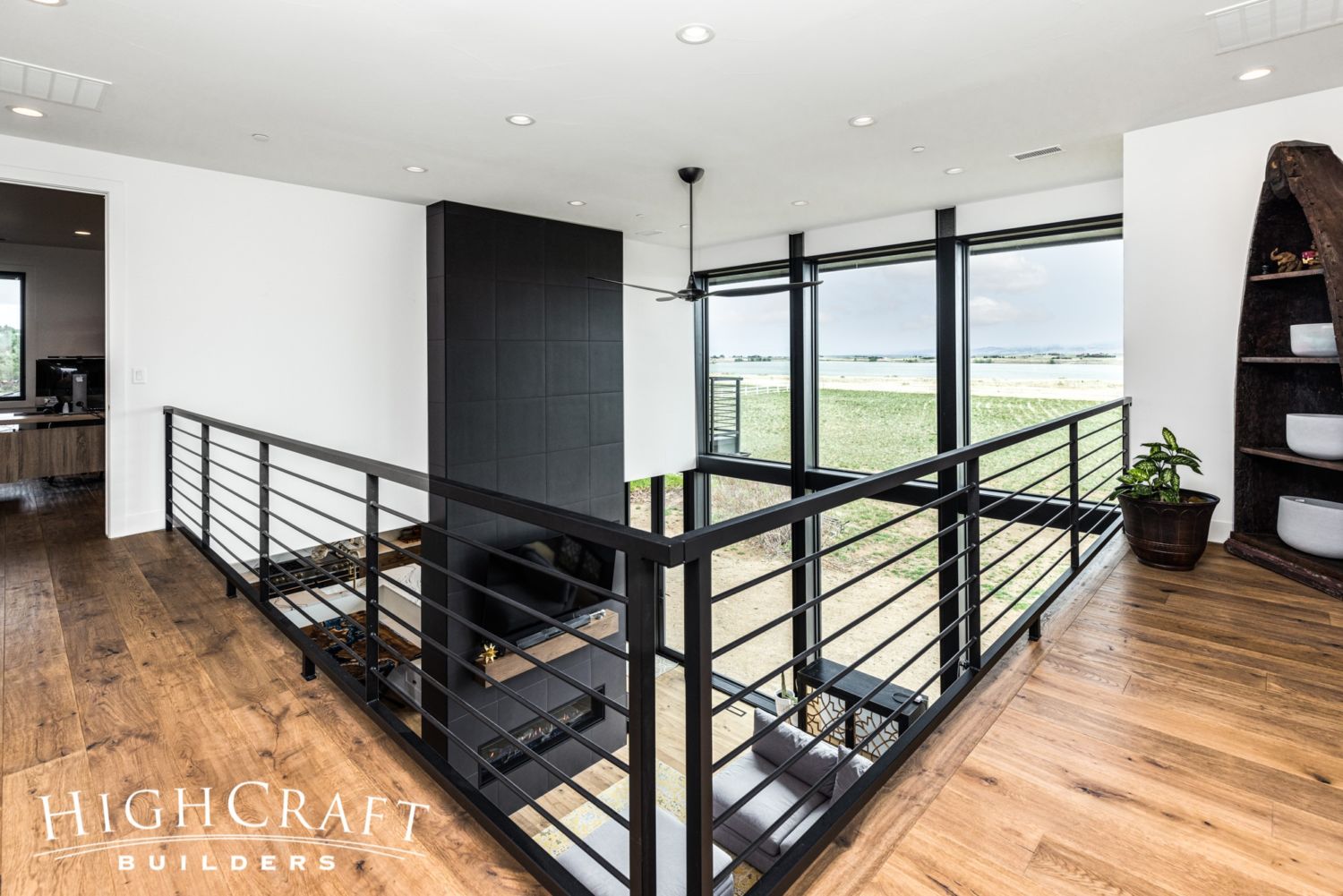
The wall of windows floods the living room and second-floor catwalk with natural light.
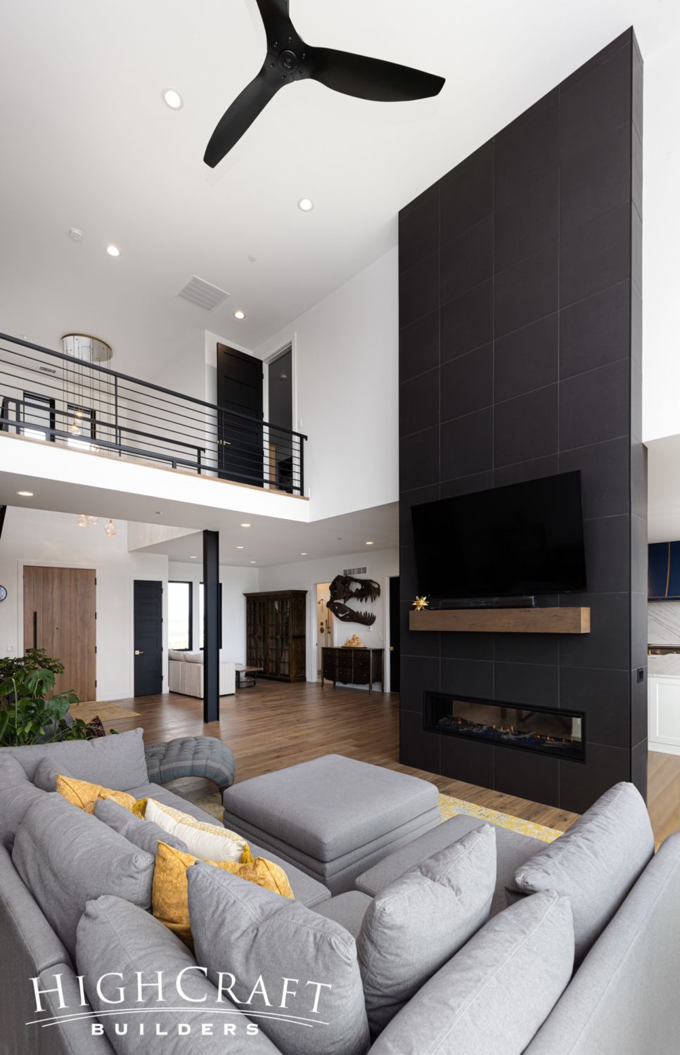
And the vaulted ceiling creates a more bright, airy and spacious feeling in the living room.
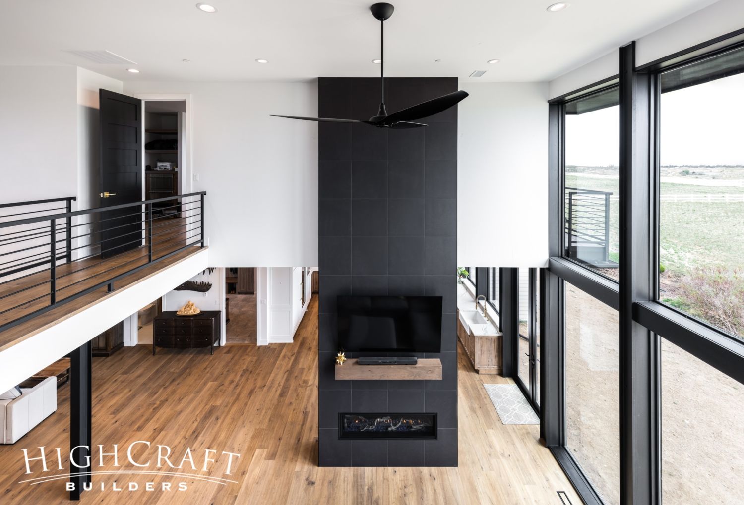
The high ceiling also allows the monolith fireplace to span two stories of the home, creating a bold accent wall that defines the kitchen and living room spaces. The hardwood flooring used throughout is a rustic European oak with a hand-scraped texture and matte urethane finish.
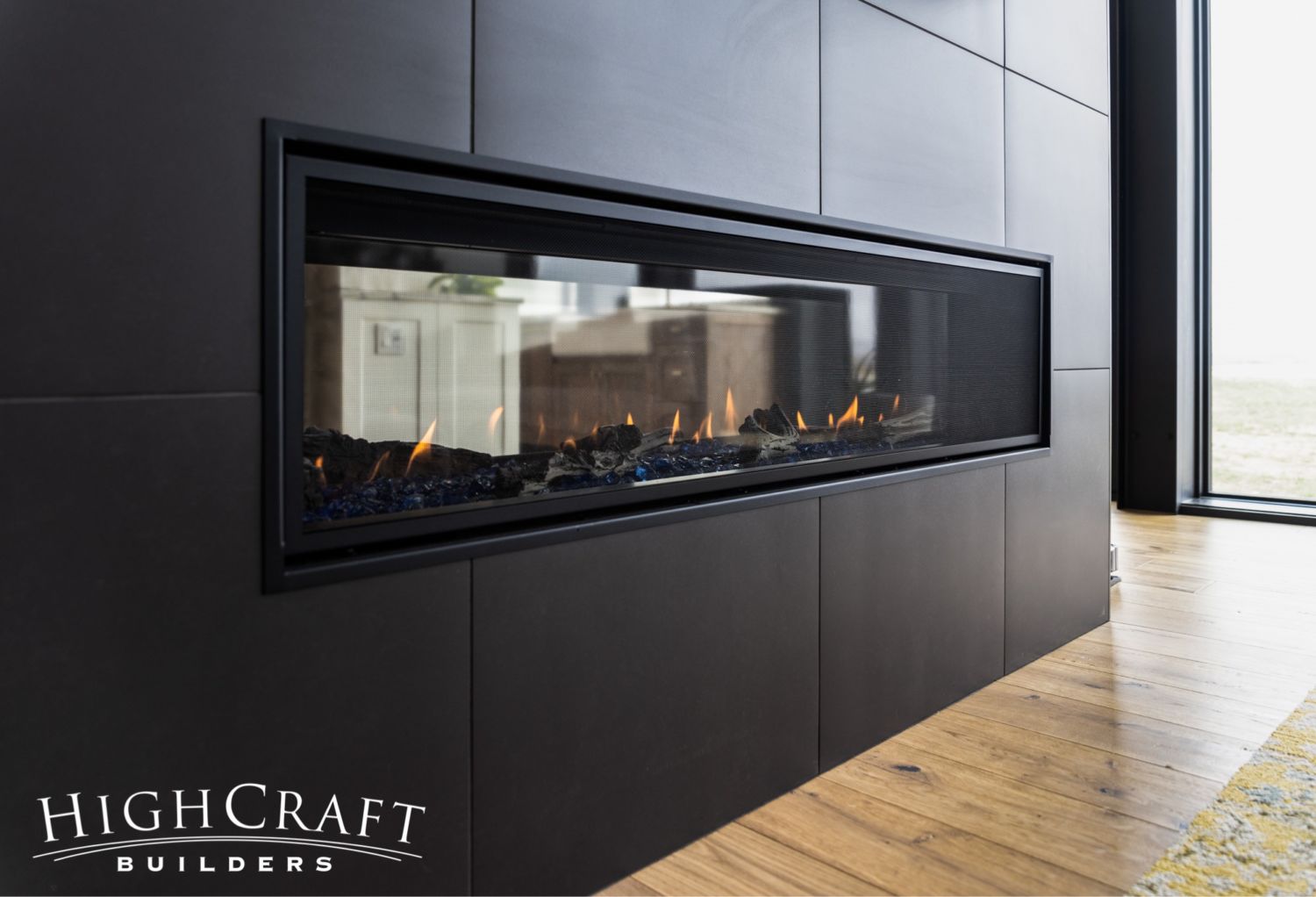
Mari and Kelly picked out some incredible finishes, including this 24- by 24-inch black porcelain tile for the fireplace surround.
Private Bathrooms for the Kids
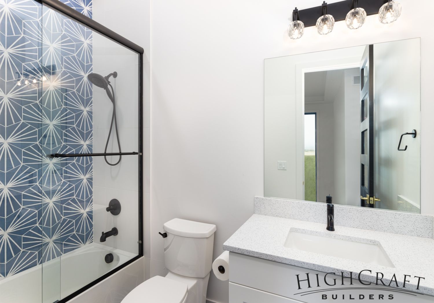
Mari and Kelly respect their son’s and daughter’s need for privacy, especially during their teenage years. So they created a bedroom suite for each kiddo with a desk nook, walk-in closet and private bathroom.
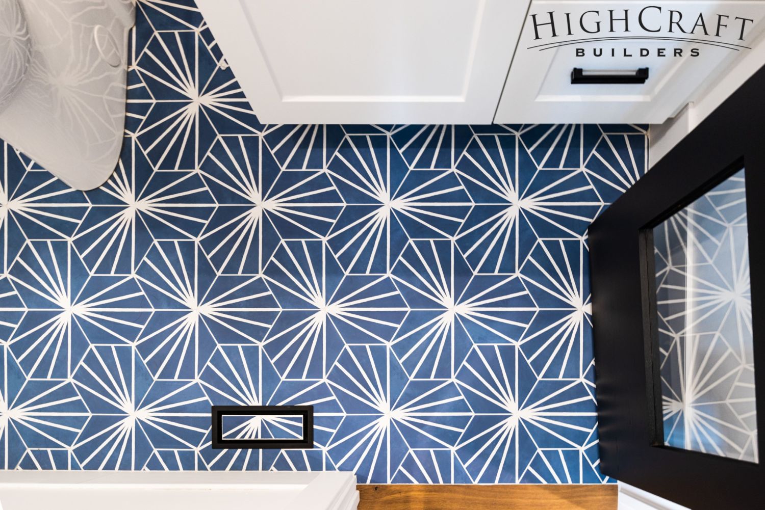
The kids chose fun starburst hex tiles in vibrant colors for their bathrooms.
For additional hex tile inspiration, explore more than sixteen different rooms in our “Hex Appeal” blog post.
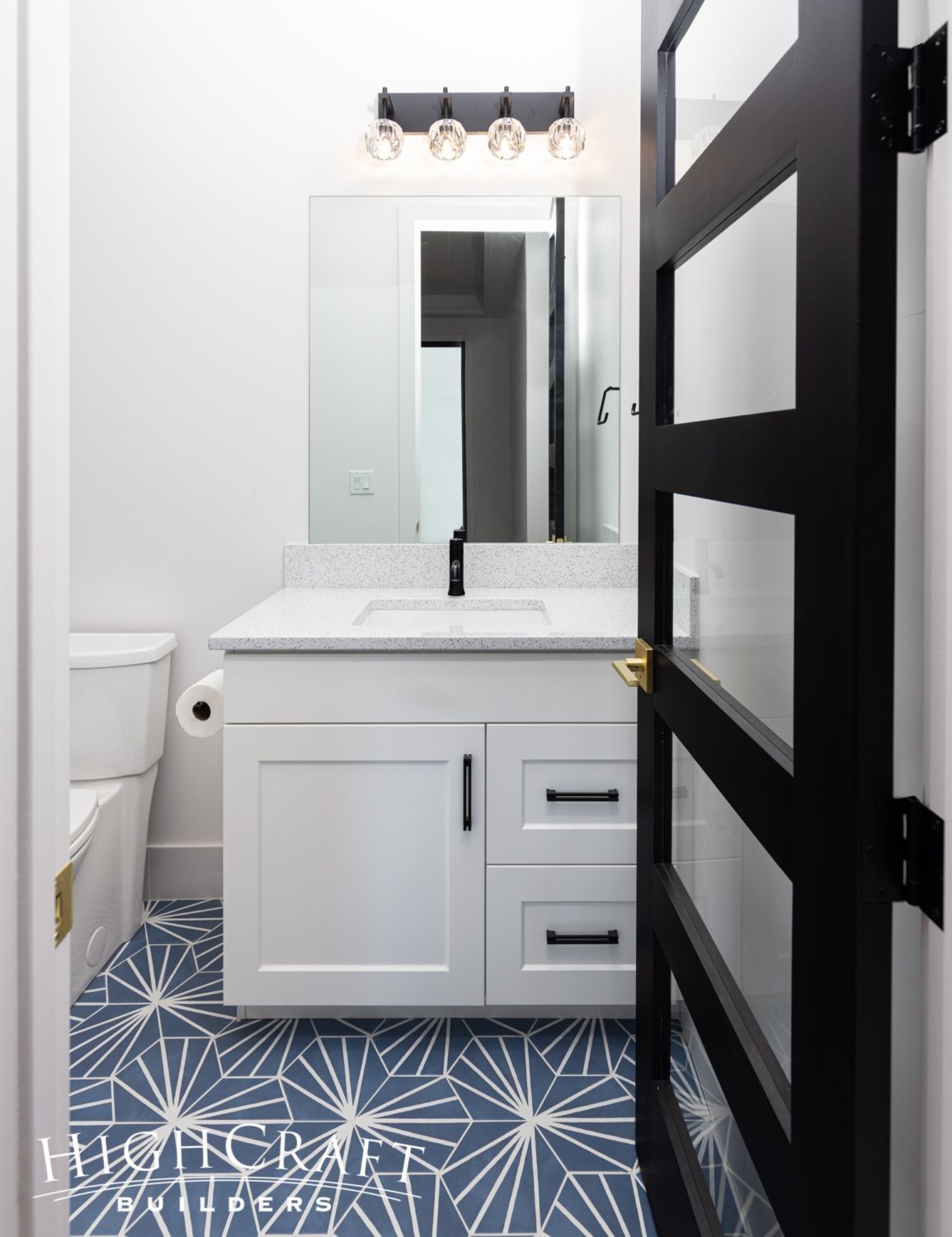
The eight-inch hex tile in Azule Deco blue was installed in a straight set pattern on the floor …
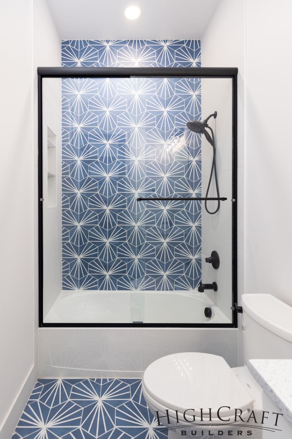
… and in the shower. The deliberate use of white on the walls, and for the bathtub, vanity and commode, makes the blue accent tile pop.
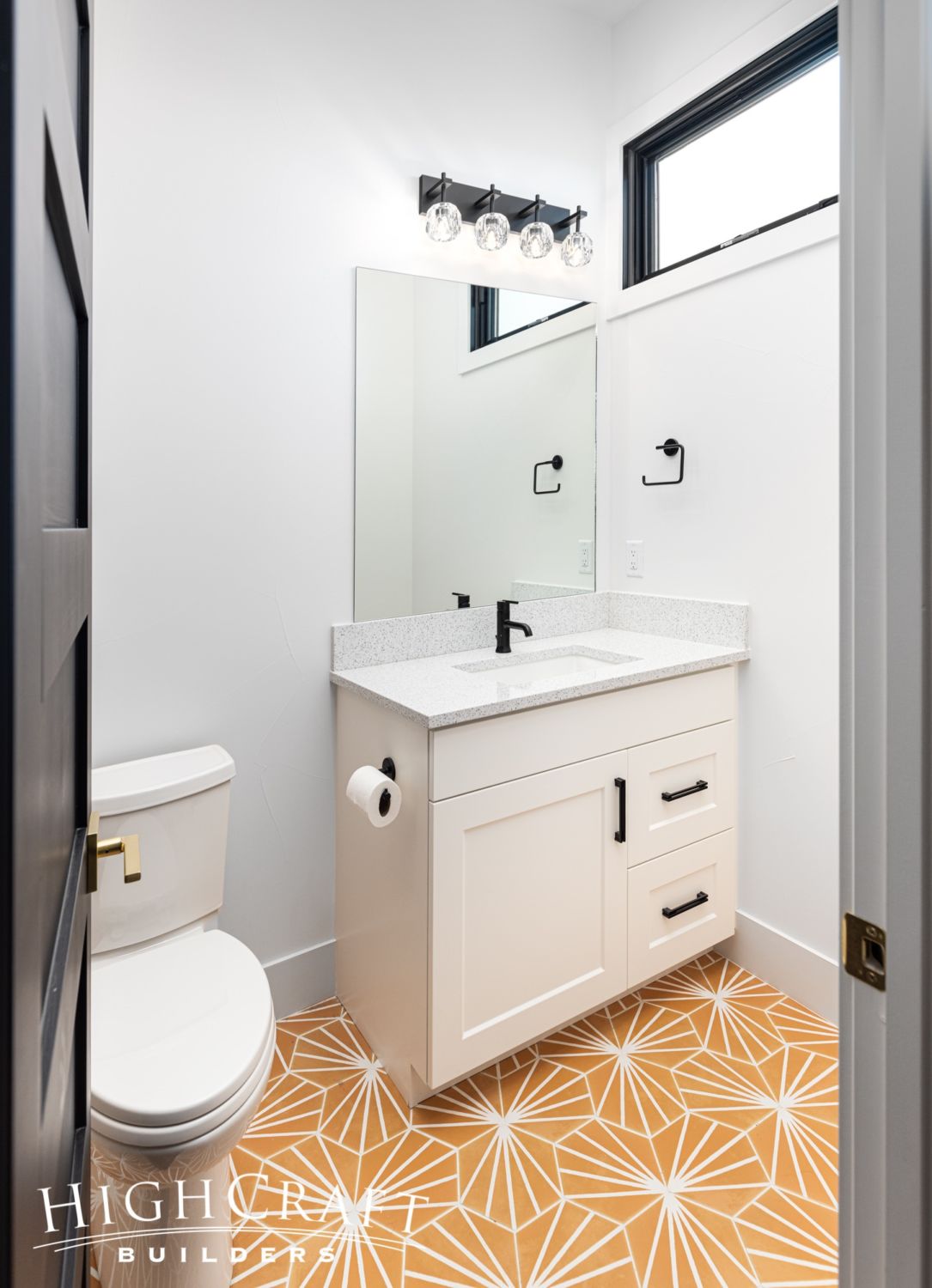
The Orange Deco tile in the other private bathroom suite is bright and cheery.
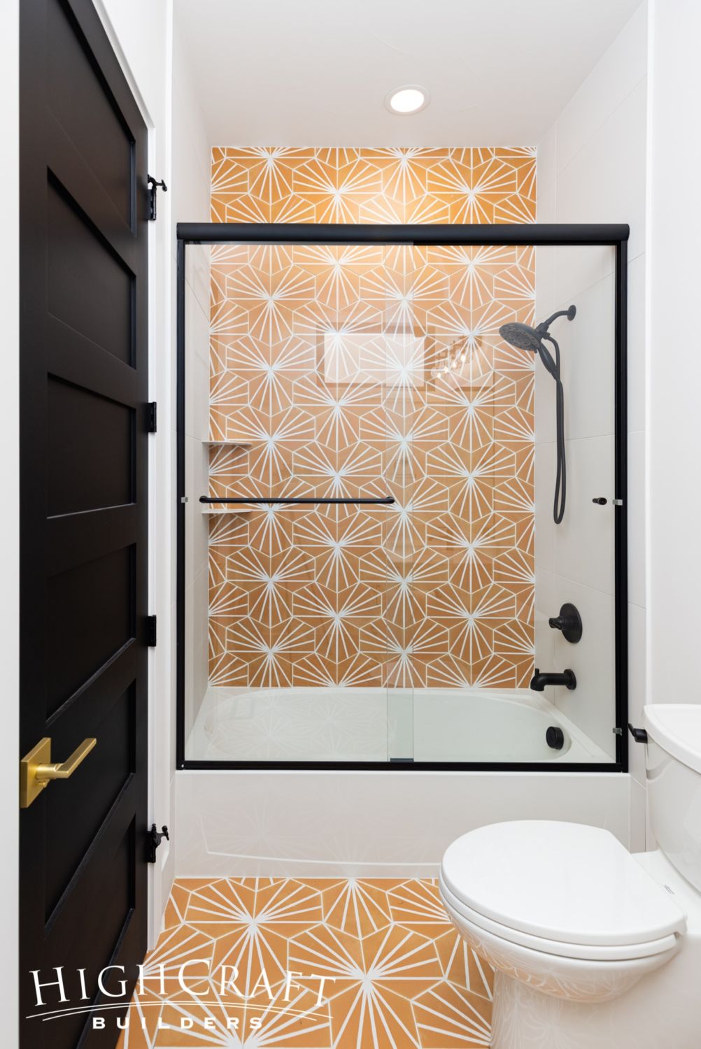
And the black doors, fixtures, and shower door frame all tie into the home’s design palette.
Foyer and Stairs
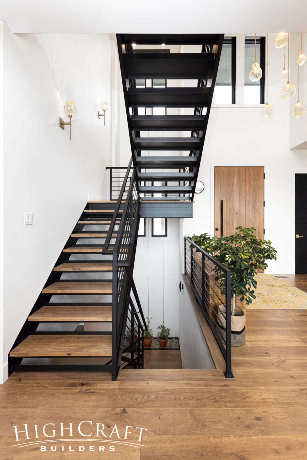
The custom metal stairs and railings make a modern statement in the front entry.
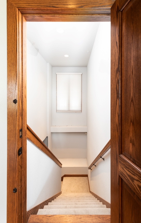
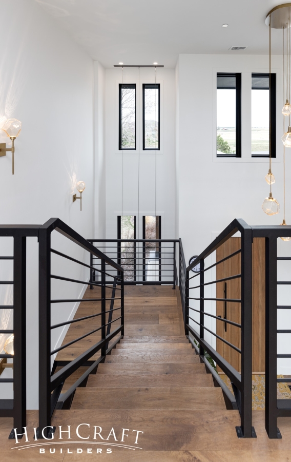
Before, the stairs were a narrow tunnel, hidden behind a closed door, leading to an unfinished basement (left). Today, the stairs are open and inviting (right).
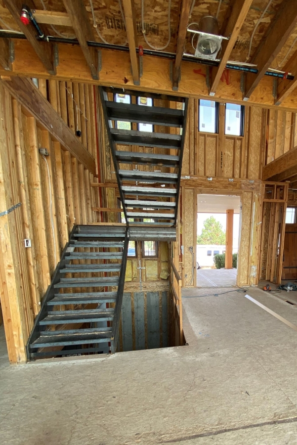

The custom metal stairs with open risers were locally fabricated, painted black, and fitted with wood overlays on the treads to match the flooring.
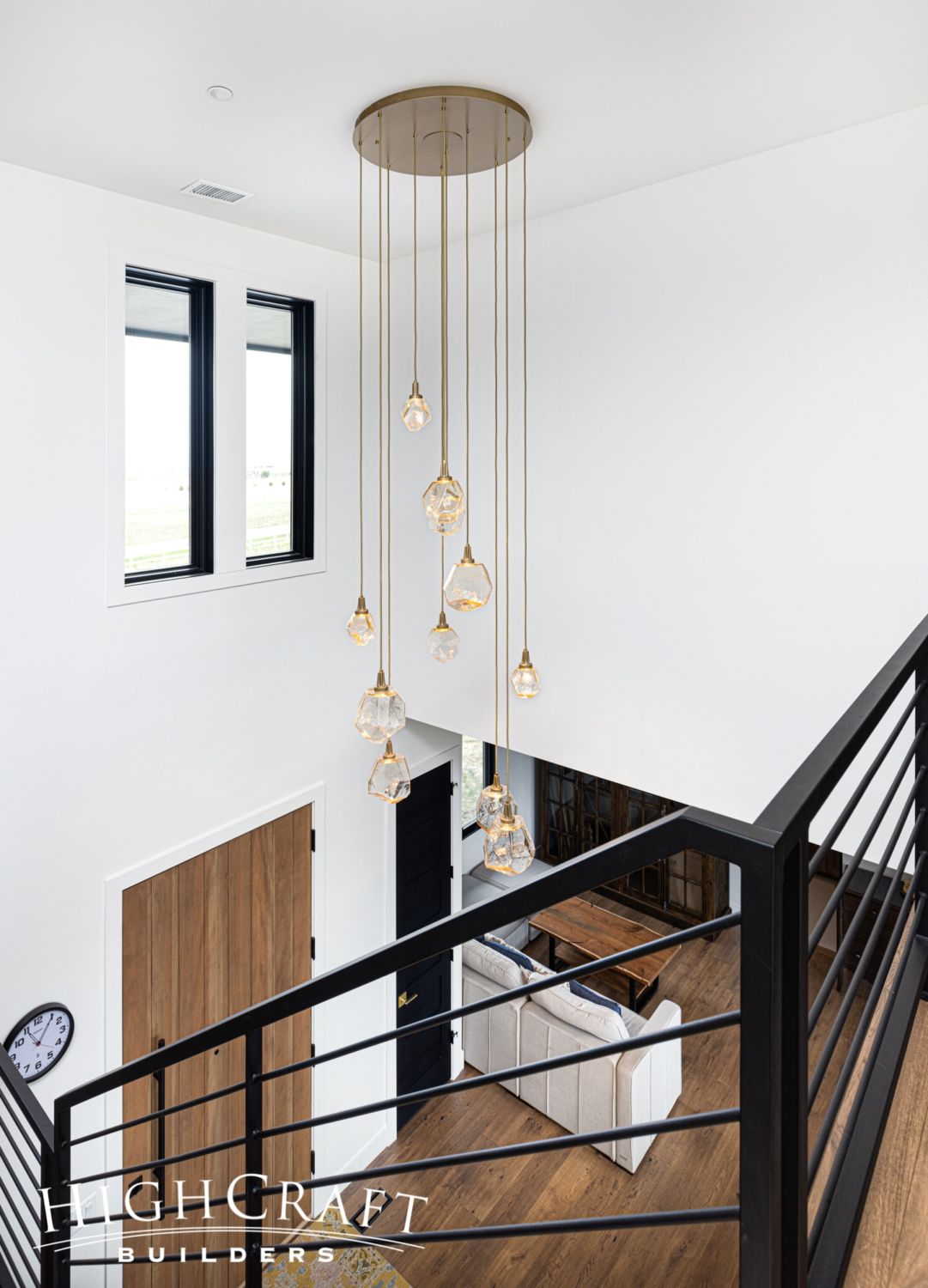
The well-chosen lighting softens the crisp lines of the stairs. According to the manufacturer Hammerton Studio, this multi-light pendant “adopts the appearance of hanging gemstones with its coarsely cut, blown glass shades.”
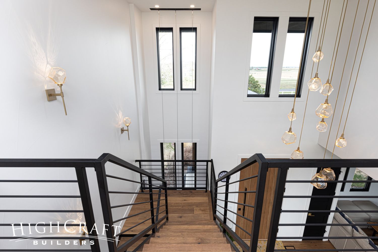
Remember that chandelier in the kitchen? Matching wall sconces, and that multi-light pendant, provide a warm glow in the stairwell.
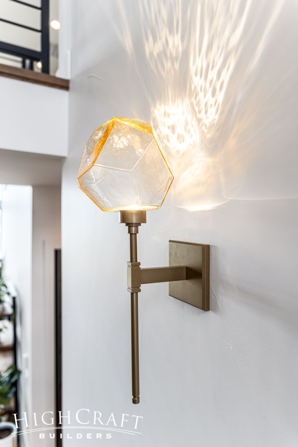
Each sconce, with its hand-crafted shade, is like a piece of art.
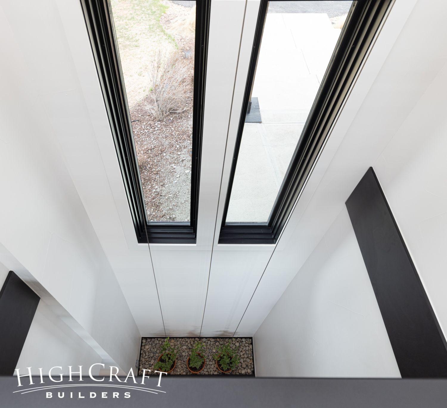
At the base of the stairs, Mari and Kelly have planted Vinca major, a vining plant that will grow up the three cables toward the natural light of the windows, filling their stairwell with greenery and periwinkle blossoms.
As we mentioned in Part 2 of the series, Mari and Kelly’s office and master bedroom suites occupy the entire second story footprint of the house.
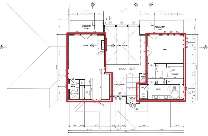
The couple wanted an office big enough for the two of them to share comfortably (see floorplan, left). They also wanted a spacious master bedroom suite that captures views to the west (see floorplan, right).
Master Bedroom Suite
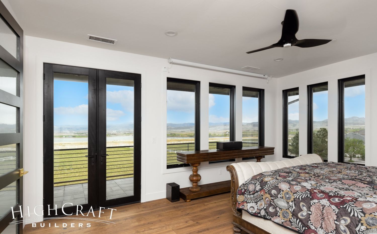
The master bedroom’s windows and private lanai take full advantage of lake and mountain views. The bedroom suite also includes a walk-in closet and five-piece bath.
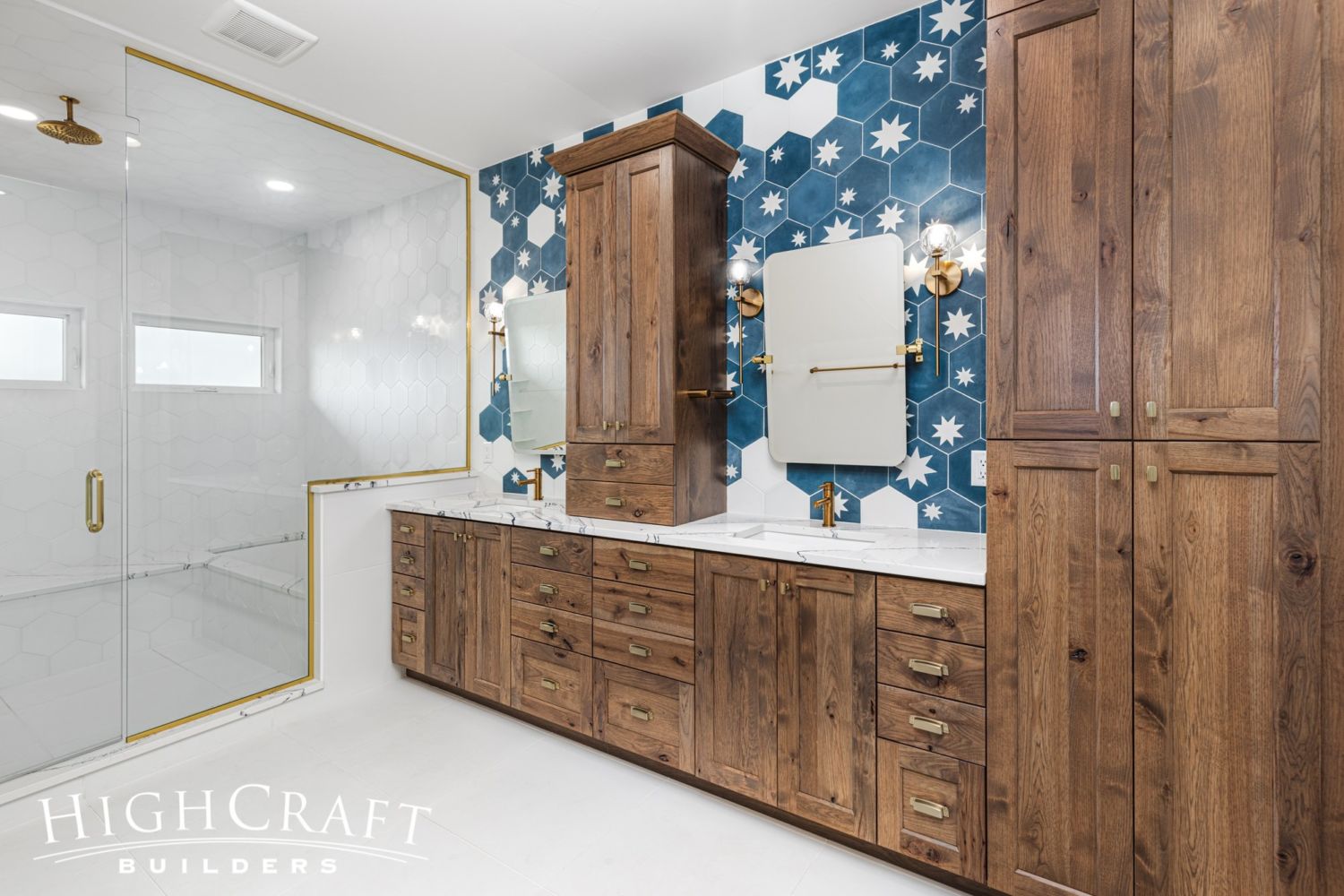
Again, we are starstruck by the gorgeous tiles in the master bathroom.
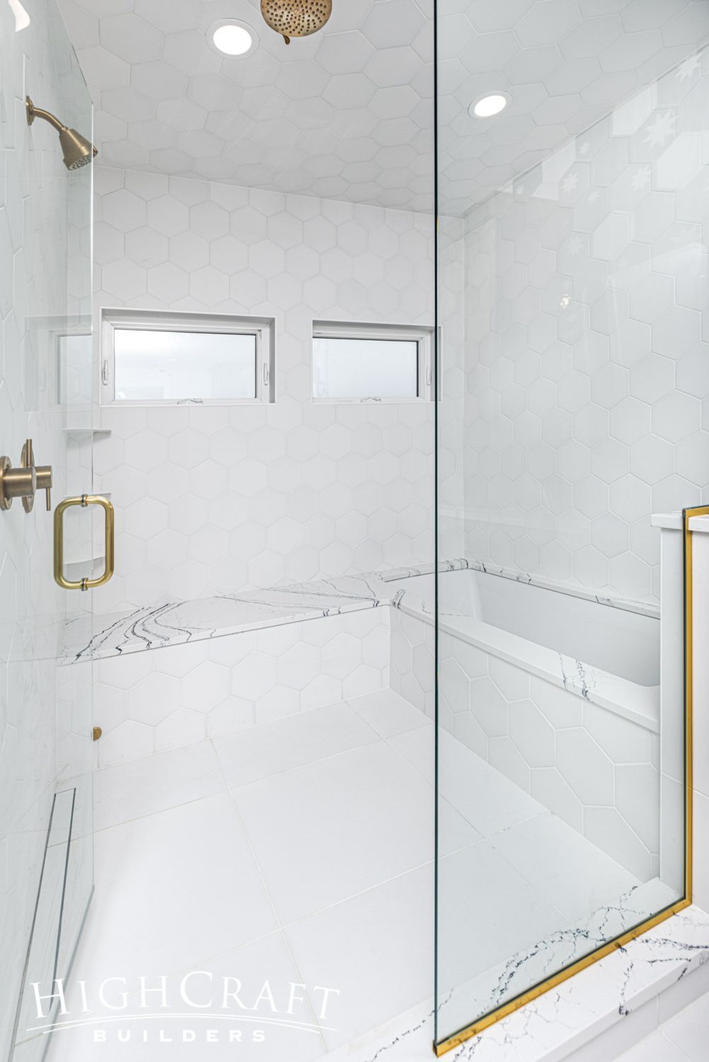
The shower is fully tiled, and the bench seat is capped with the same Portrush quartz slab used in the guest bath and kitchen.
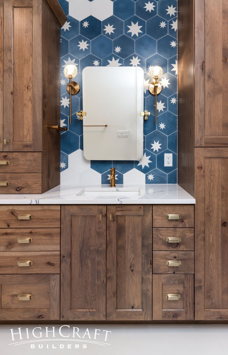
For even more design continuity, the bathroom cabinetry is the same rustic hickory used for cabinets on the main floor …
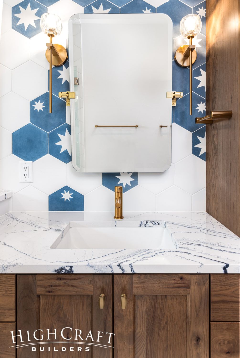
… and the long-stemmed light sconces we saw in the guest bathroom are repeated in the master bath.
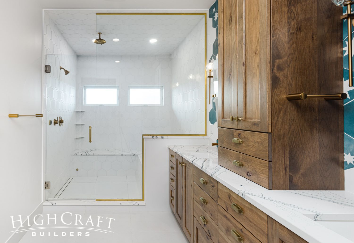
The floor-to-ceiling glass doors create a modified wet room for a true steam shower experience.
What is a wet room exactly? Check out another modified wet room project in the blog post “Bathroom Remodel with Wet Room”
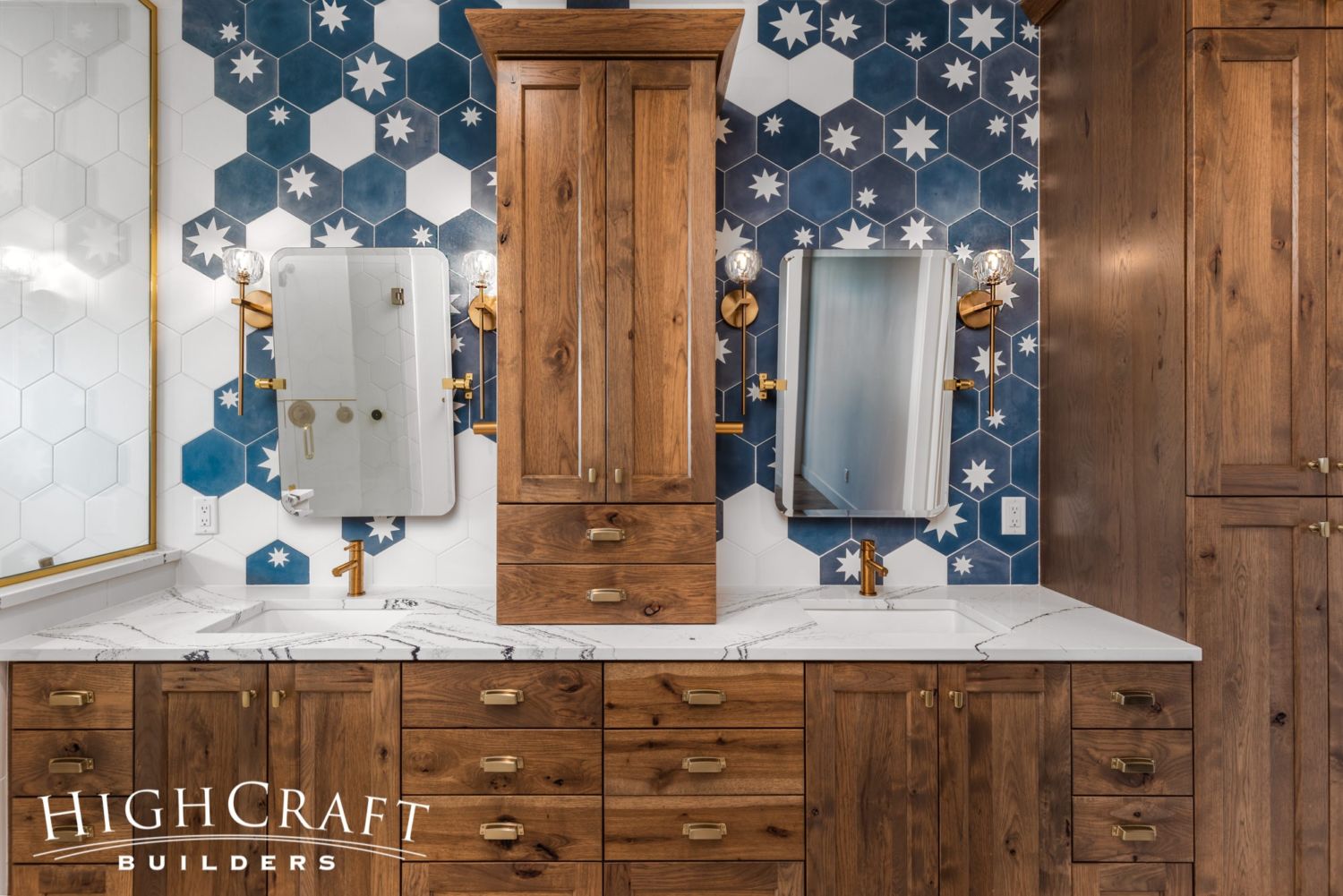
We love how this tile installation turned out, especially the transition from the blue tiles of the backsplash to the white hex tiles of the shower surround.
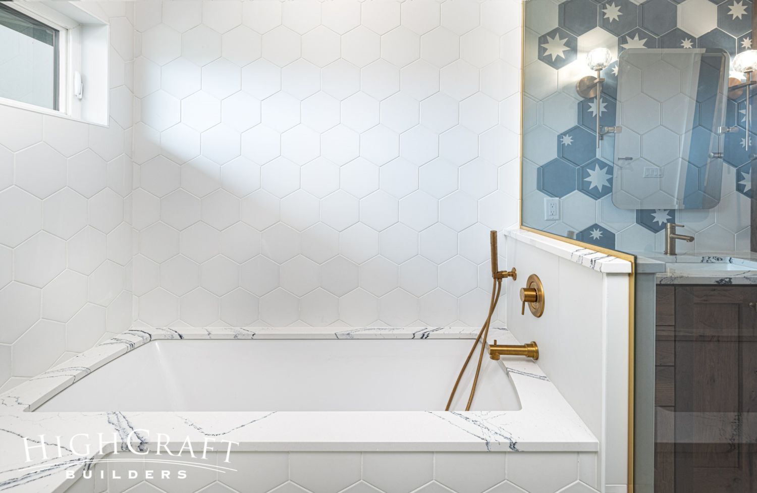
The undermount bathtub is tucked into the steam shower in the modified wet room.
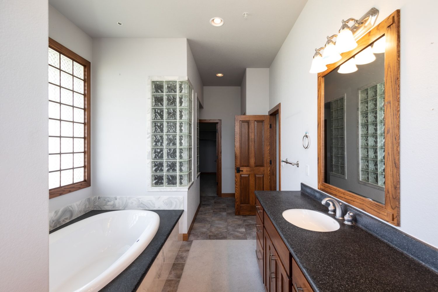

Goodbye, tired and dated glass block (left). Hello, fresh steam shower and stars (right)!

Catwalk
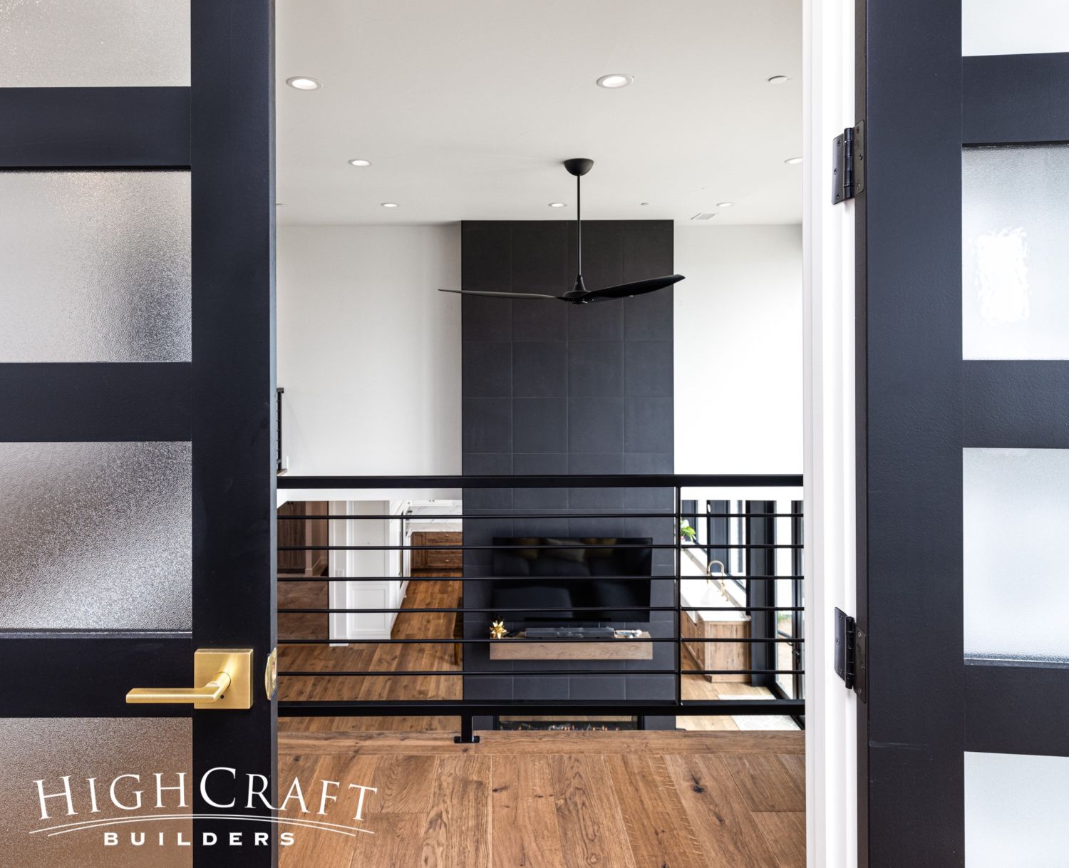
To preserve a healthy buffer between work and rest zones, the office and master bedroom are separated by the large vaulted space above the living room, and connected by a single catwalk.
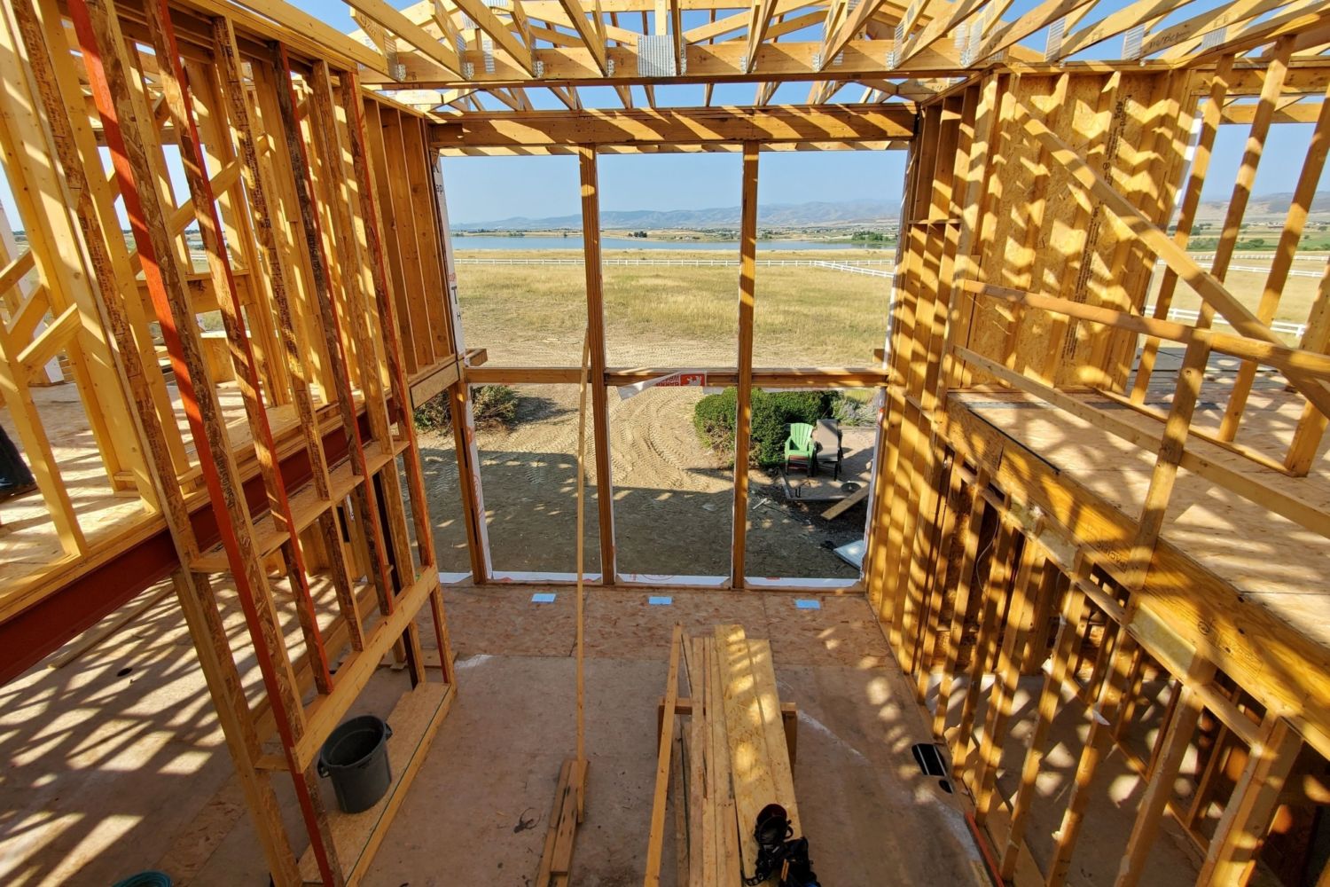
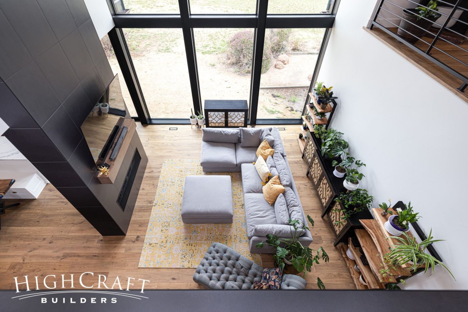
The scale of the living room, and the views beyond its windows, are best experienced from the catwalk.
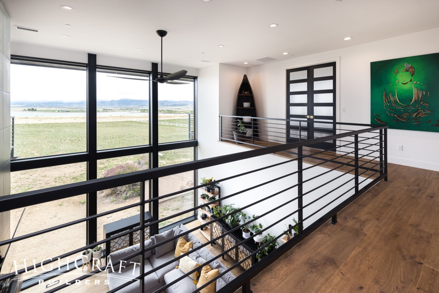
“One of the best parts of the remodel,” says Mari, “is [the] huge floor-to-ceiling windows – two full stories of windows – just to take in the view.”
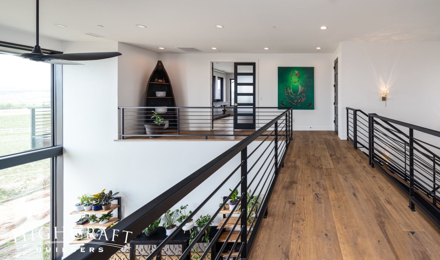
In addition to providing safety along the catwalk, these contemporary railings preserve the open and modern design concept of the home.

Shared Office
The shared office has plenty of space for his and her desks and storage.
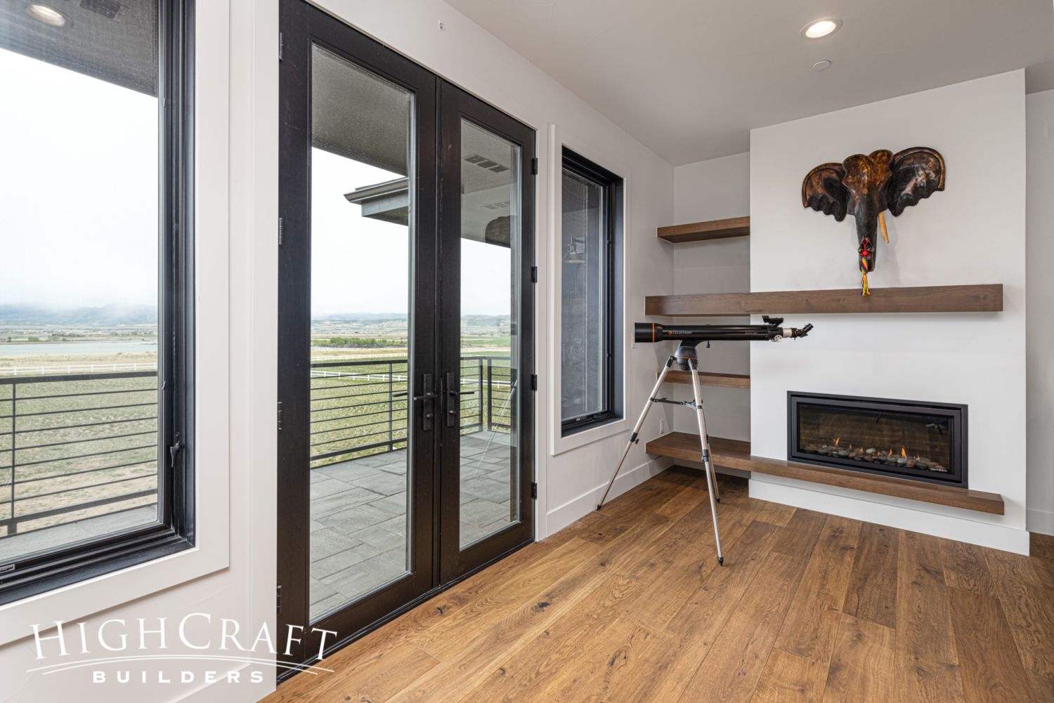
The office also enjoys several creature comforts, including its own private lanai, natural gas fireplace …
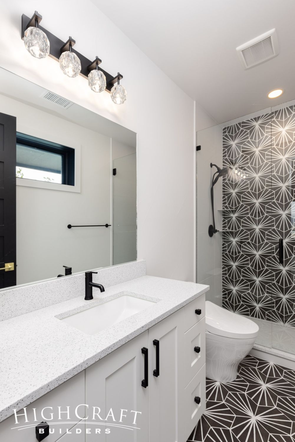
… and three-quarter bathroom.
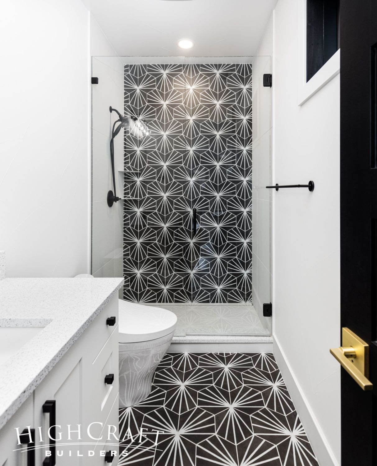
Here’s more of that striking starburst hex tile, this time in black.
“You can see farmhouse style in the cabinetry, Moroccan style in the fun bathroom tiles, and modern style in the doors and railings,” says Jill when describing Mari and Kelly’s interior design style. “We found a good balance between comforting, homey, vibrant and modern design elements.”
~~~
We want to thank our wonderful clients, Mari and Kelly, who graciously shared their home and their remodeling story in this series. For construction photos and more of the homeowners’ journey, be sure to check out earlier posts in our blog series “Second Story Pop Top.”
Part 1 – Mari and Kelly’s remodeling wish list
Part 2 – creating a floorplan with private and shared spaces
Part 3 – framing progress + Q&A with the project manager
Part 4 – drywall progress + Q&A with the interior designer
Part 5 – tile, door and cabinetry installation
Part 6 – countertops, more tile, and Tesla solar shingles
Part 7 – blue and brass appliances in the kitchen
Whether you build new construction, or remodel what you have, HighCraft’s experienced design-build team is here to help with your project, large or small. Contact HighCraft with questions or to schedule a free consultation.
