Every year, experts at the Pantone Color Institute identify the top color they feel “reflects the mood and attitudes taking place in our culture.” They also announce an additional palette of colors to complement their chosen Color of the Year. These color selections are so powerful they often guide fashion and interior design trends.
Intense. That’s the word one color analyst used in a recent Elle Décor interview when describing the current mood of our culture, and subsequently the pigments she predicts will be popular in 2018.
“Intense colors seem to be a natural application of our intense lifestyles and thought processes these days,” says Pantone Color Institute executive director Leatrice Eiseman after announcing Pantone’s palette predictions. However, Pantone has yet to announce their single 2018 Color of the Year (we have to sit tight until early December for that announcement).
But major paint companies, including Sherwin Williams, Benjamin Moore and Behr, have beaten Pantone to the punch by announcing their own selections for 2018 Color of the Year. Although each color is radically different, two are fairly intense, reflecting Pantone’s forecast. Behr’s 2018 top color pick, the calm exception, could be seen as a possible antidote to our often intense, plugged-in lifestyles.
HERE ARE THE PAINT INDUSTRY’S COLOR PREDICTIONS FOR 2018
SHERWIN WILLIAMS
The Sherwin Williams 2018 Color of the Year, Oceanside, is a marine-inspired mix of blue and green that is sure to make waves in the coming year.
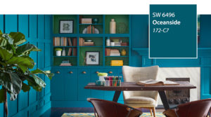
Sherwin Williams calls it “A complex, deep color that offers a sense of the familiar with a hint of the unknown, [that] bridges together a harmonious balance of blues and greens that can be found in what’s old and new.”
BENJAMIN MOORE
Benjamin Moore’s 2018 Color of the Year, Caliente, is on fire and can’t be ignored.
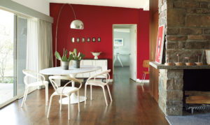
“Strong, radiant and full of energy, Caliente AF-290 is total confidence. It is pleasing, passionate and makes people feel special, like ‘red carpet treatment,'” said Ellen O’Neill, Benjamin Moore Director of Strategic Design Intelligence, in a recent Elle Décor post. “Whether used as one note or on four walls, the spirited personality of red turns heads signaling surprise and adventure. The eye can’t help but follow its bold strokes.”
BEHR
If the first two Colors of the Year were too intense for your taste, Behr’s 2018 Color of the Year, In the Moment, invites calm reflection and an escape from the fast-pace lives we lead.
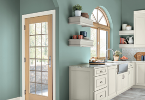
“This cool, tranquil spruce blue is inspired by nature and is a soothing, restorative coalescence of blue, gray and green,” says the company’s website. “This comfortable color evokes a sense of sanctuary and relaxation amid our busy, always-on lives.”
Although paint industry giants may not agree on the 2018 Color of the Year, they acknowledge that color is an emotional cue, and can affect the mood in each room of your home. To learn more about the superpowers of certain colors, and the emotions each may trigger, check out The Meaning of Color in Your Home.
