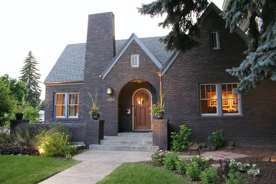
Pantone Color Institute, an international authority on color trends, announced their top picks for home interior color palettes for 2019 – and HighCraft designers Jill, Danette and Katie share a few thoughts about next year’s predictions.
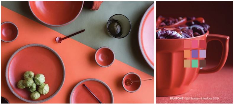
Pantone’s forecasted “Cravings” collection (above) tempts the taste buds with culinary-inspired hues that “draw upon memorable sensory experiences,” including spicy Cayenne and Chili Pepper. According to Pantone, “The neutrals of tasty Butterum and Cappuccino serve up a delectable warming presence, while Grassy Green promises a cooling respite from the heat of the surrounding shades.”
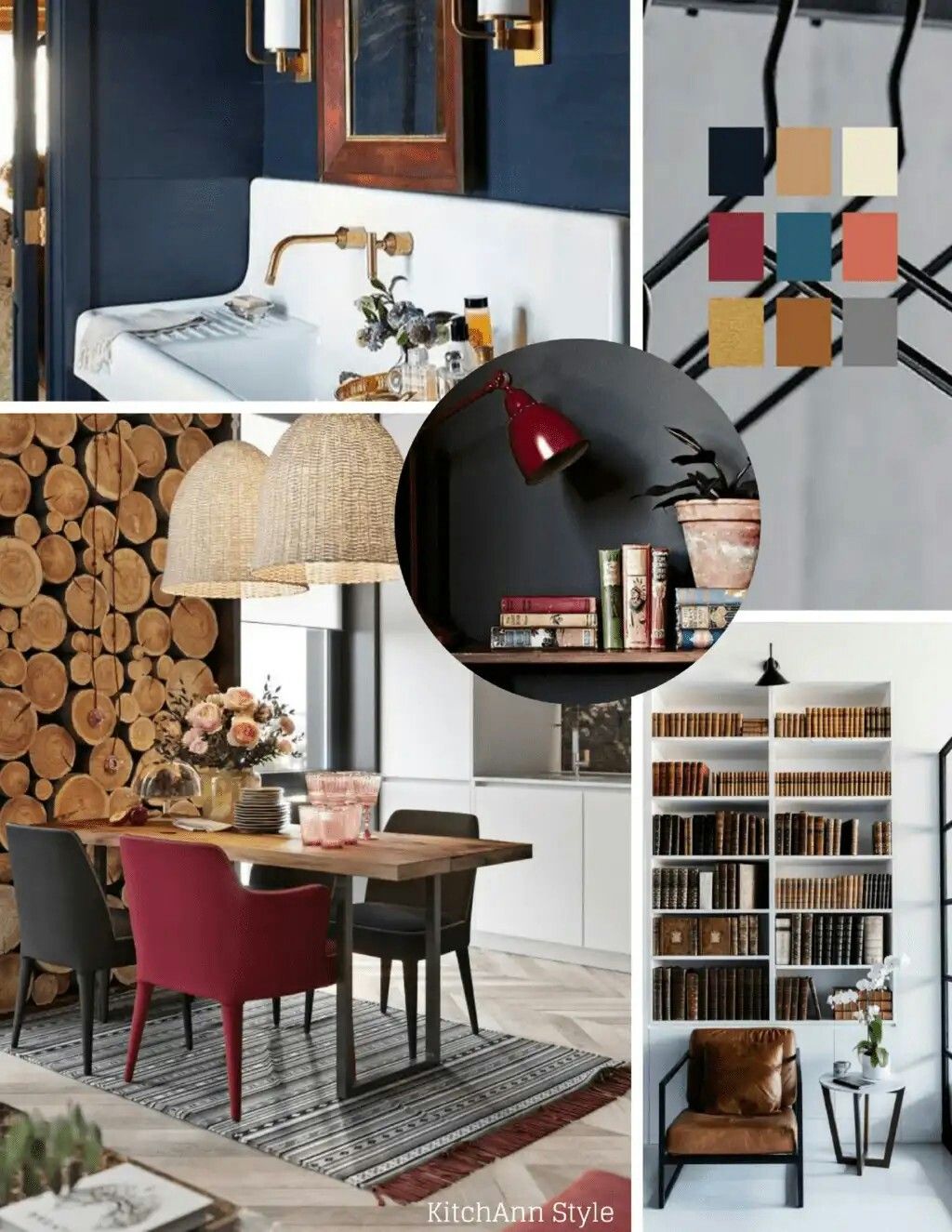
Pantone’s “Classico” palette (above) predicts more timeless hues, including Camel, Deep Teal, Apricot Brandy, Gray Flannel, Caviar and White Swan that are “fundamental, basic, and everlasting, while at the same time, elegant and forever fashionable.”
PAINT INDUSTRY PREDICTIONS
Does the paint industry subscribe to Pantone’s predictions? Sherwin Williams, Benjamin Moore and Behr announced their 2019 Colors of the Year, and although each top choice is radically different, they all seem to complement one another.
Sherwin Williams
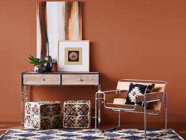
The Sherwin Williams 2019 Color of the Year, Cavern Clay, is “A warm terracotta color with ancient, elemental roots … a nod to midcentury modern style, but with the soul of the American Southwest.”
Benjamin Moore
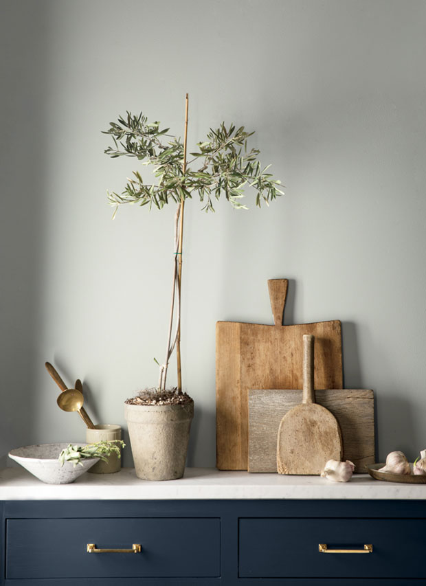
Benjamin Moore’s Color of the Year, Metropolitan, is a subtle gray that is “Calm, composed and effortlessly sophisticated … [exuding] glamour, beauty and balance.”
Behr
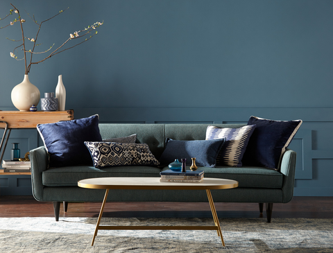
Behr’s 2019 Color of the Year, Blue Print, is “An honest, approachable color that conjures up the blueprints builders rely on to bring architectural designs to life.”
HIGHCRAFT DESIGNERS WEIGH IN
What do our interior designers think about the industry’s top color picks for 2019?
Danette: “I can appreciate all different colors in certain applications but my favorites from these predictions are Pantone’s Classico palette and Benjamin Moore’s Metropolitan. I think people are really loving neutrals right now, myself included. It’s always nice to have something that takes up such a large portion of a space in your home, like paint, be neutral and versatile and let the other elements of the space bring the pop of color. Pantone’s Cravings collection and Sherwin Williams Cavern Clay are a little bold for my taste! I see these in more of a commercial setting rather than residential.”
Jill: “Well said, Danette! I agree with you on Pantone’s Classico palette, but love seeing that it’s not just whites, greys, beiges, but including some rich deep color hues like the Deep Teal, Apricot Brandy and Camel. These “neutral colors” are bold and add some interest, but the deep, rich tones make them a little more timeless and comforting and not just trendy. And we’re not just seeing these colors in paint, but in accents, light fixtures, tiles, and even cabinetry. We’re still seeing the greys and blues like Benjamin Moore’s Metropolitan and Behr’s Blue Print, so it’ll be interesting to see if the Cavern Clay takes off.”
Katie: “It is so nice to see color again! We were living in a world of Greige for far too long. I am loving the Camel (borderline obsessed) and with the Flannel Grey and pops of Cranberry … ugh, swoon! I’m not sure how I feel about the Cayenne and Chili Pepper, but they are pretty with the Grassy Green. Together they have a southwest, Santa Fe type feel. Can’t wait to see what these new colors will bring to the design world in 2019.”
Whether or not you agree with the top industry picks, one thing is certain – color is an emotional cue that can affect the mood in each room of your house. To learn about the emotions colors may trigger, check out our blog The Meaning of Color in Your Home.
Photos courtesy Pantone, KitchAnn Style, Sherwin Williams, Benjamin Moore and Behr.
