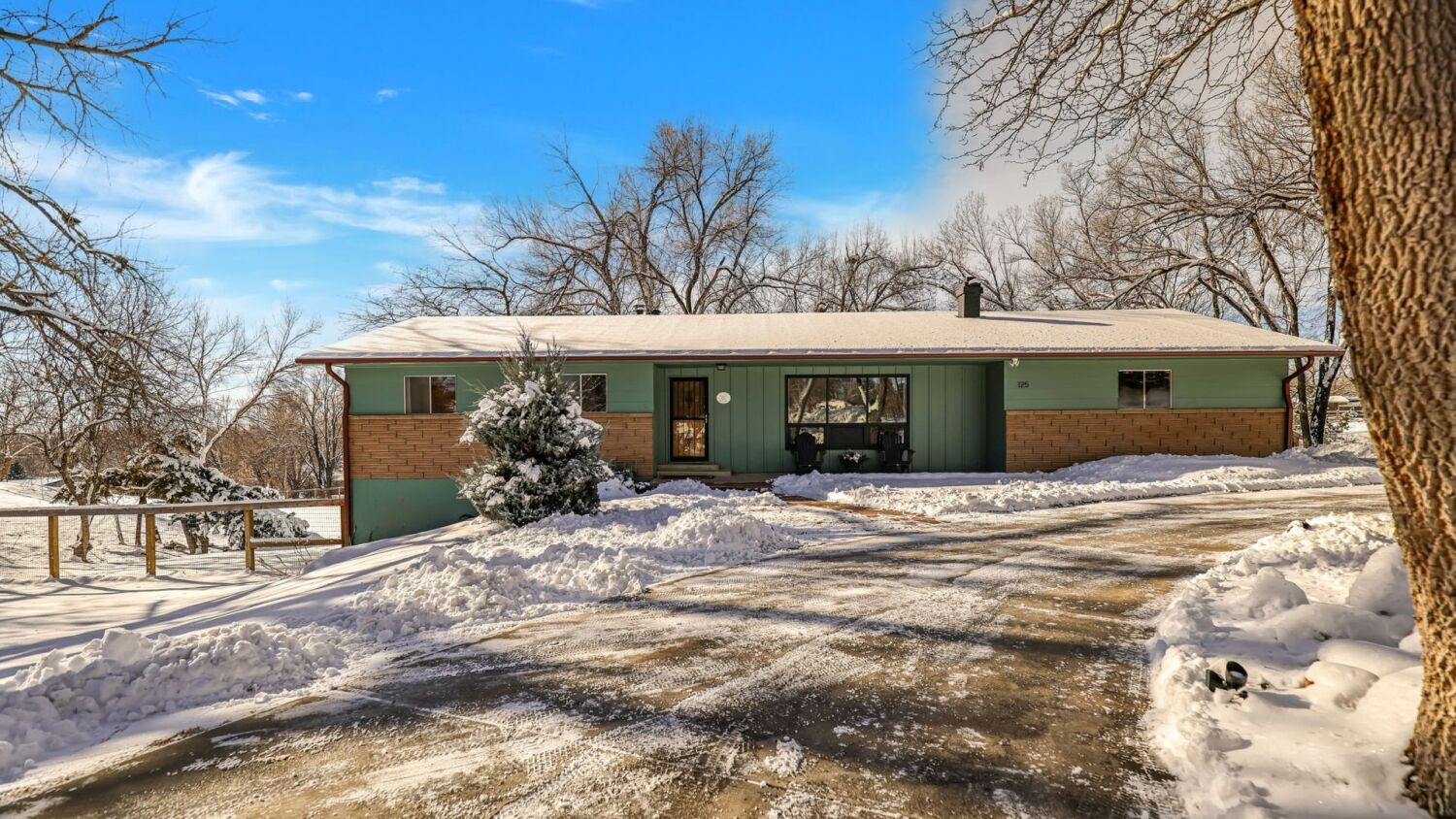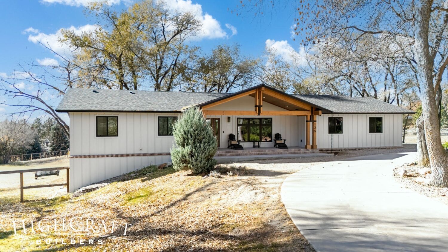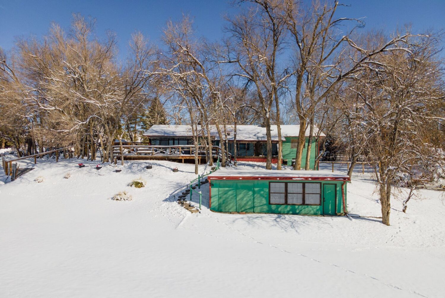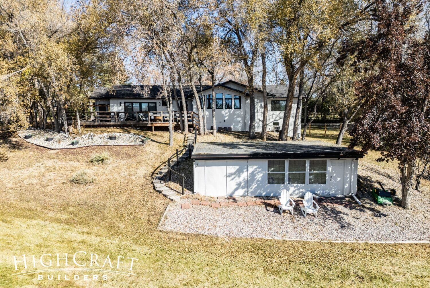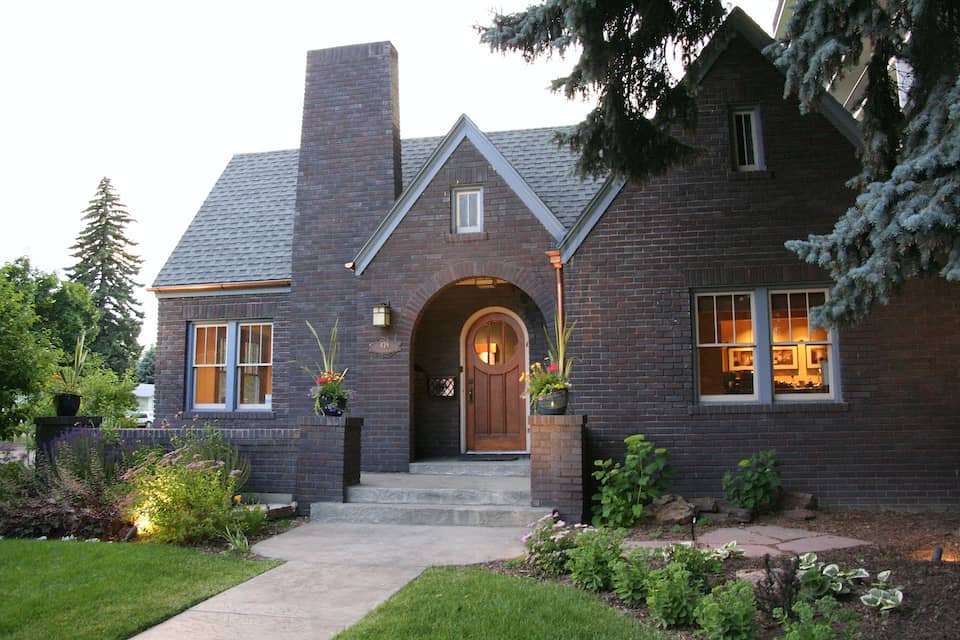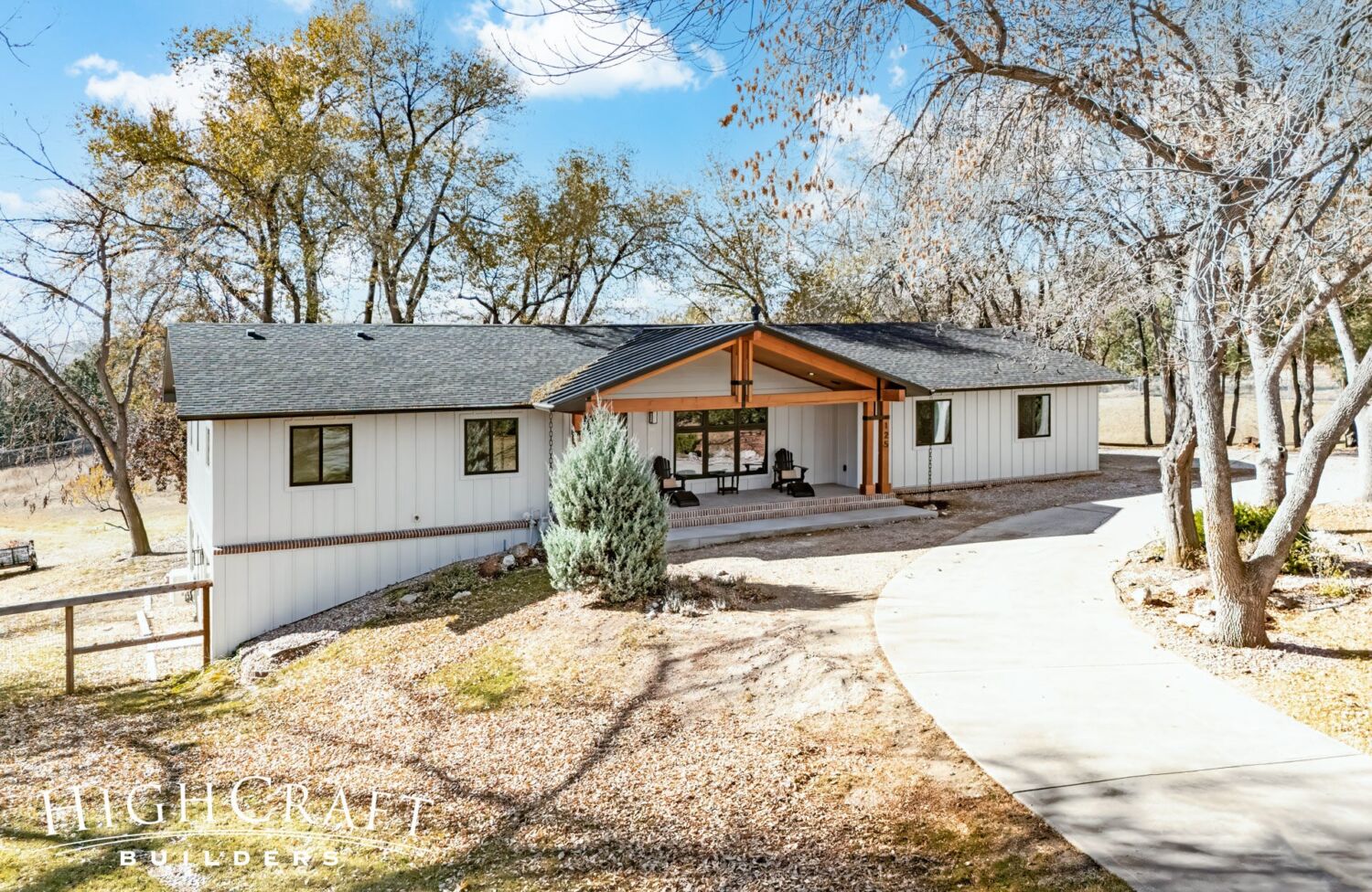
We’re excited to share before-and-after photos of Jeff and Ally’s newly remodeled home! To recap, the top goals for their whole-house remodel were:
- open up the interior layout
- maximize mountain views
- improve the functionality of their home
- finish the basement
- improve curb appeal
EXTERIOR
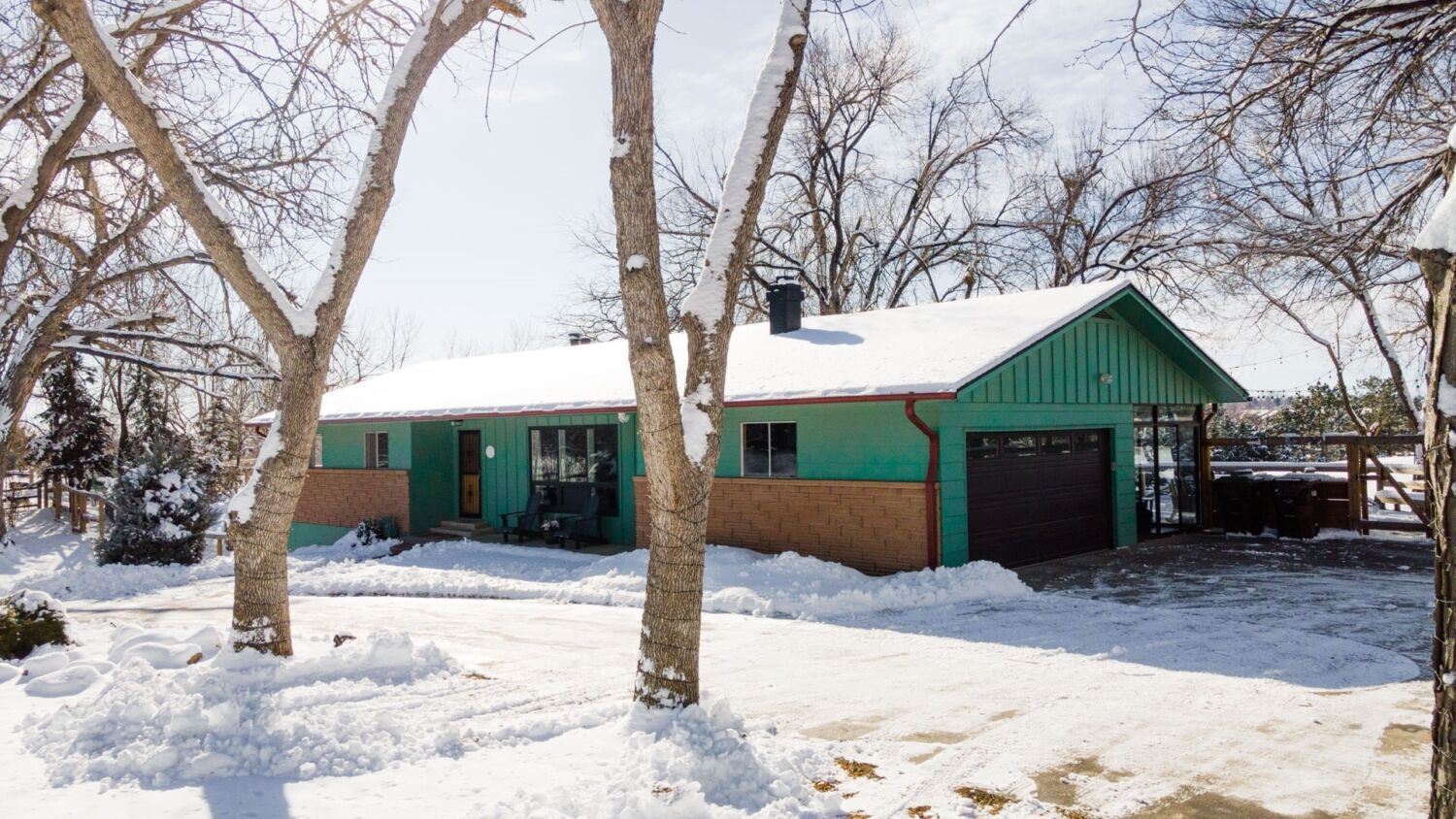
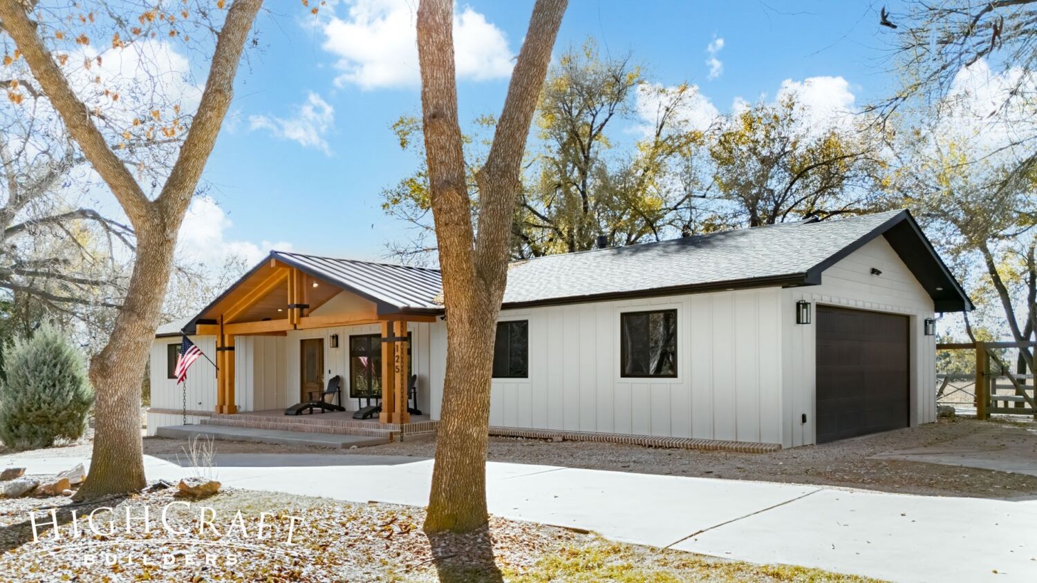
When it came to the home’s exterior, Jeff and Ally were not fans of the original front entry, shallow front stoop, and turquoise green and blonde brick siding (above, left). They wanted a welcoming front porch, covered seating area, and classic farmhouse color palette (above, right).
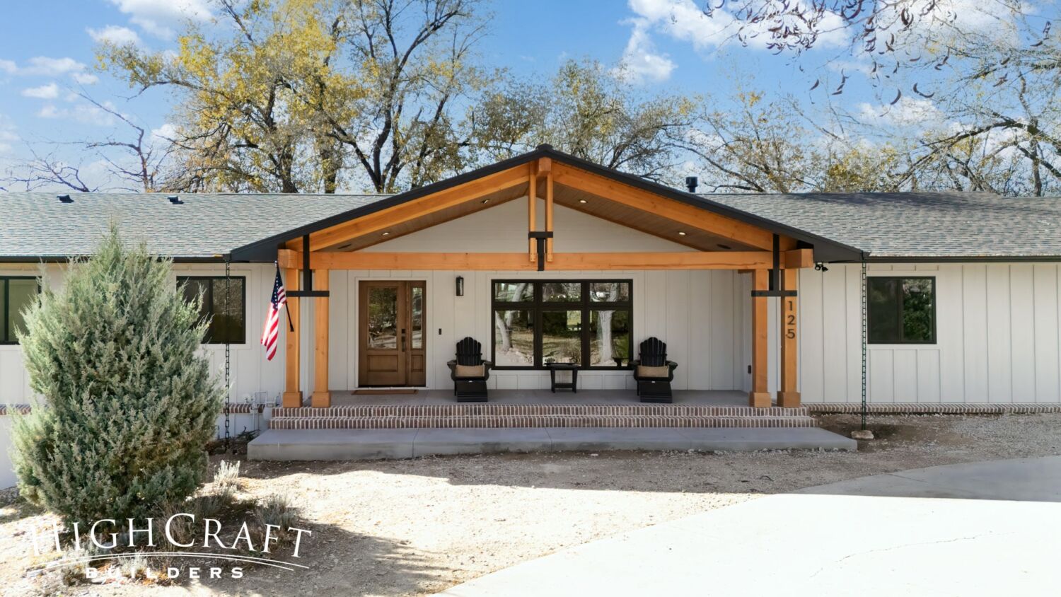
When asked about her design style, Ally describes it as coastal farmhouse with a nod to Colorado rustic.
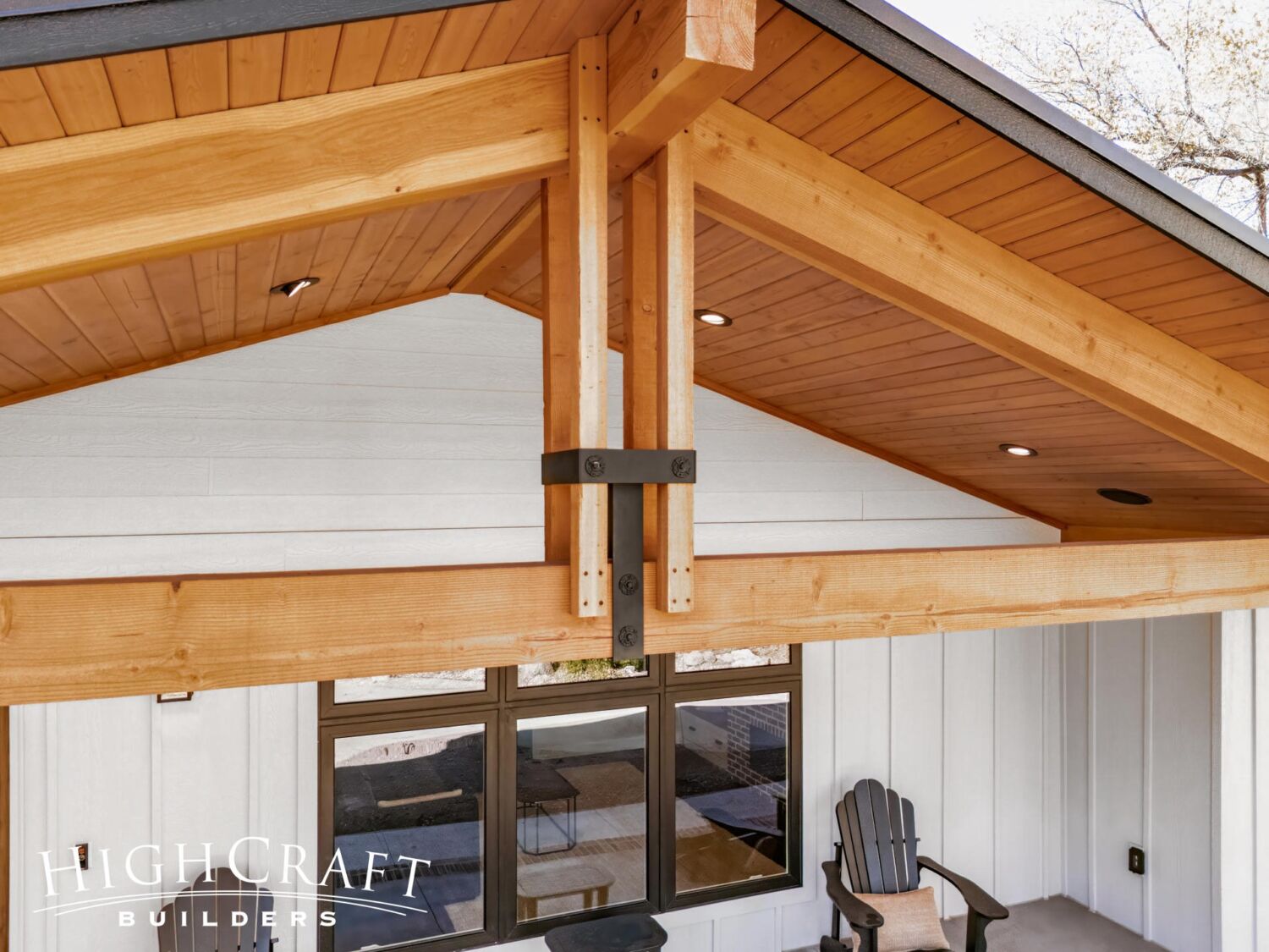
Her intention with the design, she says, was to create “a little bit of a southern feel, but also trying to keep the Colorado vibe, too, with the exposed wood on the ceiling of the front porch and big thick beams.”
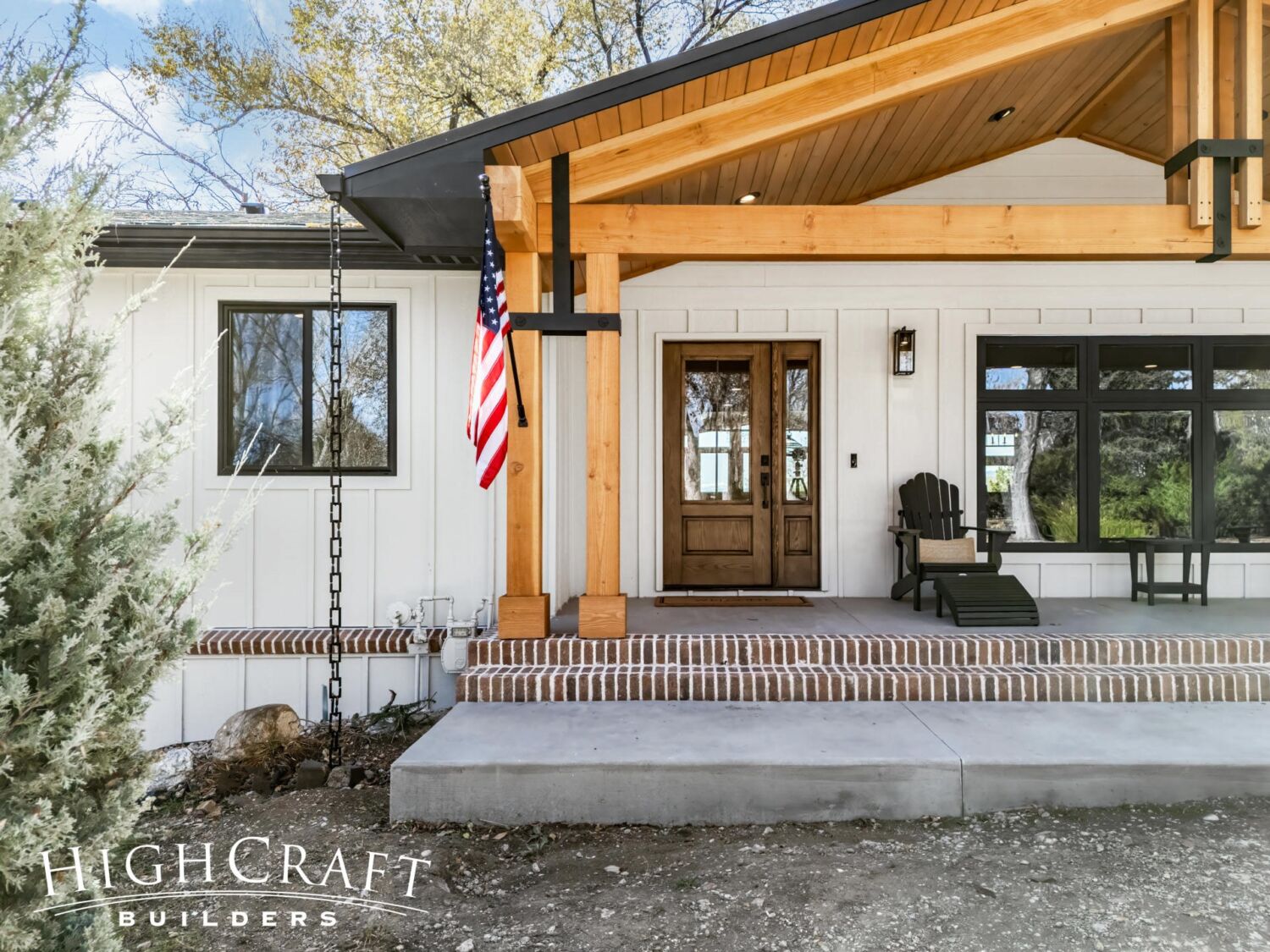
Reflecting Ally’s love of traditional brick, our team installed full-depth brick as a border for the house skirting and porch steps.
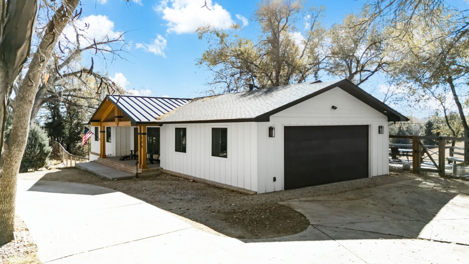
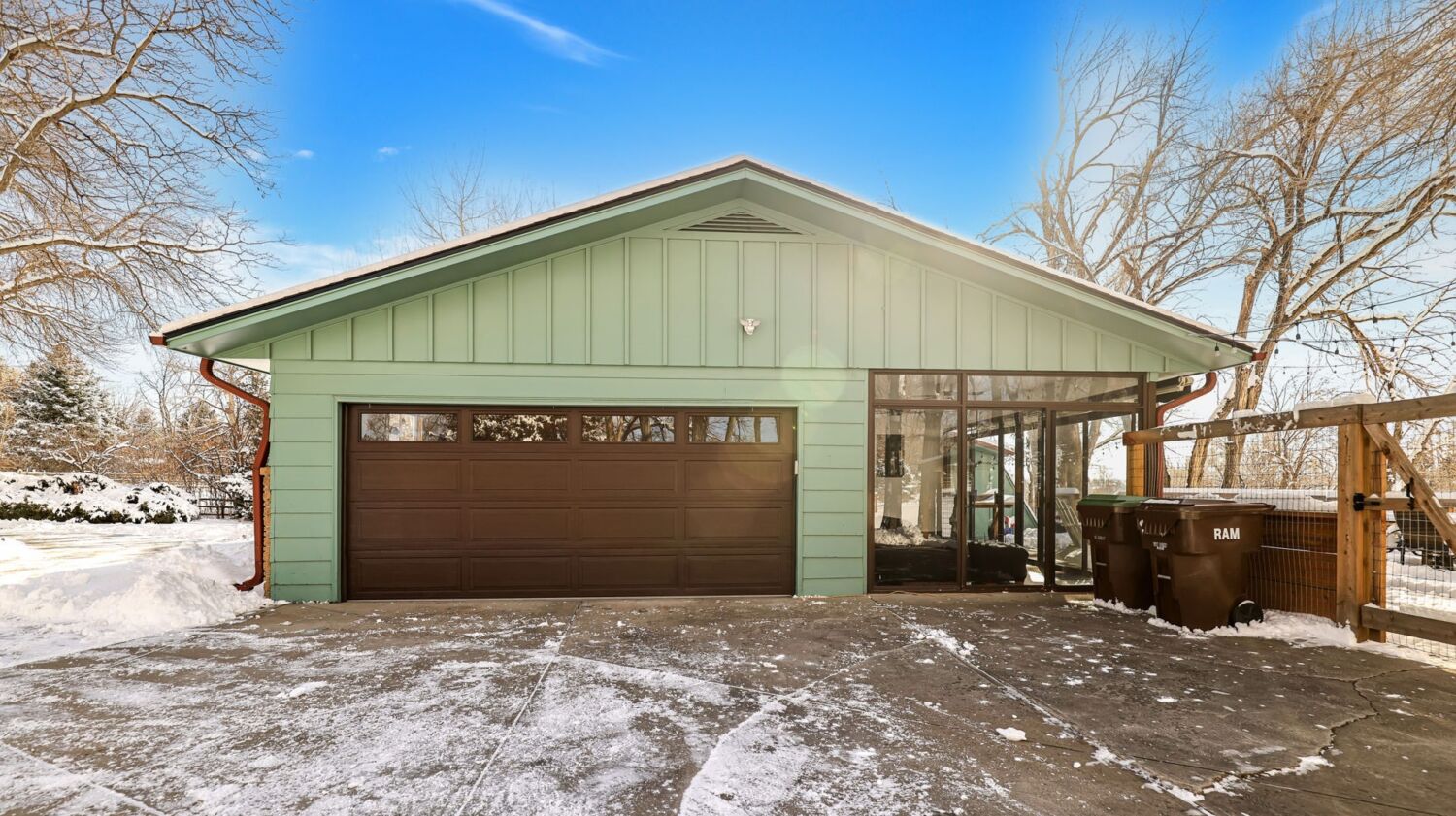
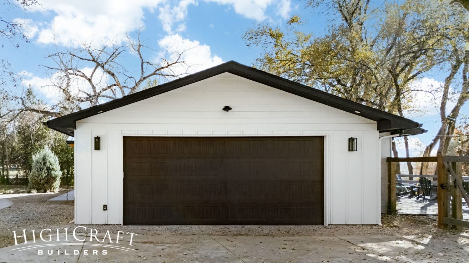
Jeff and Ally also wanted a larger, deeper garage, but they weren’t sure it was possible without making some drastic changes. The HighCraft team found a solution.
“Slightly bumping out the length and width was key. It made a huge difference,” says HighCraft architect Mike Hutsell. “It’s amazing how much bigger the garage is now.”
Read the architect Q&A in Part 2 of this series.
Adding a second window to the garage (above, right) also created more symmetry on the front of the house, boosting curb appeal.
We gave all exteriors, including the existing outbuilding in the backyard, a fresh coat of paint.
INTERIOR
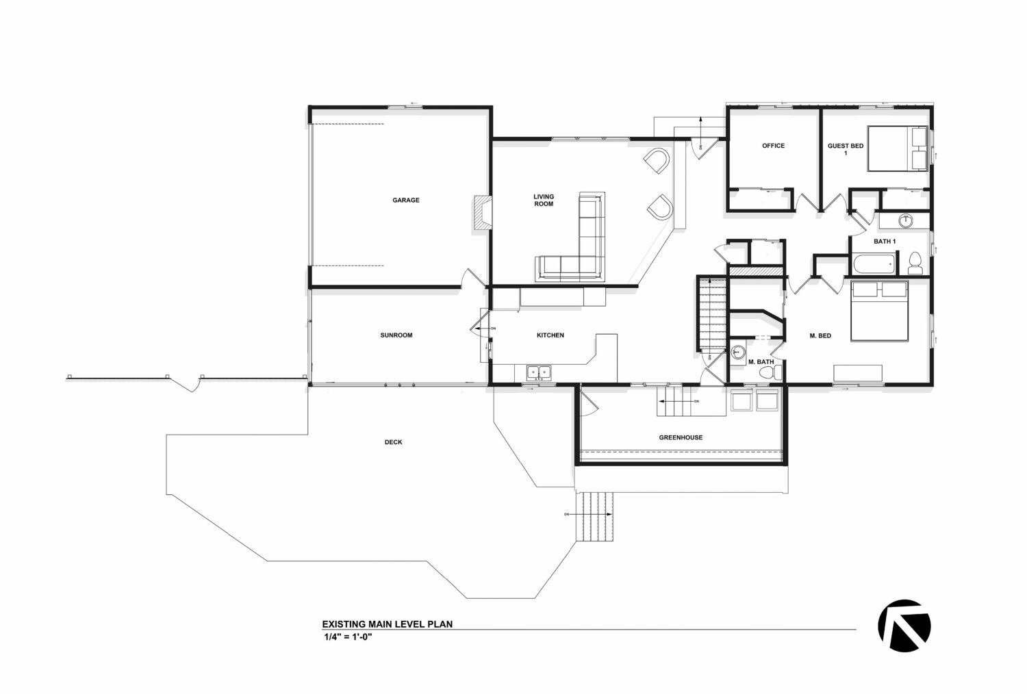
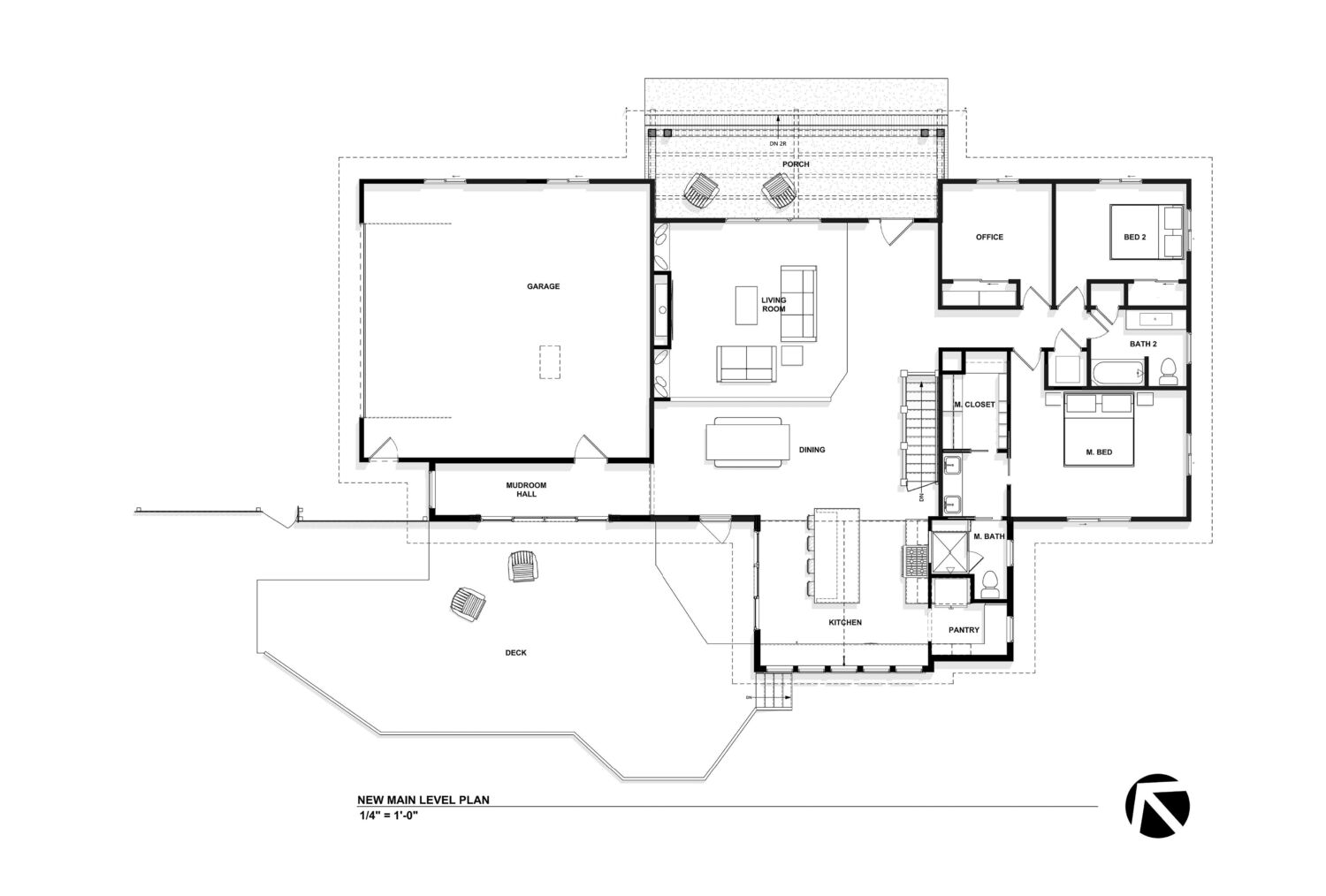
Jeff and Ally’s remodel included three additions: 1.) the front porch, 2.) the garage bump-out, and, 3.) an expanded new kitchen and master bathroom (below, right).
Our team reclaimed space from the old greenhouse (above, left) to create a larger kitchen and master bathroom (above, right). And because the new kitchen and open floorplan will flood the home with sunshine, Jeff and Ally chose to remove the old sunroom in favor of the larger two-car garage and mudroom hallway.
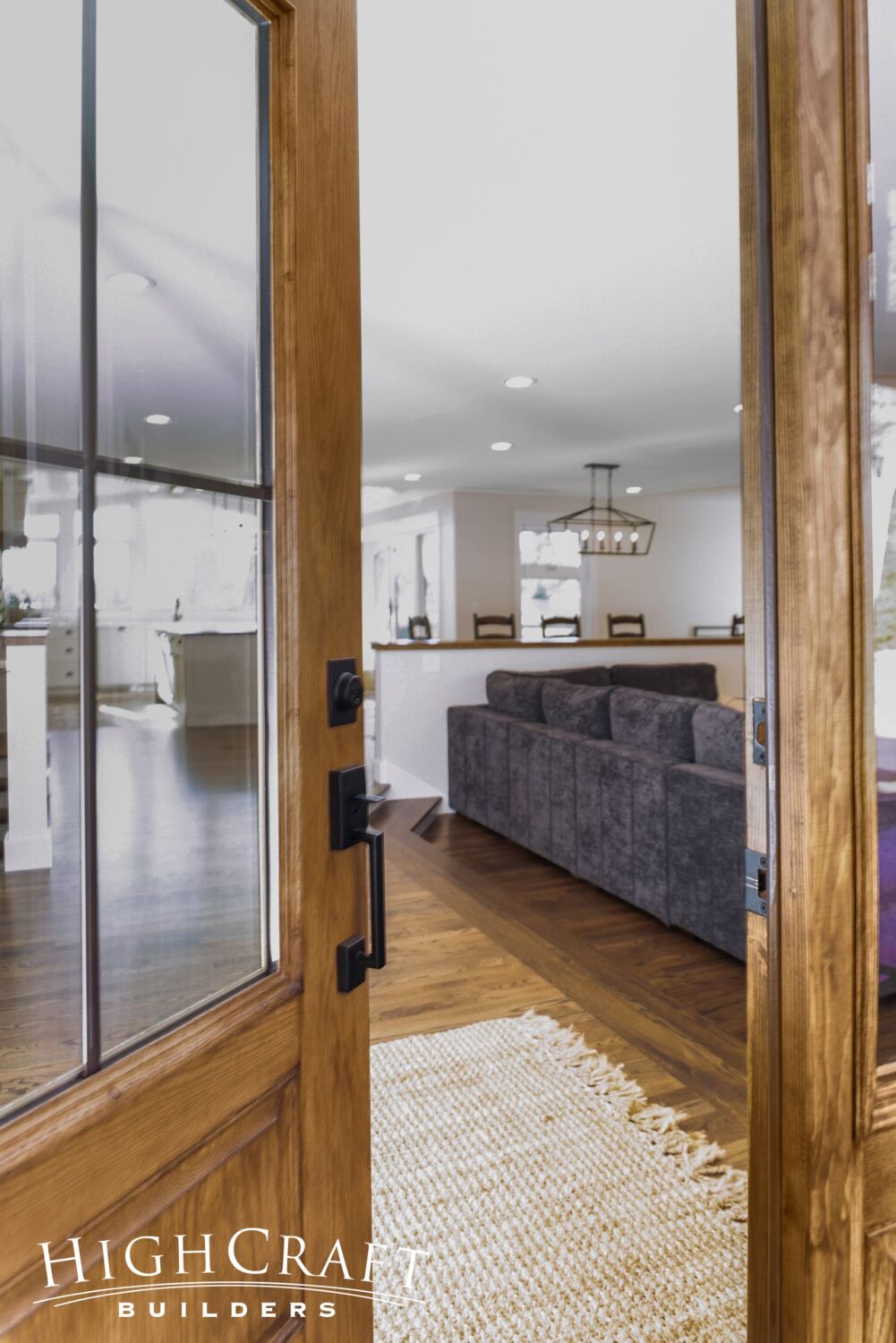
“Ally grew up in Florida, and she’s used to coastal-style houses where you have a clear line of sight from the front entry all the way through the back of the house,” says Mike, who designed the new floorplan.
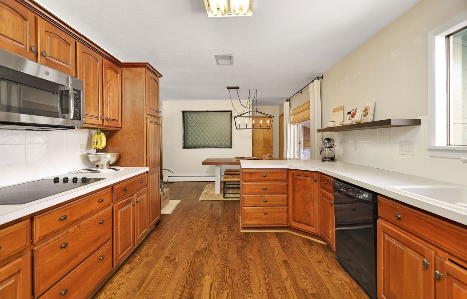
Kitchen
“Opening up the house – and making it feel airy, getting that coastal feel – was one of the biggest challenges of the project,” he adds. “To solve that, we didn’t just remove walls. We made sure that nothing would obstruct your view from the front door to the kitchen.”
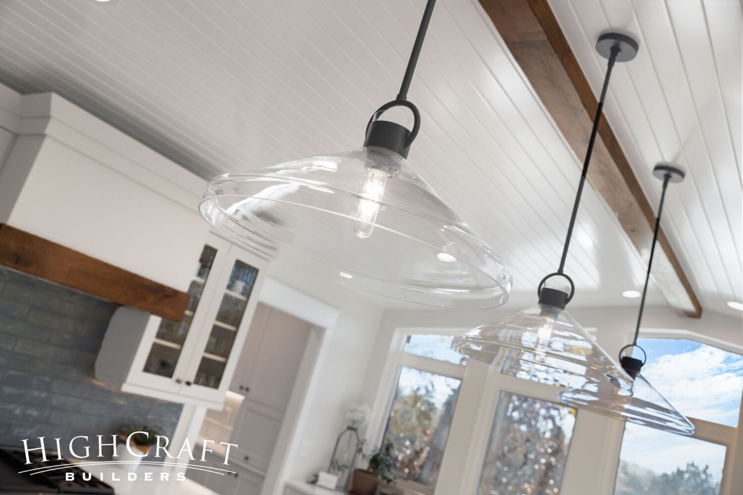
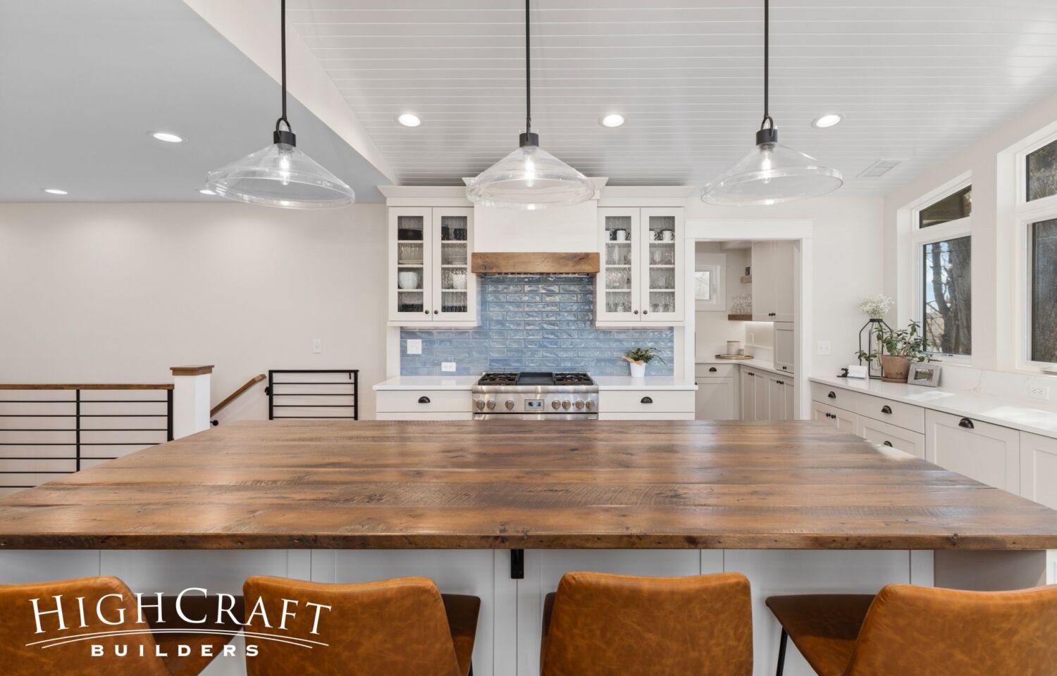
Even the glass shades on the pendant lights preserve the sight line into the kitchen and the views beyond.
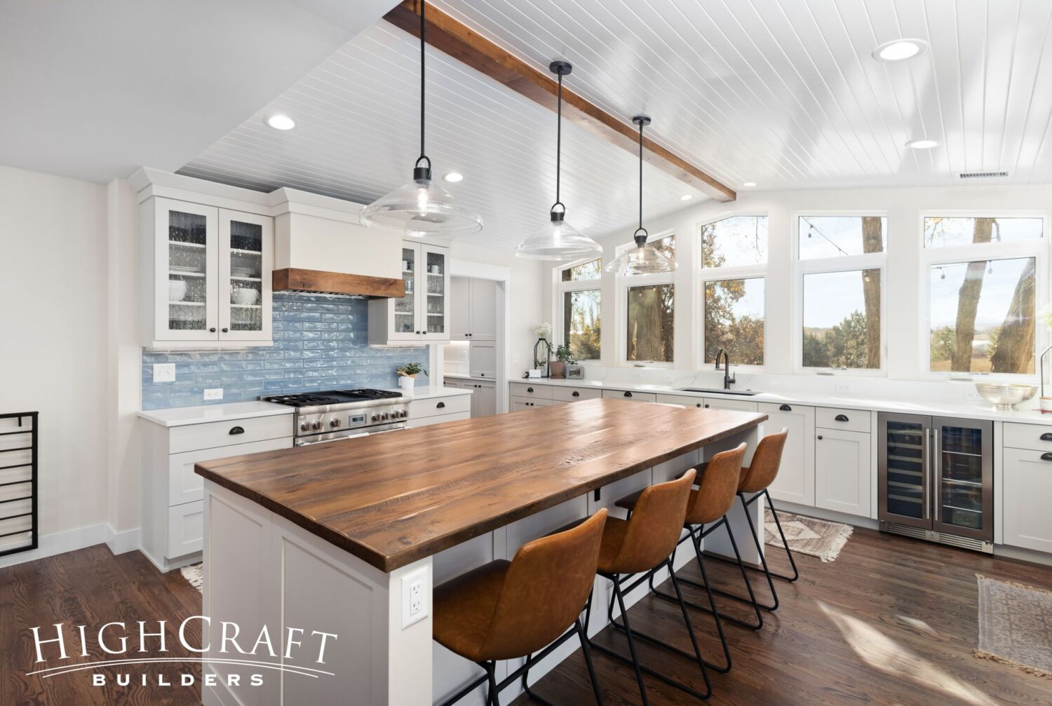
“I really like [Ally’s] twist on the well-known ‘modern farmhouse’ style by adding a little coastal flair with some of her material and finish selections,” says HighCraft design manager Jill Sanchez.
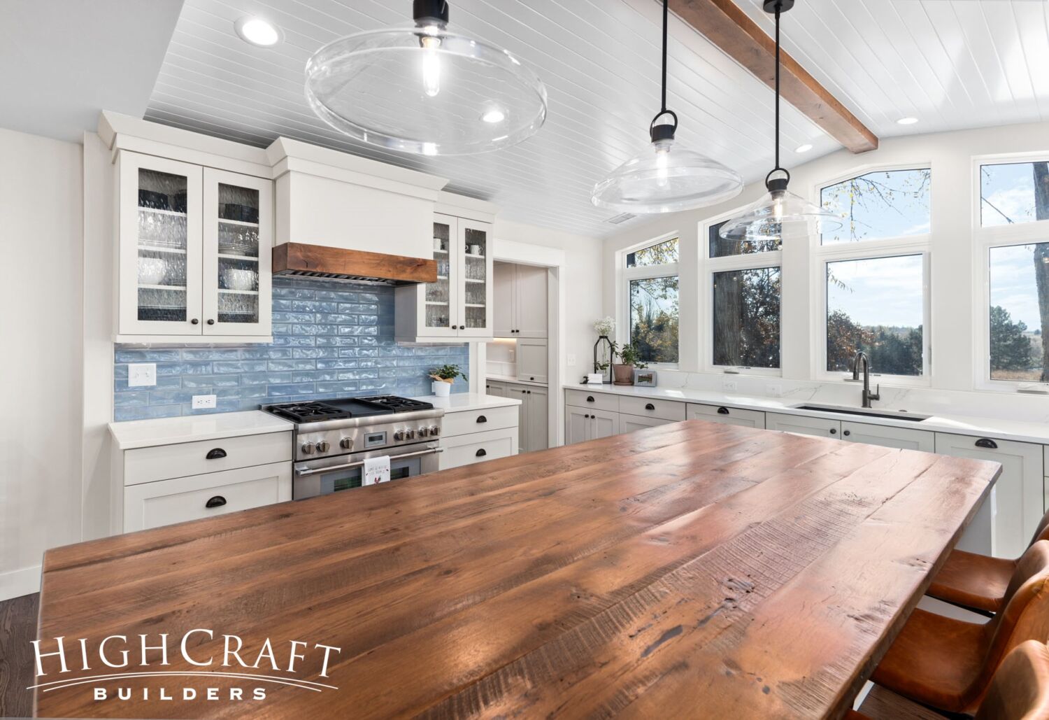
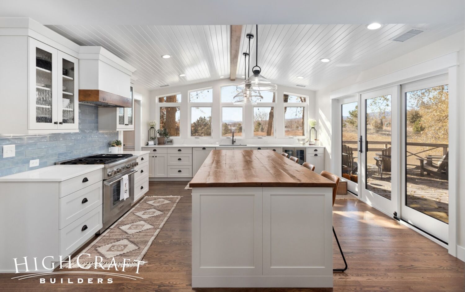
“The calming blue tile backsplash and off-white cabinets reflect coastal design,” she says. Jill thinks that Ally’s coastal-inspired choices pair well with the warm, rustic Colorado style of the distressed ceiling beam, island countertop …
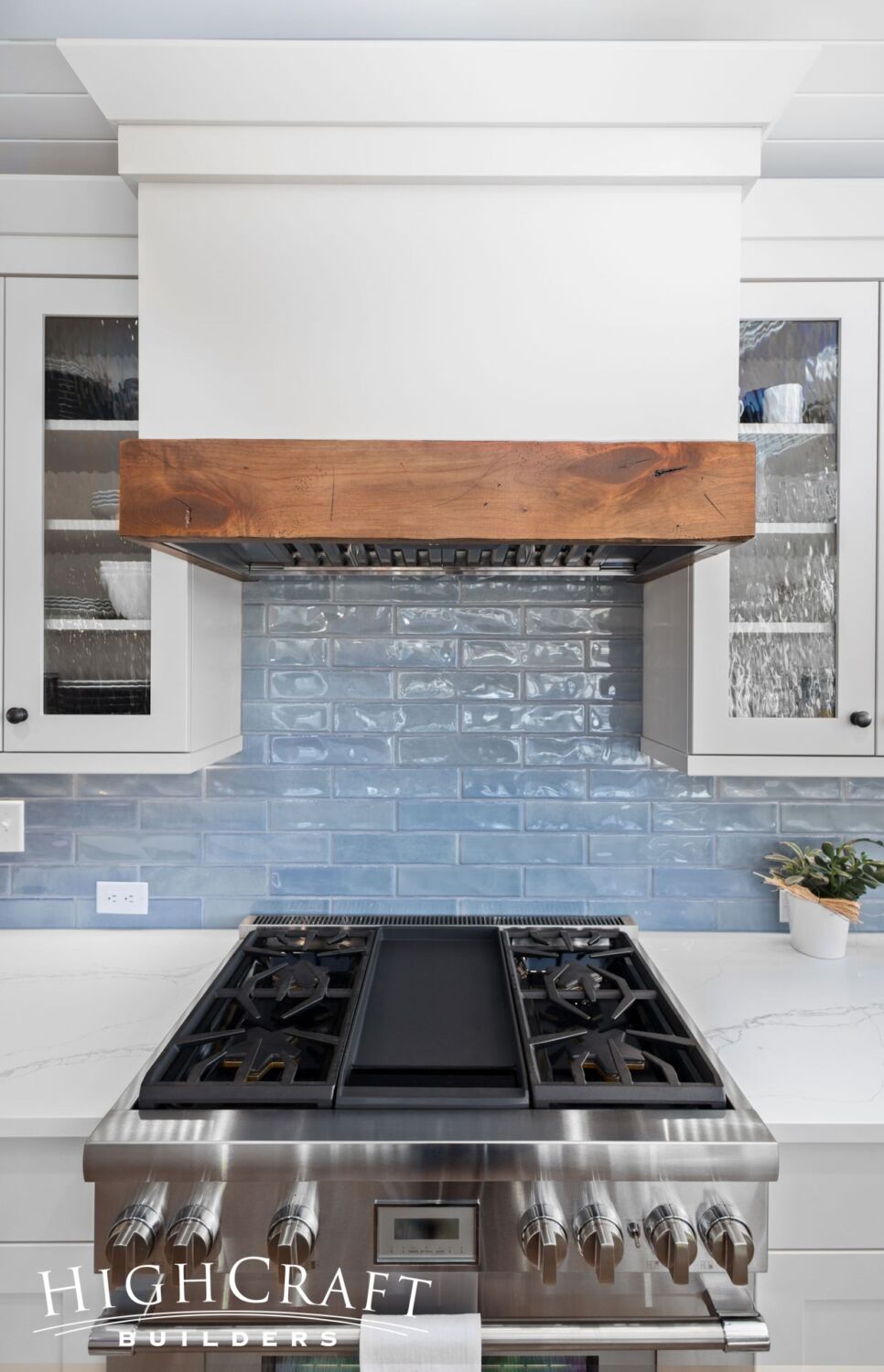
… and range hood trim in the kitchen.
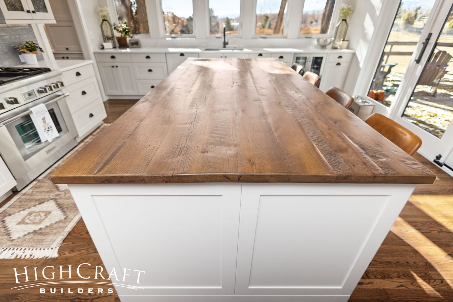
“The kitchen seems to be the place where everybody gravitates when we have folks over,” says Jeff, explaining why a big center island with a reclaimed wood countertop was a major must-have. “We knew from the start that was something we wanted,” Ally adds.
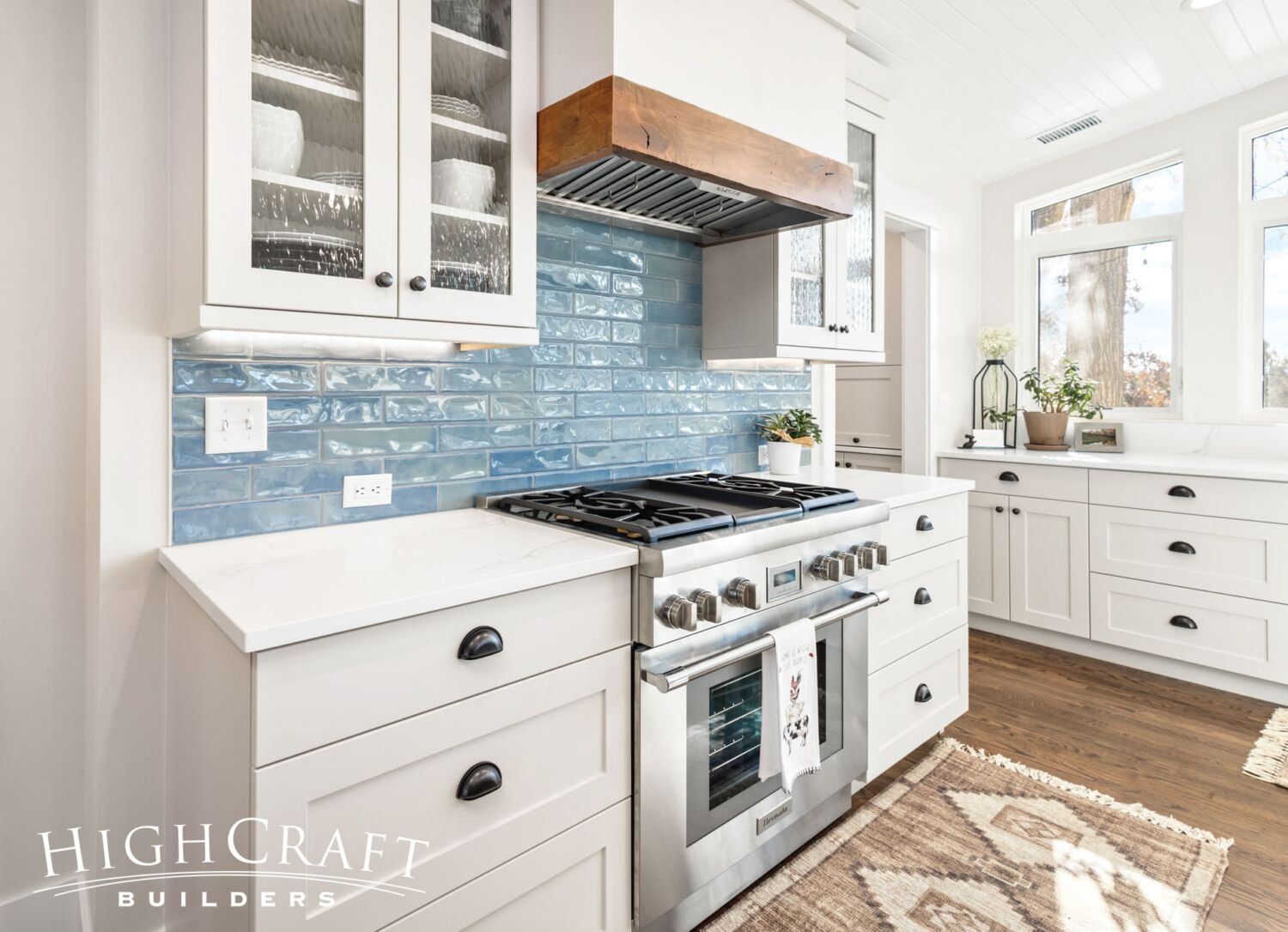
In addition to the Shaker-style cabinets, other farmhouse elements include bin pulls on drawers, refinished original hardwood floors, white board and batten exterior siding, and black accents such as lighting, railings and exterior window trim.
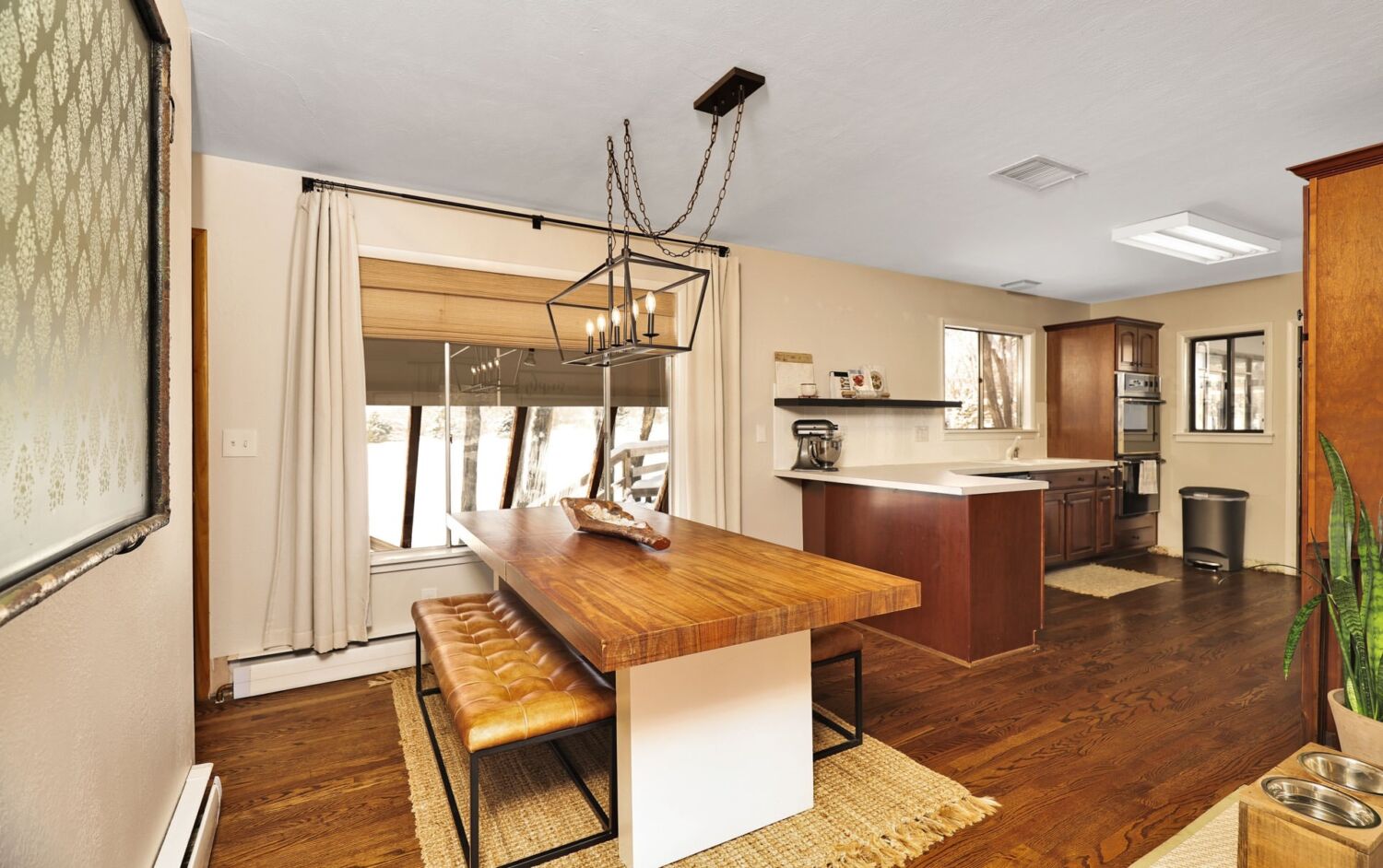
The kitchen transformation is like night and day.
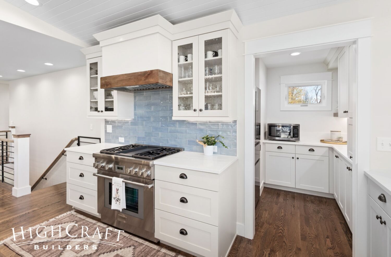
A walk-in butler’s pantry is conveniently tucked around the corner from the range.
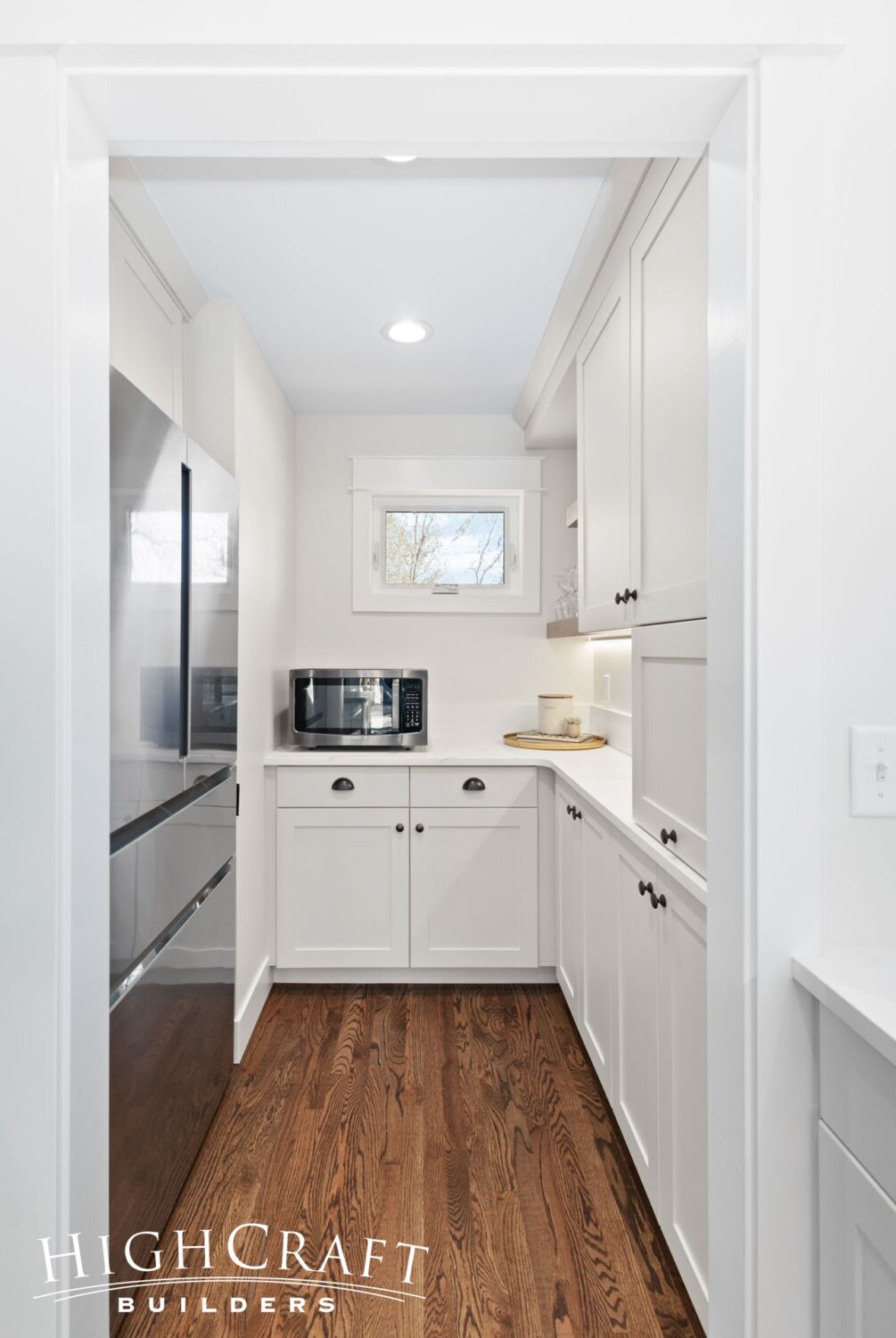
To keep the kitchen clutter-free and open, the refrigerator and microwave were intentionally located in the side pantry.
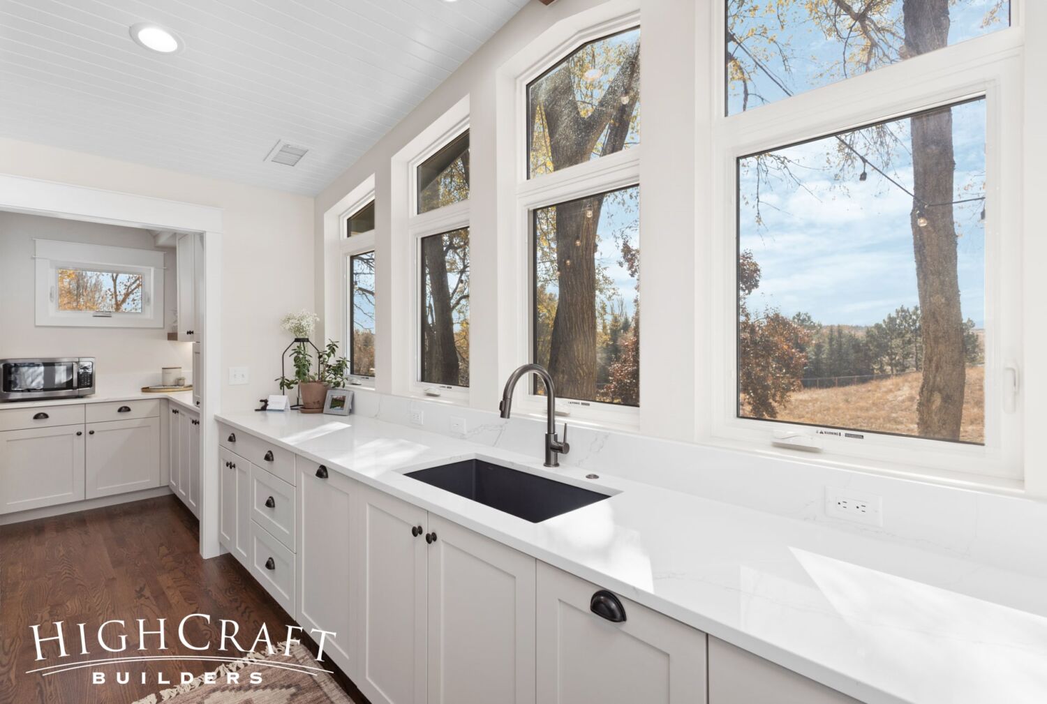
A wall of custom windows floods the kitchen, and most of the main floor, with natural light.
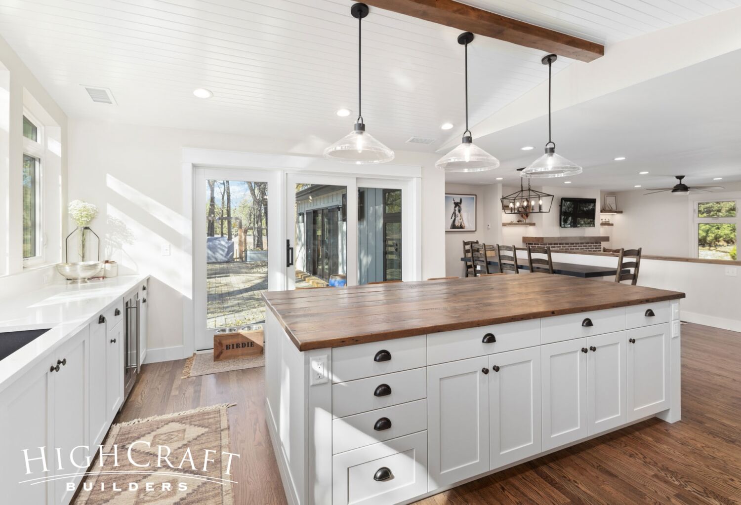
A new sliding glass door opens to Jeff and Ally’s existing deck. “We spend a lot of time on the back deck with that view of Longs Peak, and just enjoying that with family and friends,” says Jeff. “This new kitchen and open floorplan will incorporate the deck a lot more.”
Dining Room
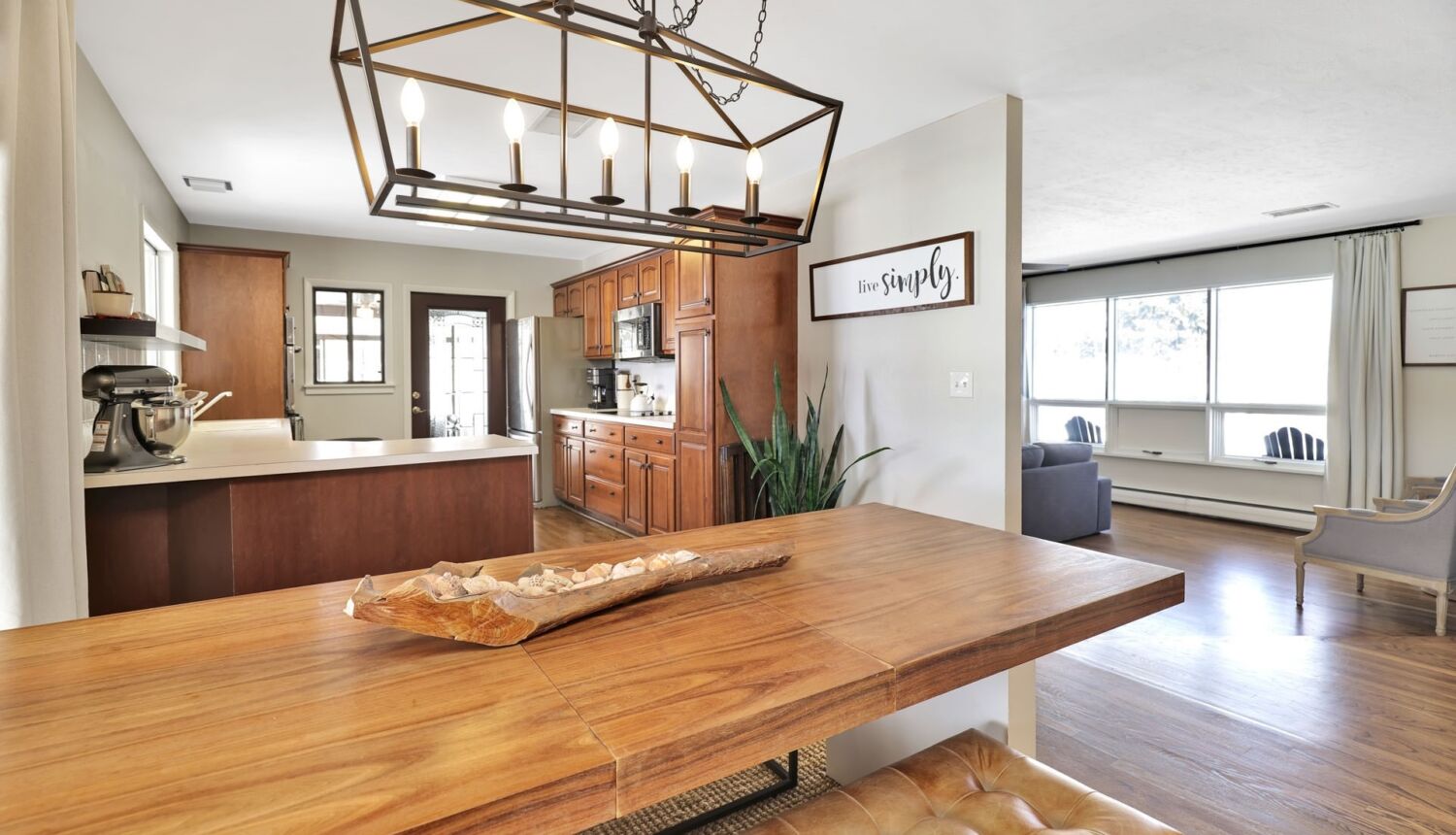
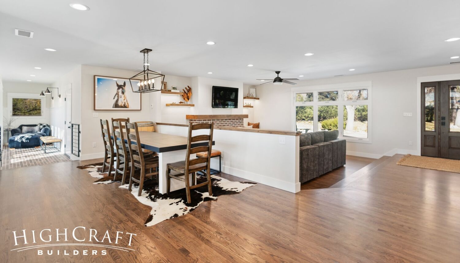
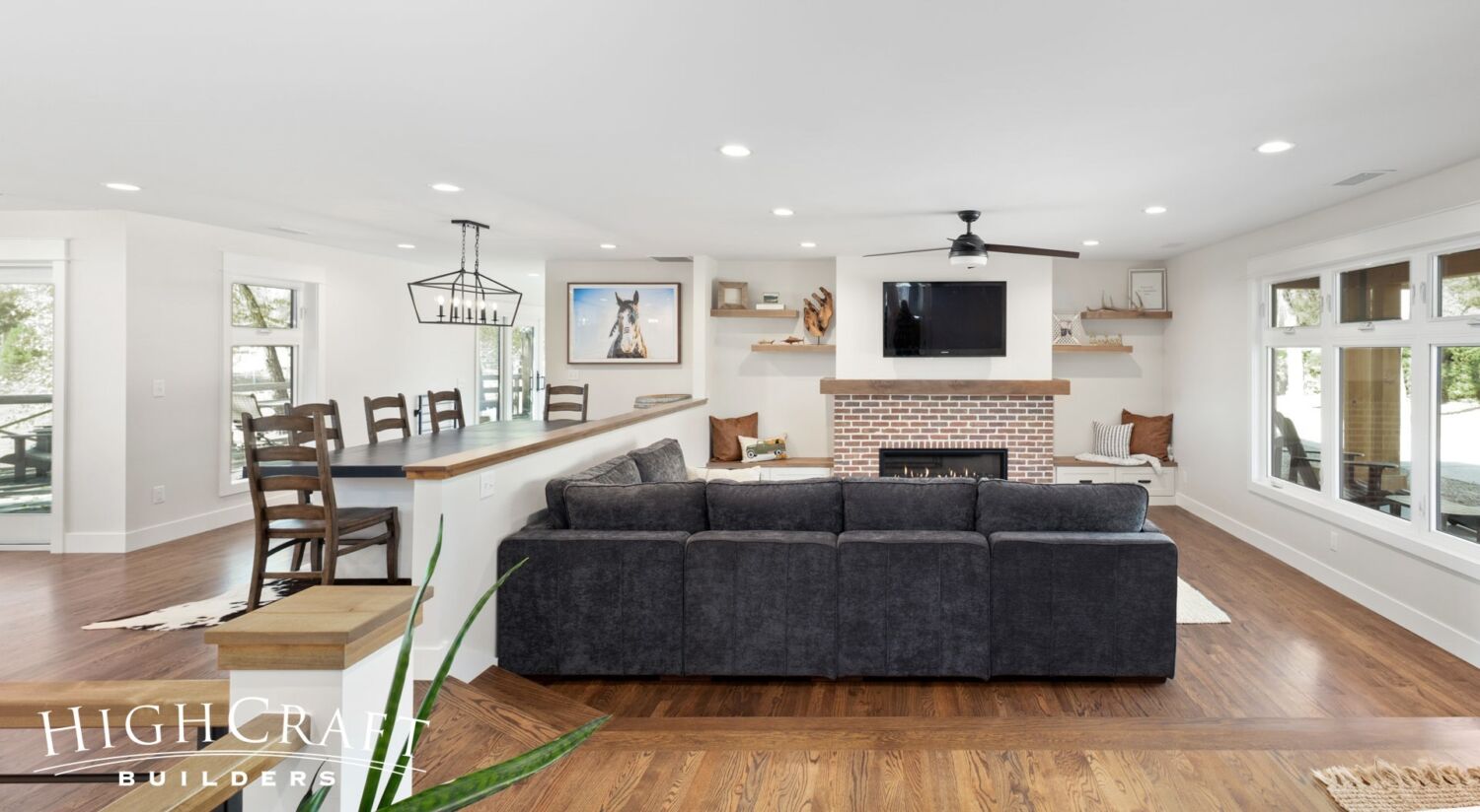
To accommodate the kitchen’s new layout, the former dining room (above, left) was moved next to the living room (above, right).
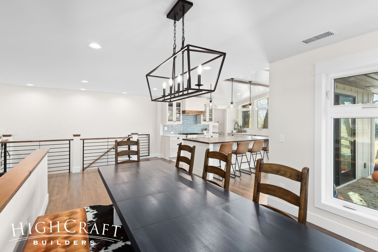
Because of the open floorplan, the relocated dining table remains highly accessible to the kitchen.
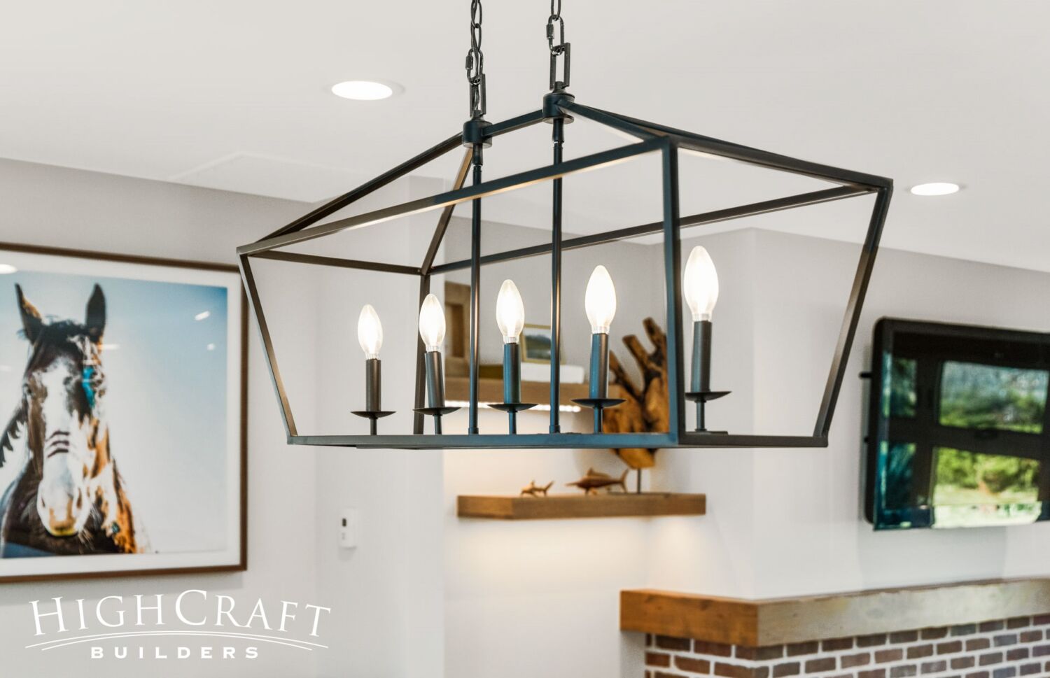
During our 25 years in business as a remodeling company, our team has always been a huge proponent of reusing beautiful lighting, doors, hardware, and other materials that have plenty of good years left in them. We were delighted to reinstall Jeff and Ally’s existing modern farmhouse-style light fixture over the dining room table.
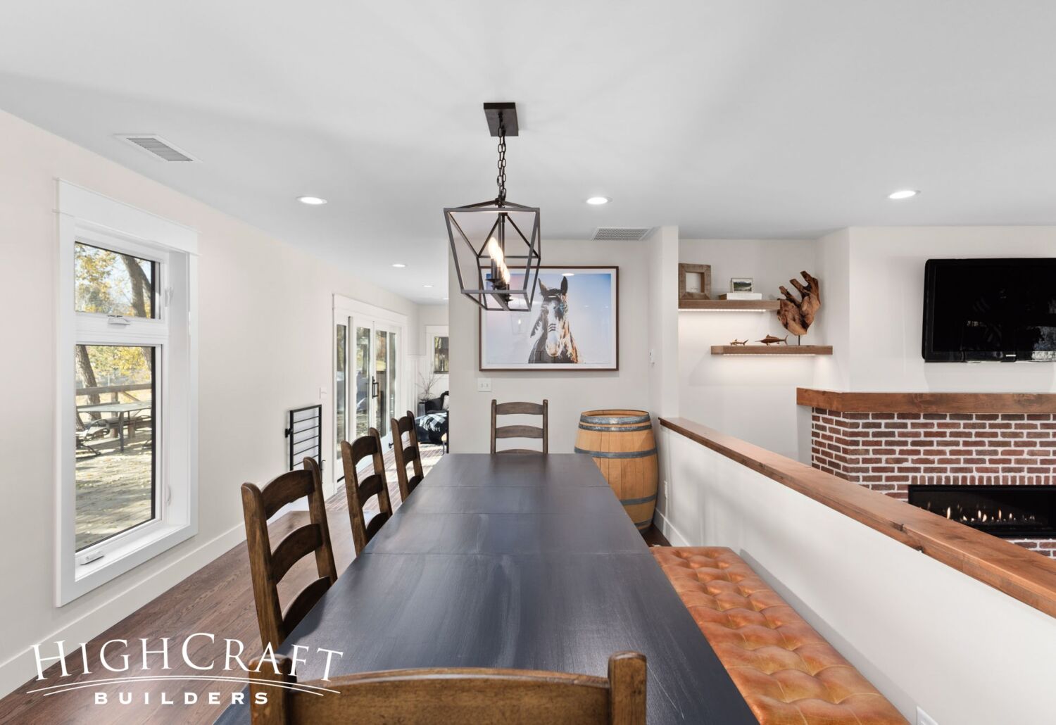
A half wall separates the dining room from the living room and provides a backrest for the bench seating.
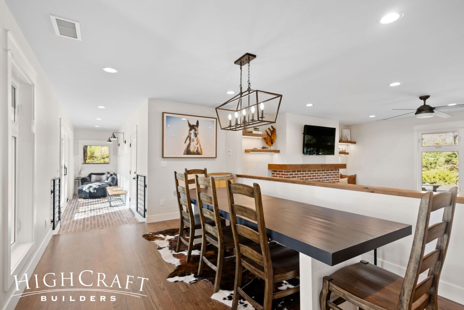
Just beyond the dining room is the mudroom hall.
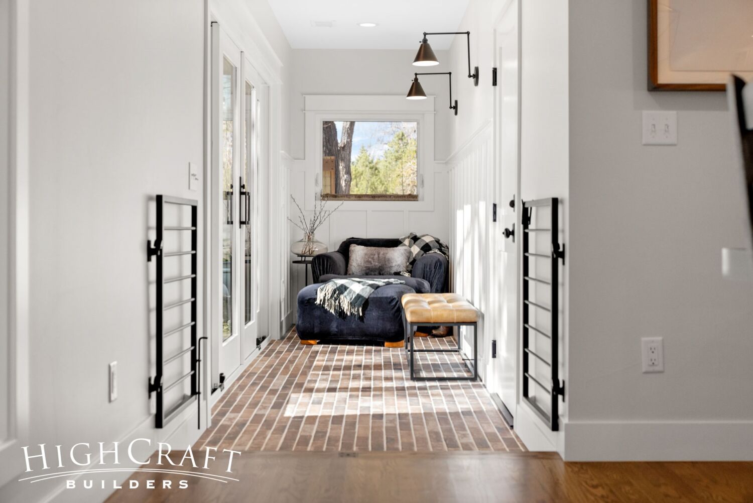
Mudroom Hall
In the mudroom hall, Jeff and Ally chose a porcelain tile made to look like reclaimed bricks, but it’s far more affordable and easier to maintain.
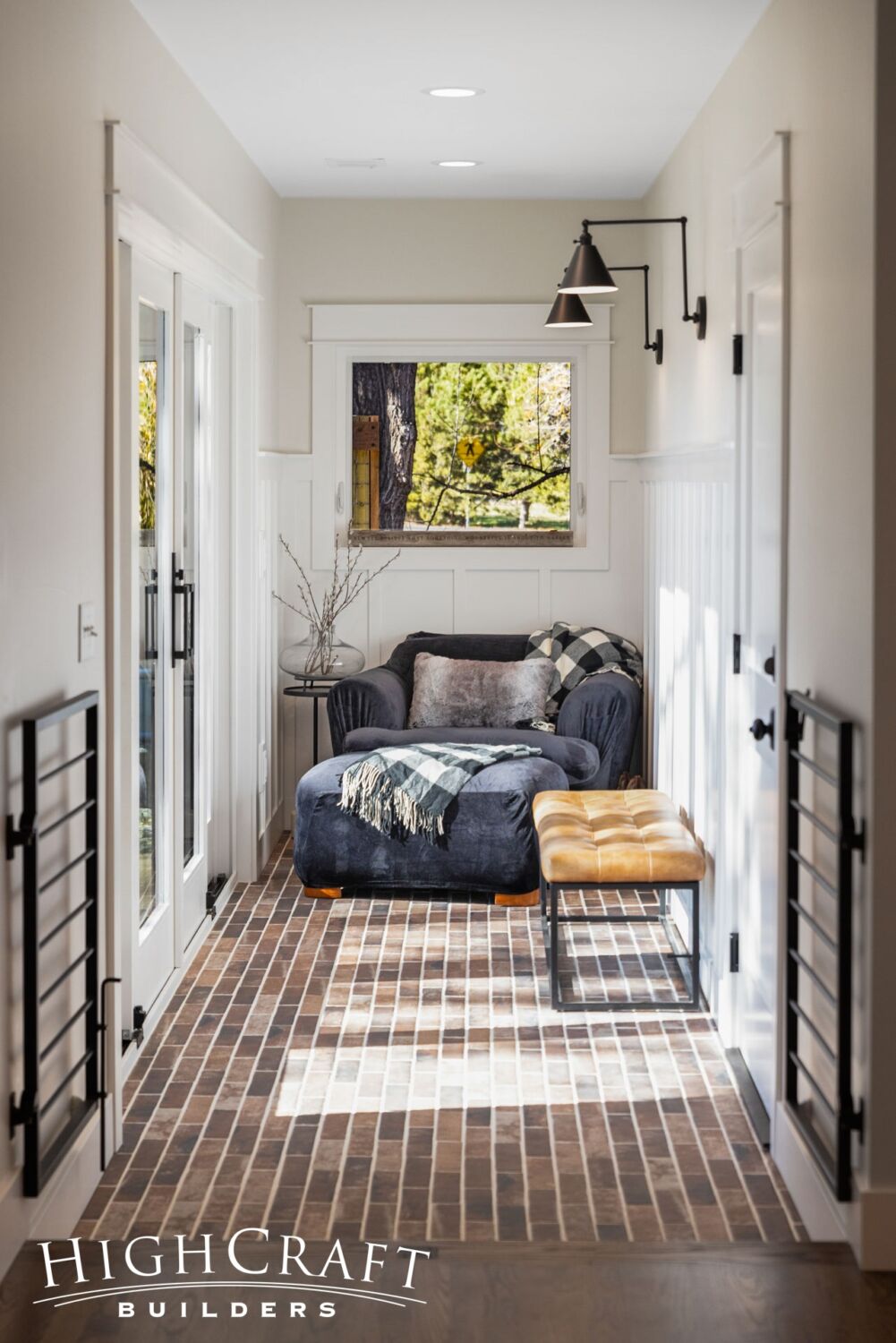
A comfy chair and custom metal gate create a safe, sunny space for Birdie the dog to hang out while Jeff and Ally are at work.
Read about other design considerations made for Birdie in Part 6 of the series.
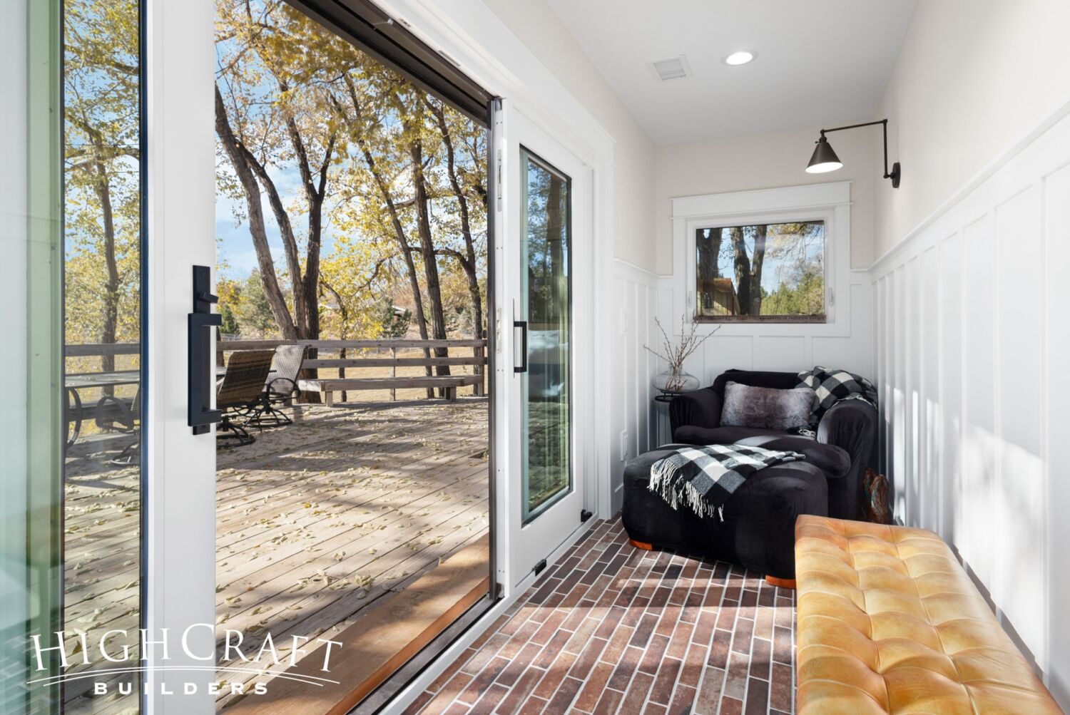
New sliding glass doors …
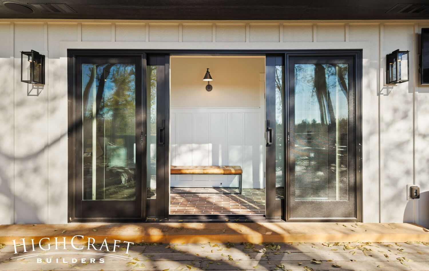
… make it easy for Jeff, Ally, Birdie and their guests to access the deck from the mudroom.
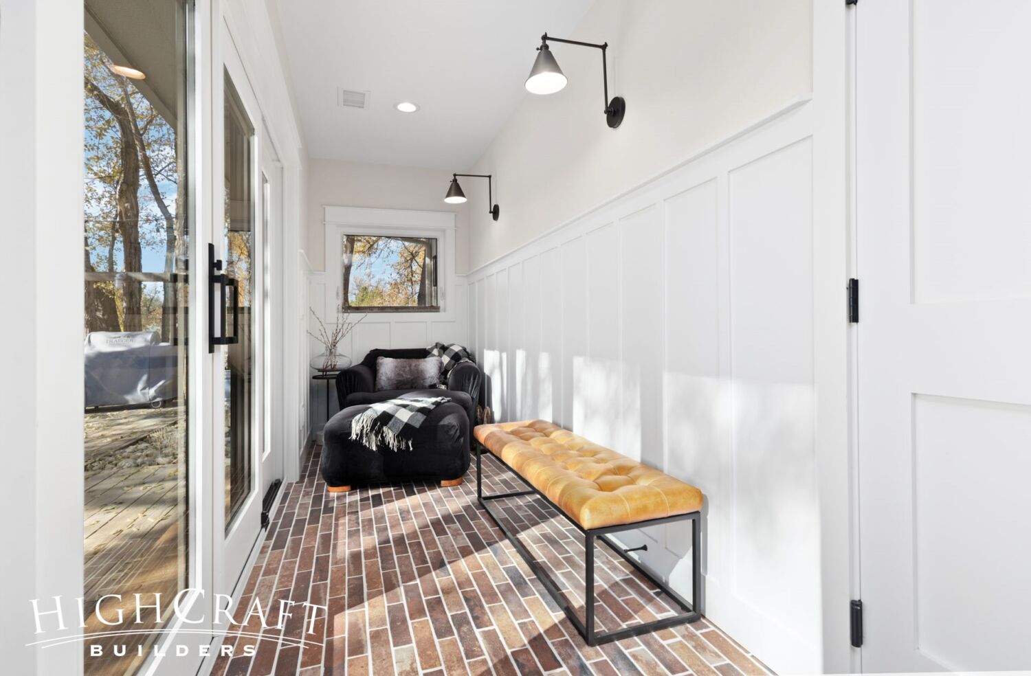
Whether entering the mudroom from the garage or back deck, the bench is a great place to kick off shoes before walking into the main living space.
Living Room
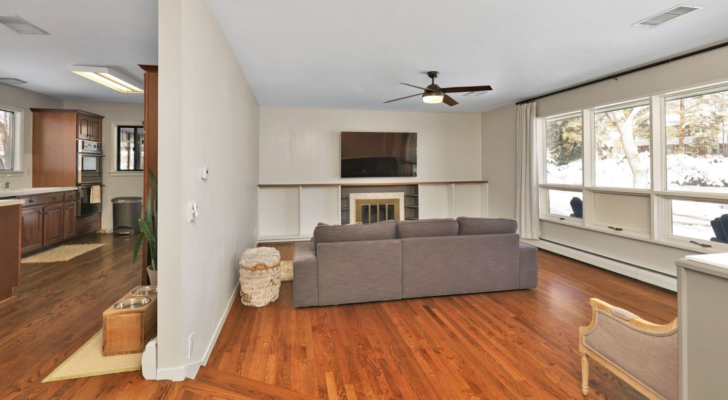
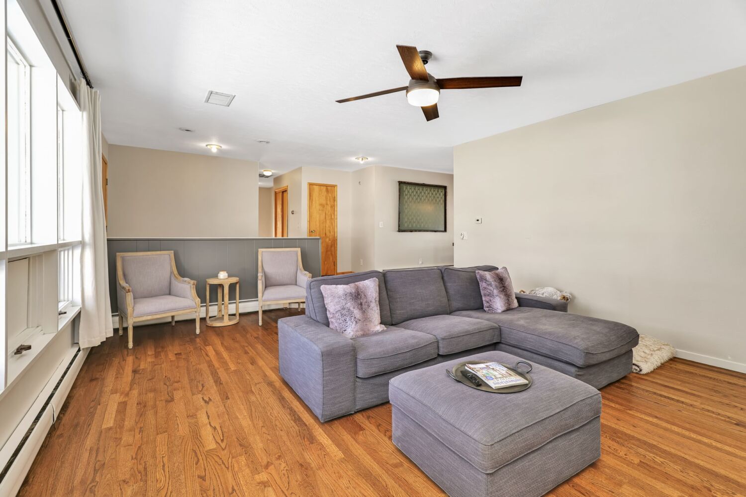
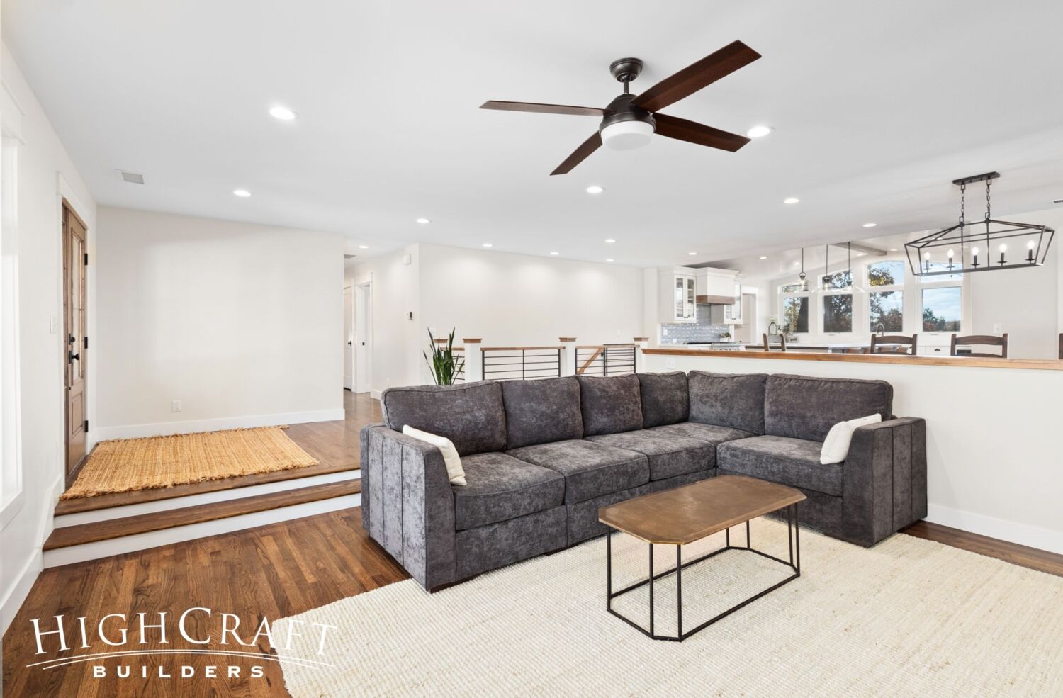
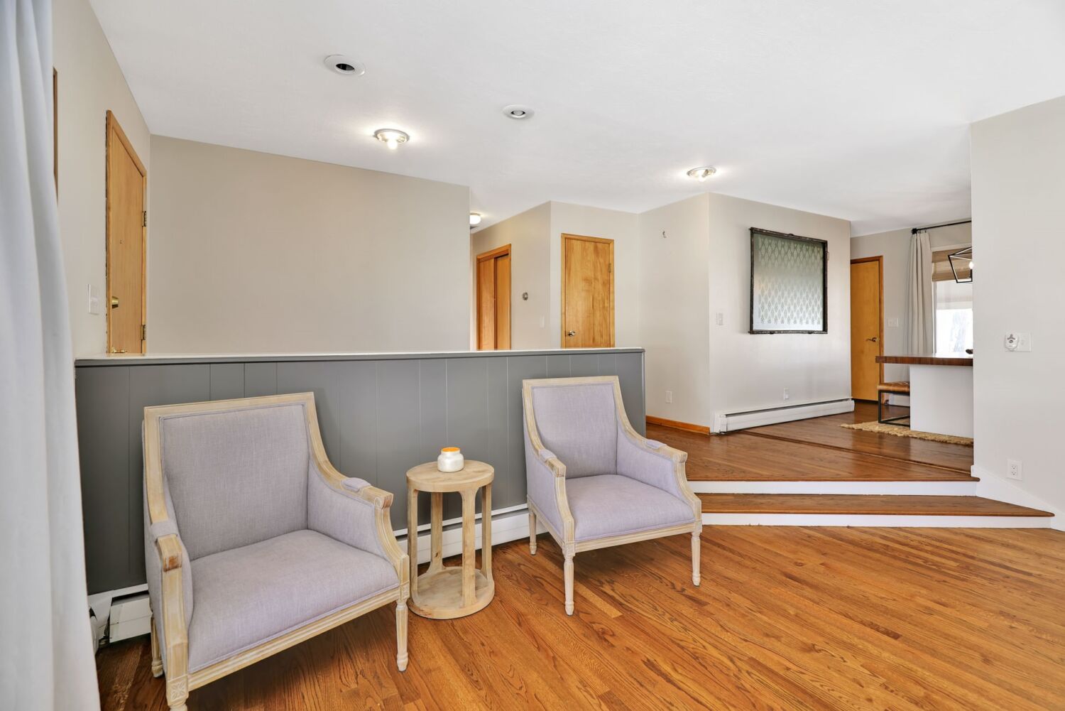
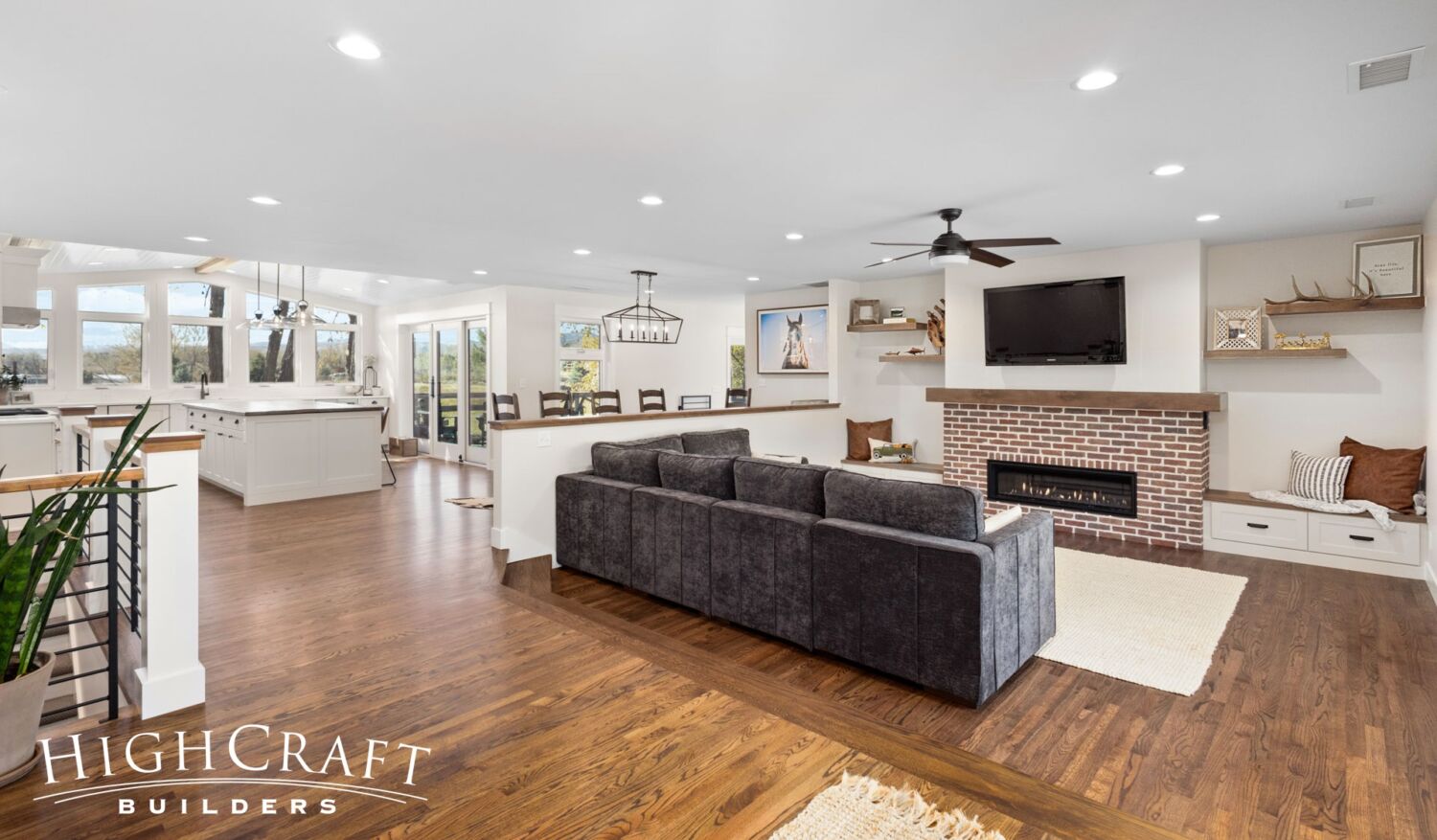
Although we made several structural and cosmetic updates, we preserved the footprint of Jeff and Ally’s unique 1960s sunken living room.
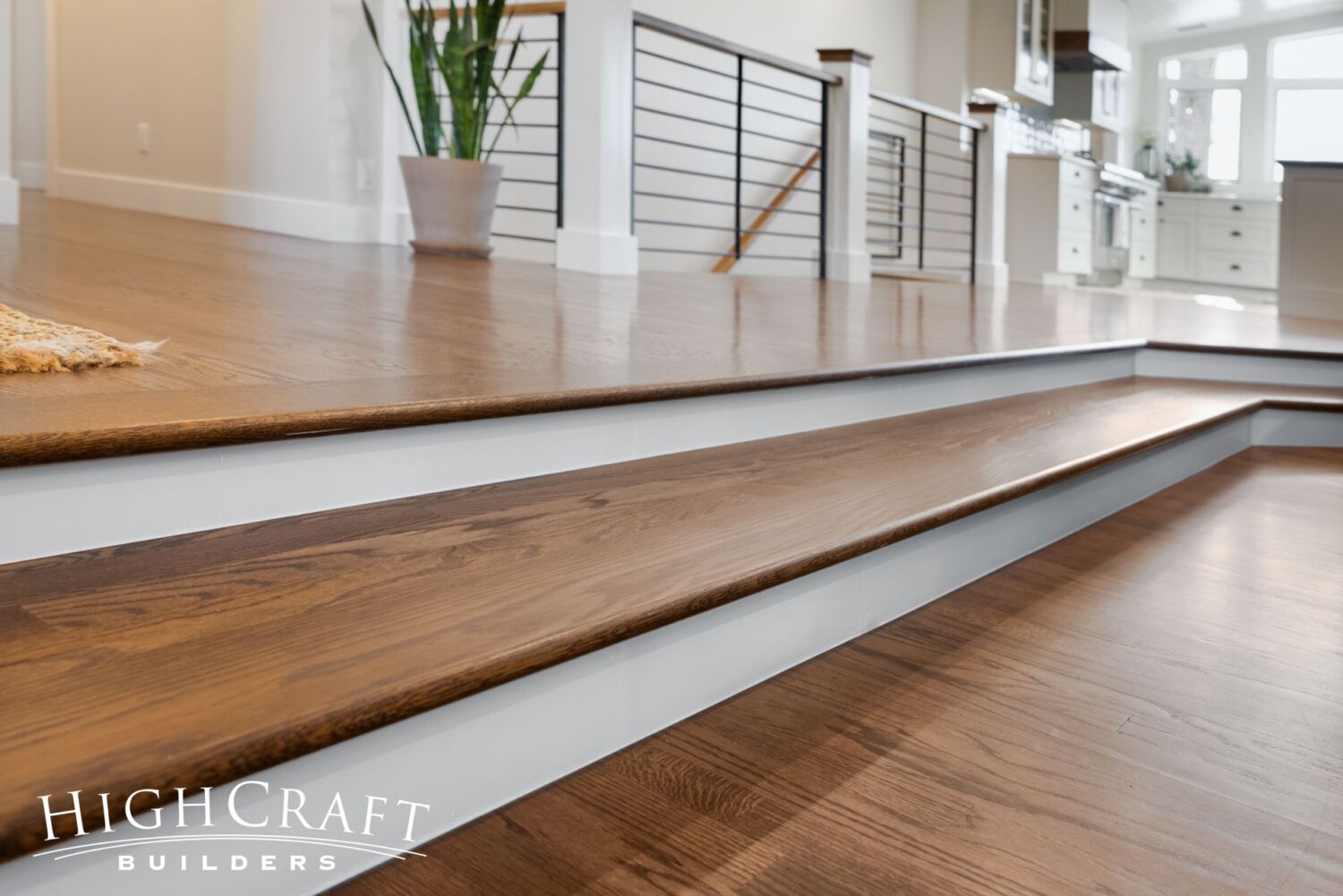
Original red oak hardwoods were refinished, including stair treads in the living room.
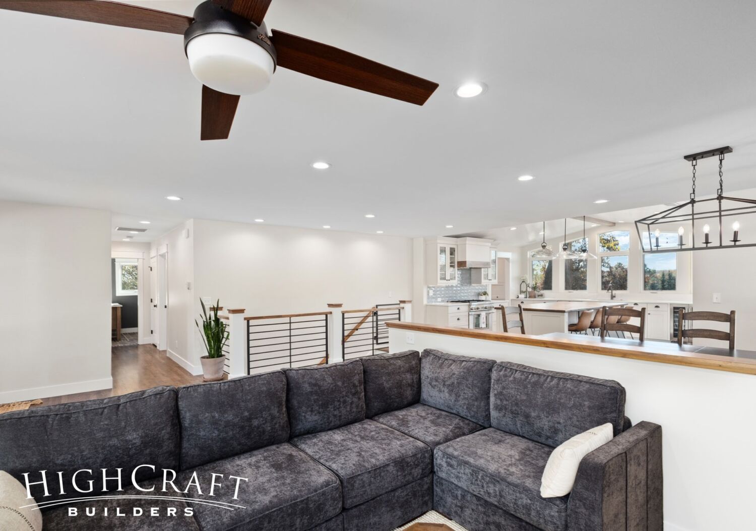
Our crew removed the original wall between the living room and kitchen (above, left). The new half wall (above, right) clearly defines the living room space, yet ensures the open floorplan Jeff and Ally were after.
We also removed the original half wall (above, left) by the front door for improved openness and flow (above, right).
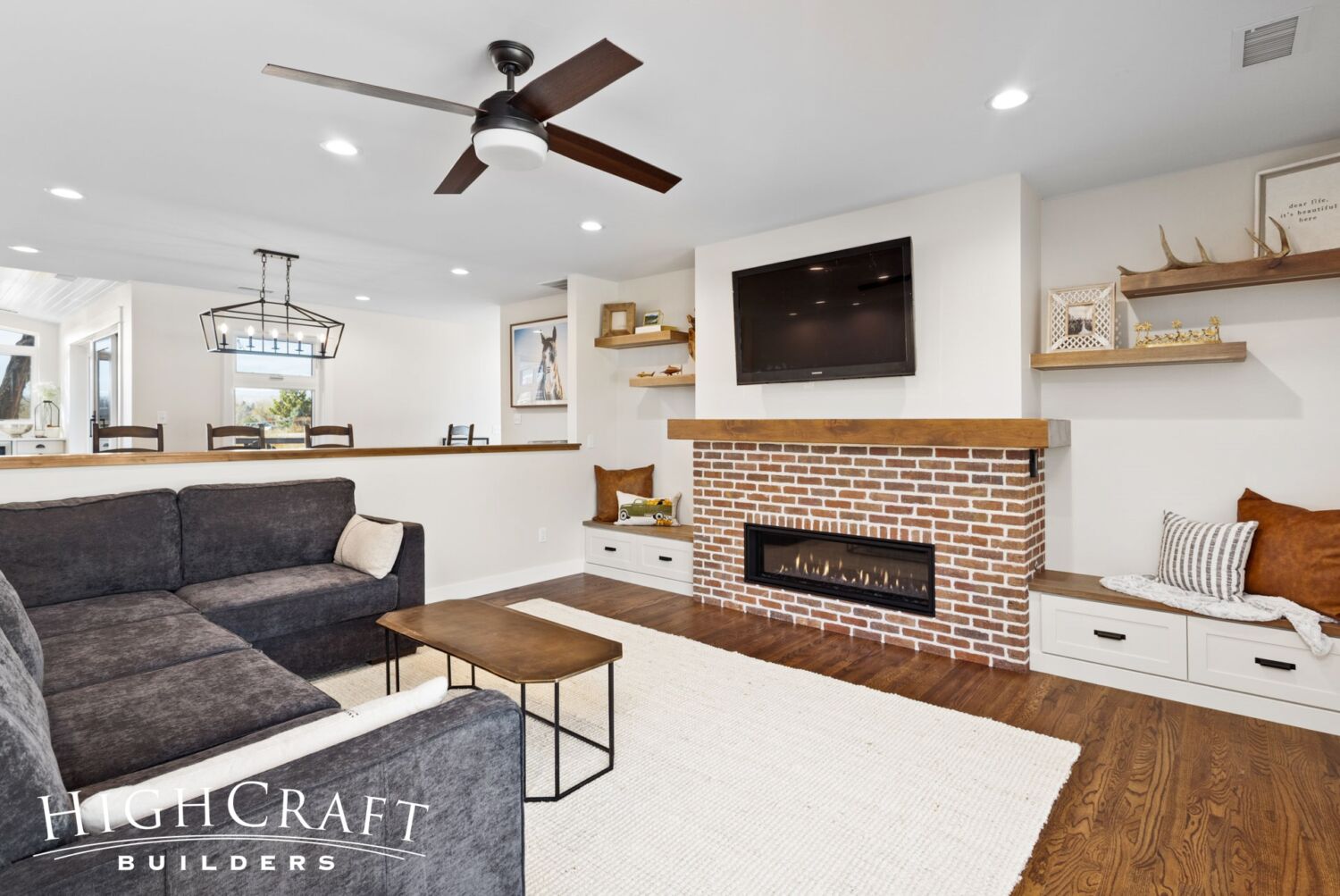
“Brick is a classic building staple that just oozes farmhouse style,” Jill says, pointing to the new natural gas fireplace surround.
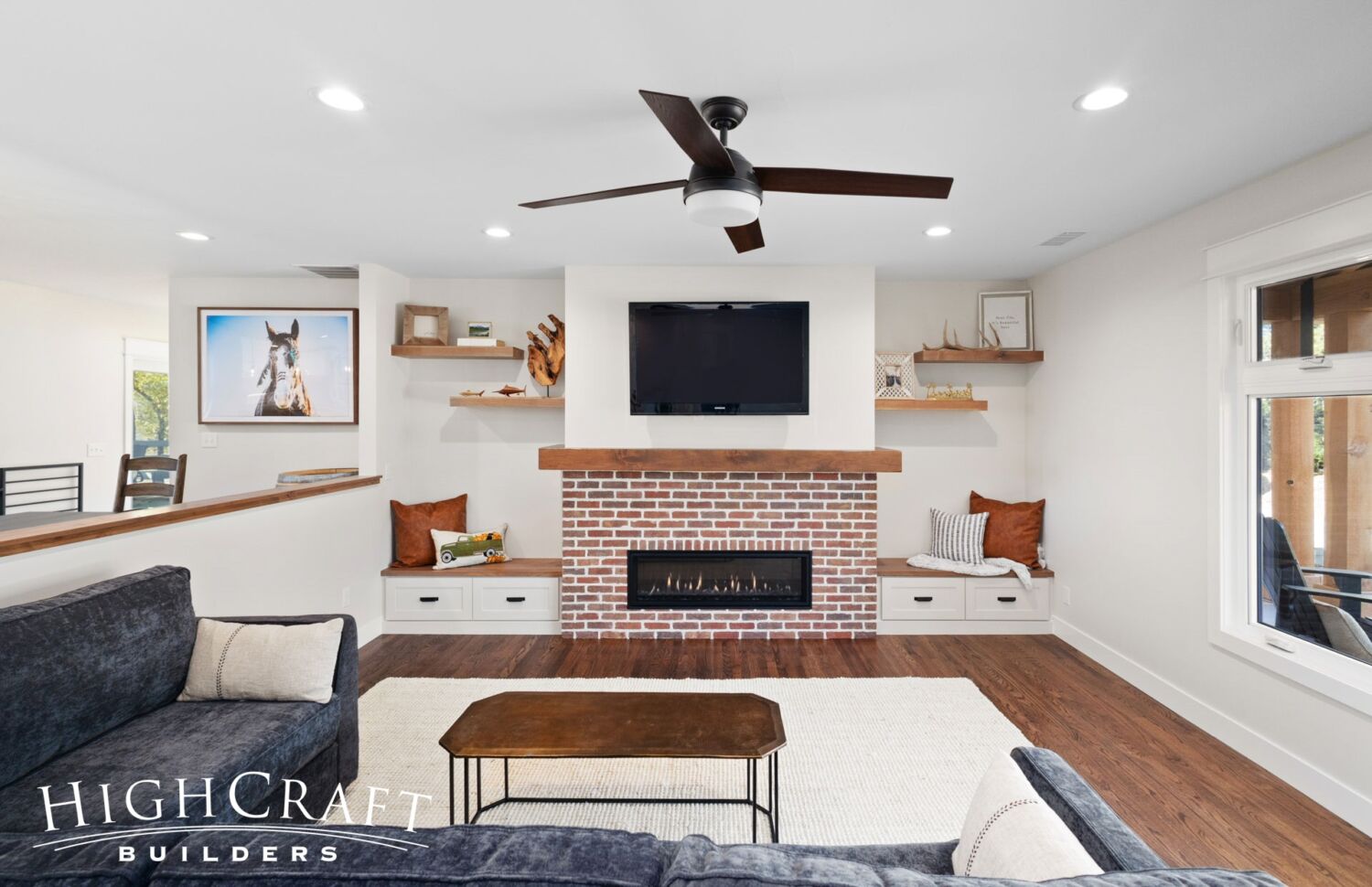
“I think most people are tearing out traditional brick fireplaces, but we put one in,” Ally says, “and I’m excited about it.”
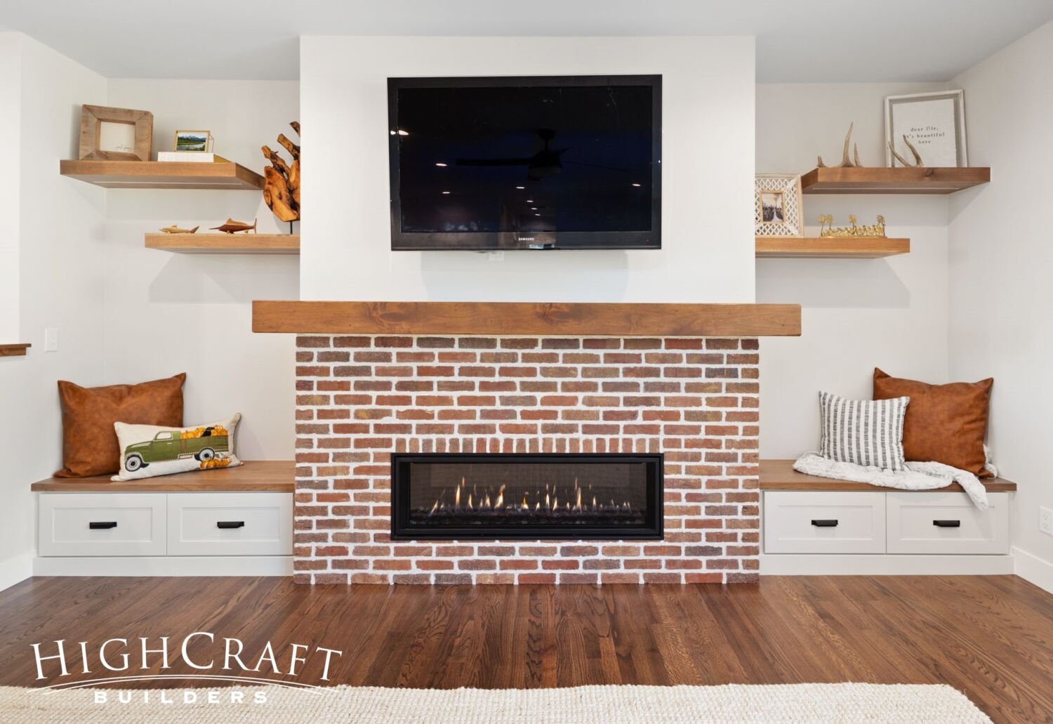
The fireplace wall is an eye-catching focal point with its box mantel, floating shelves …
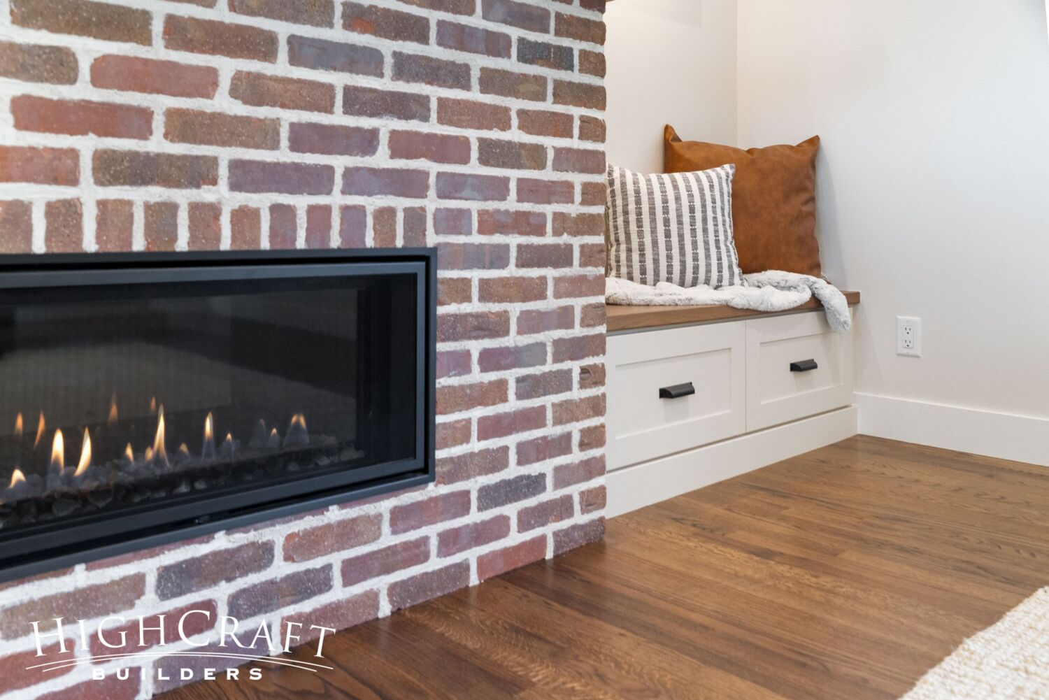
… and built-in bench seating with drawers for storage.
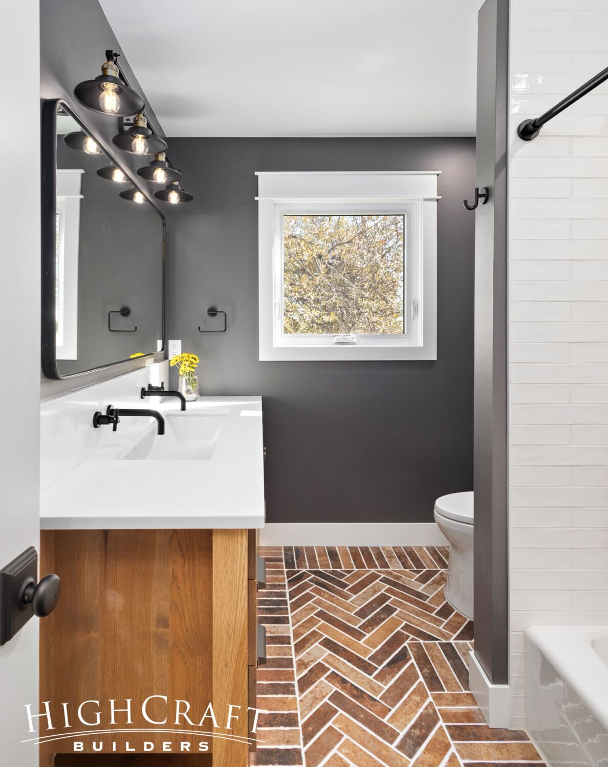
Hall Bathroom
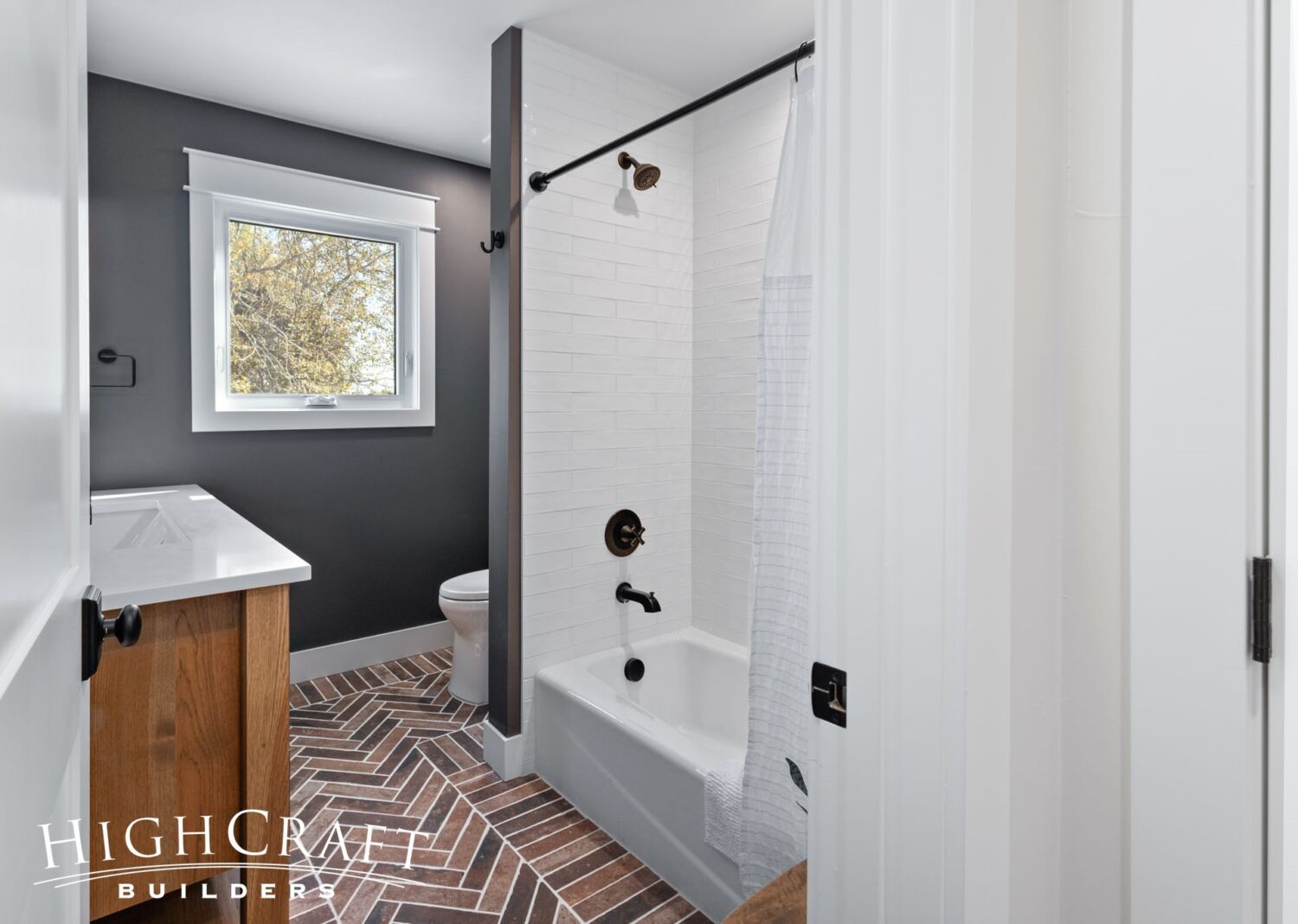
Jill admits that the brick-looking floor tile used in both the mudroom and hall bathroom is a new personal favorite.
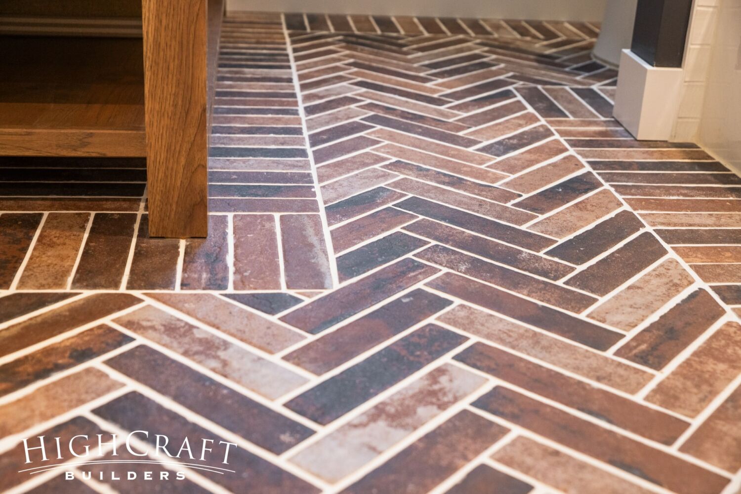
“Porcelain tiles are more practical for cleaning, and less prone to chipping, than real clay bricks – and they look great,” she says.
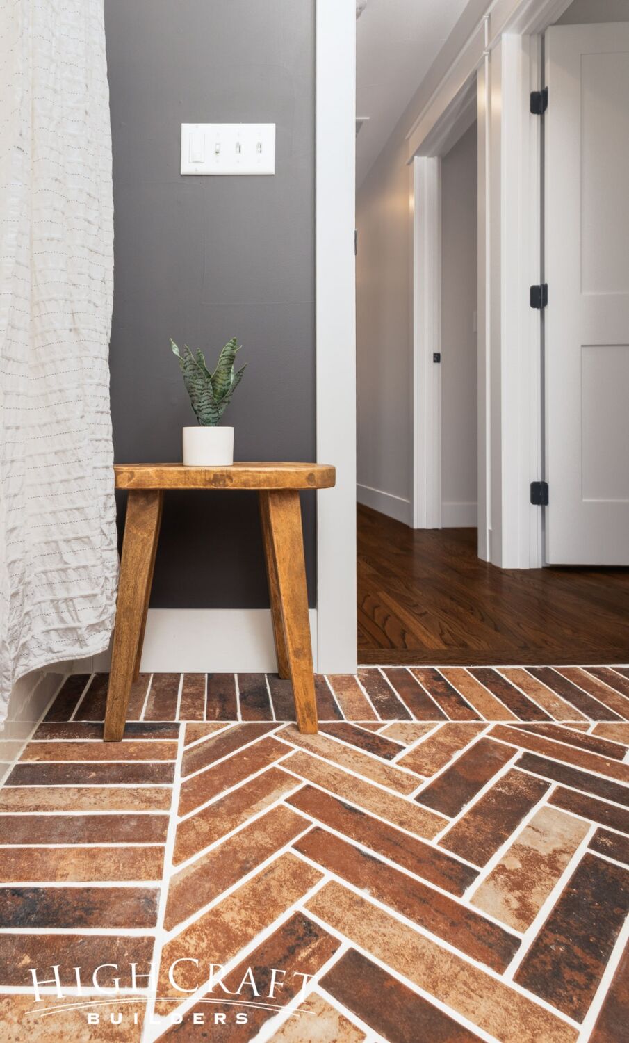
A straight tile border causes the central herringbone pattern to really pop.
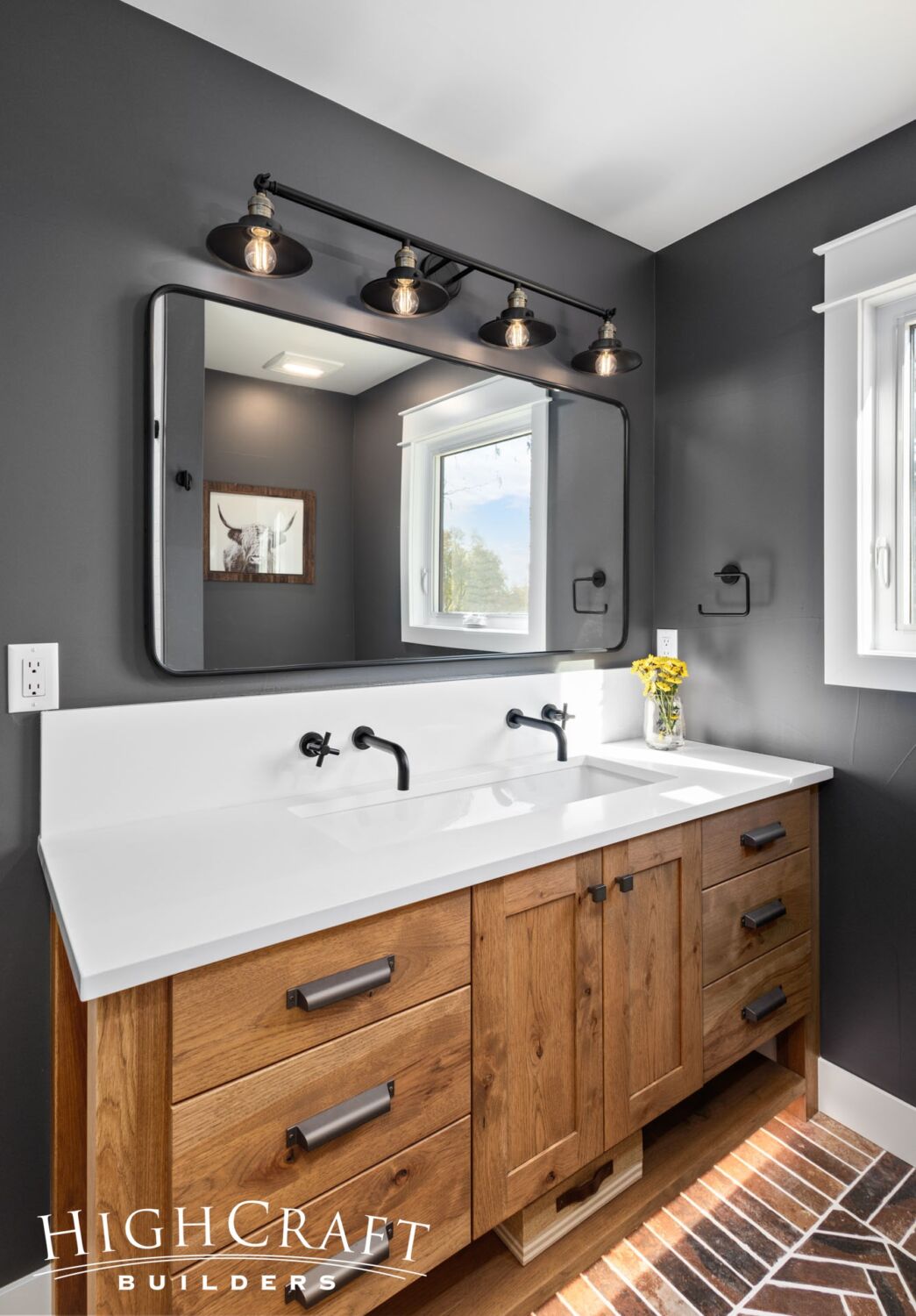
The rustic hickory vanity is stained a warm Spanish pecan.
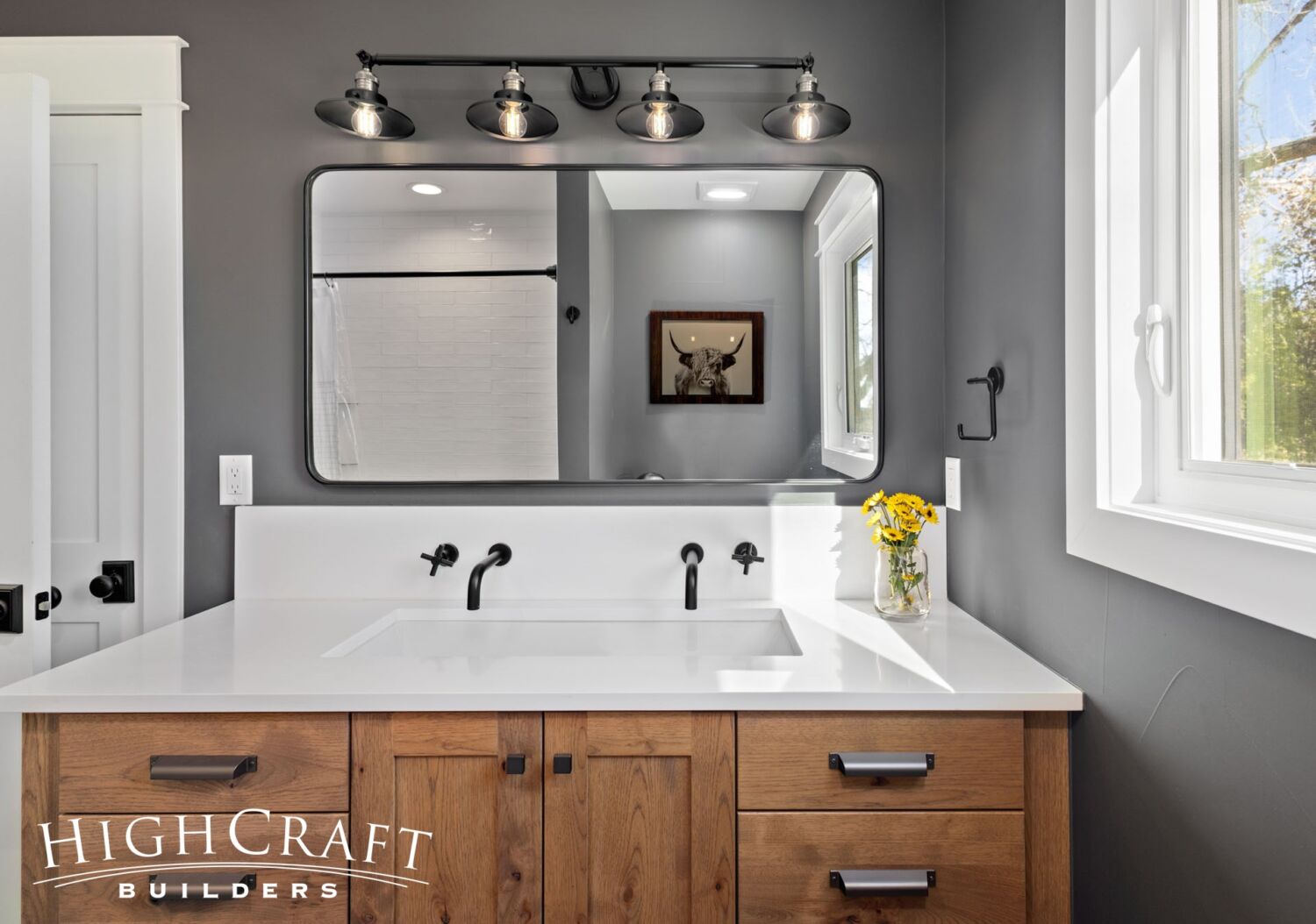
And the quartz countertop has an undermount sink with wall mounted faucets.
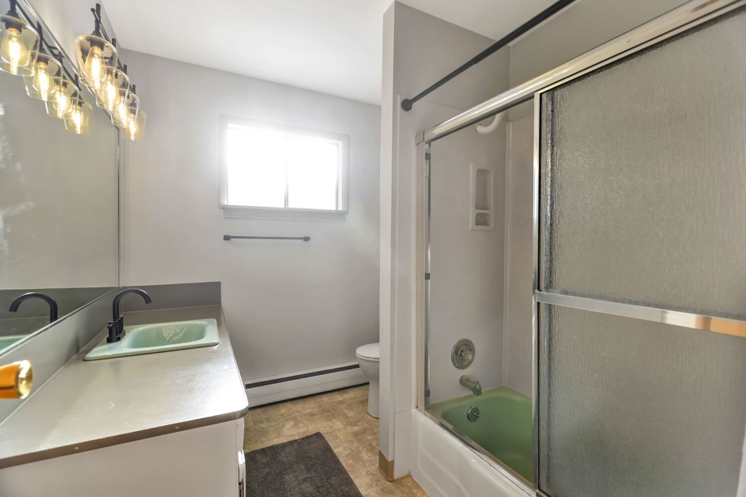
Although the layout of the hall bathroom didn’t change, the new finishes and other updates make the hall bathroom a real knockout.
Master Suite
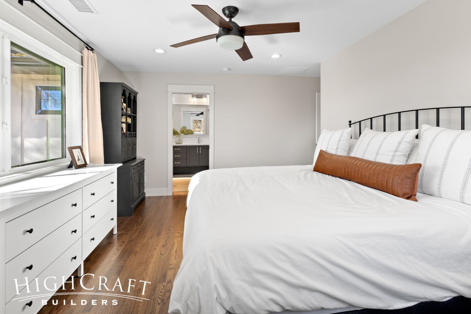
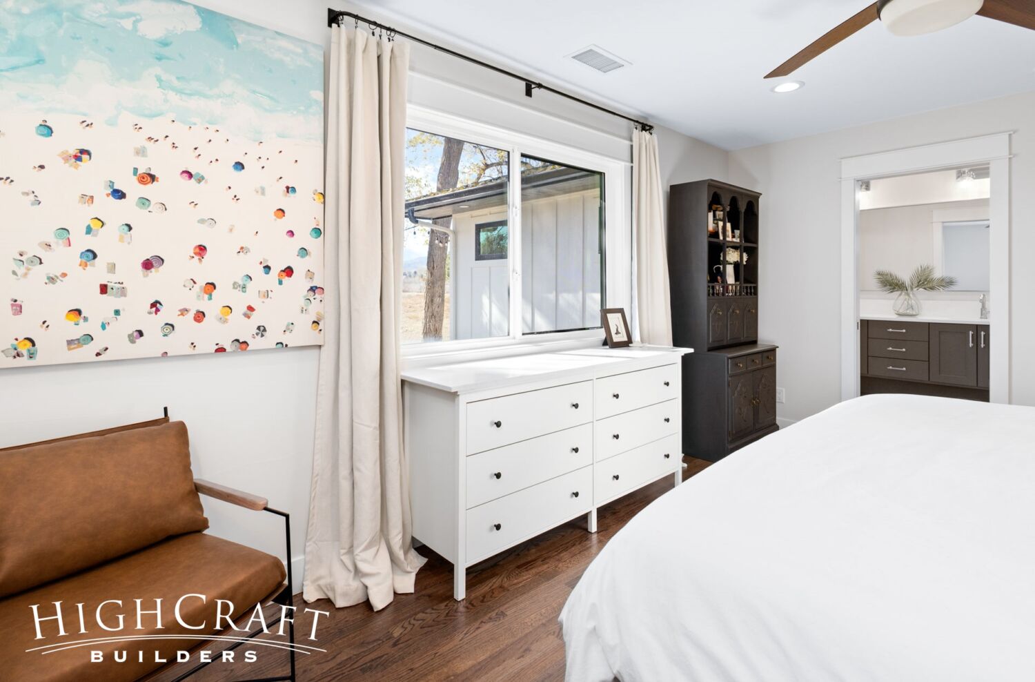
A big goal for the master suite was improved functionality, especially in the bathroom and closet.
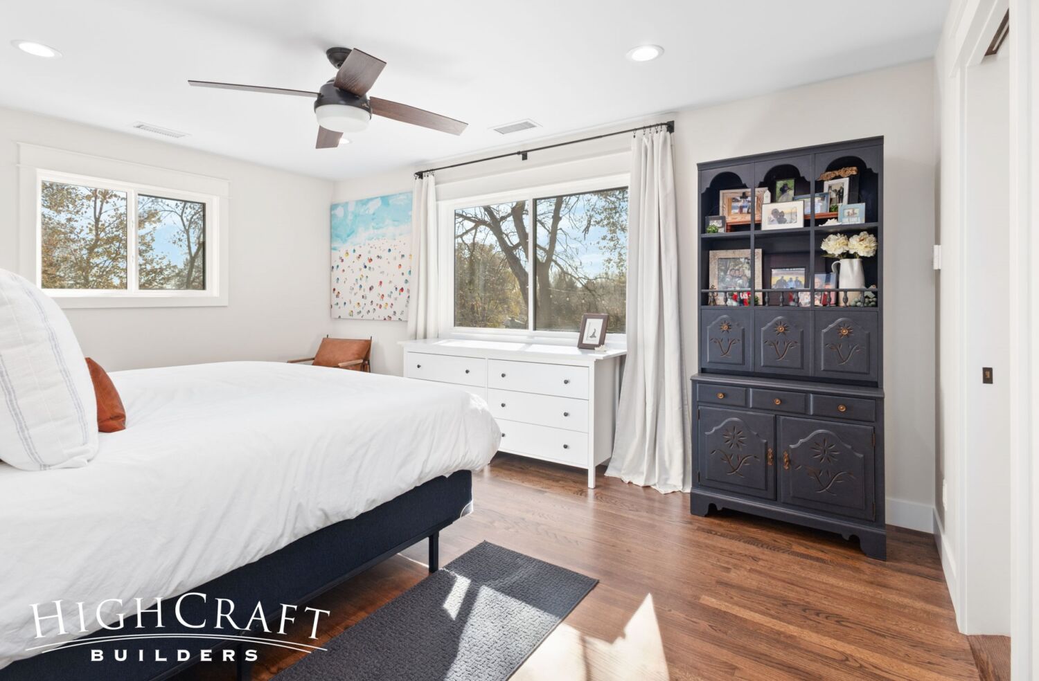
Jeff and Ally also added more insulation and replaced windows throughout the home – master suite included – for improved energy efficiency.
Jeff appreciates the new master bathroom.
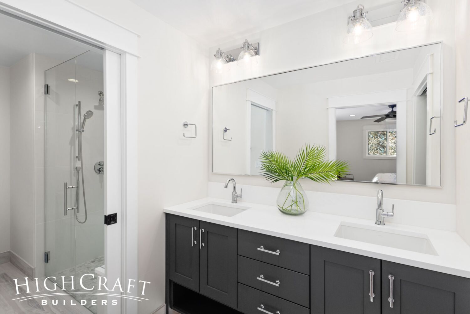
He does not miss the single, shared sink in their original bathroom, and says, “I really wanted two sinks.”
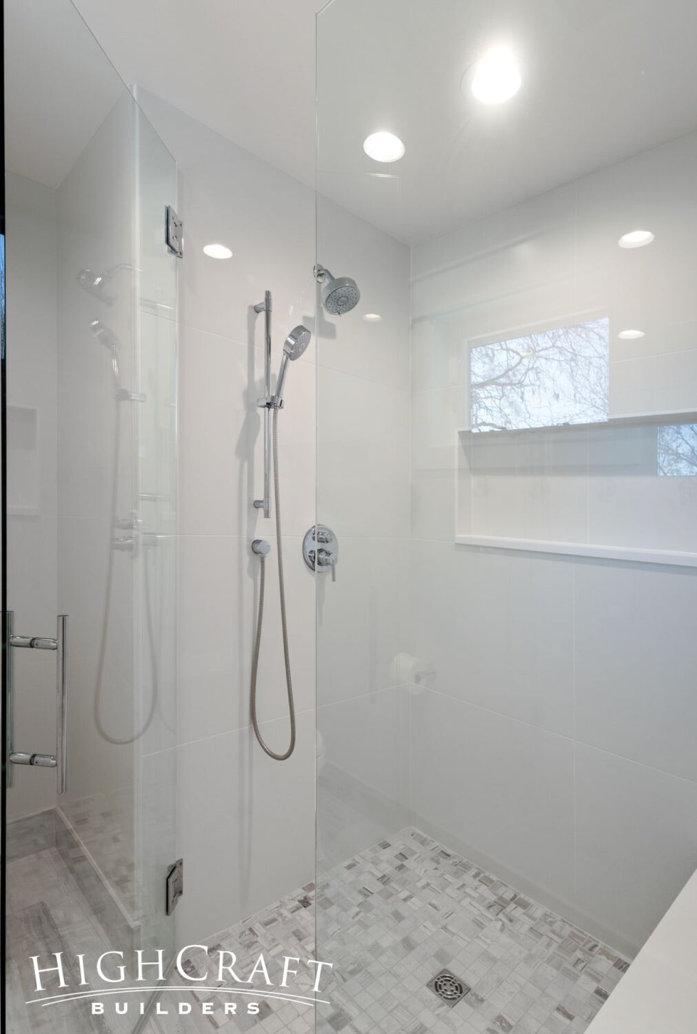
Jeff and Ally both love the frameless glass shower with bench seat and shampoo niche.
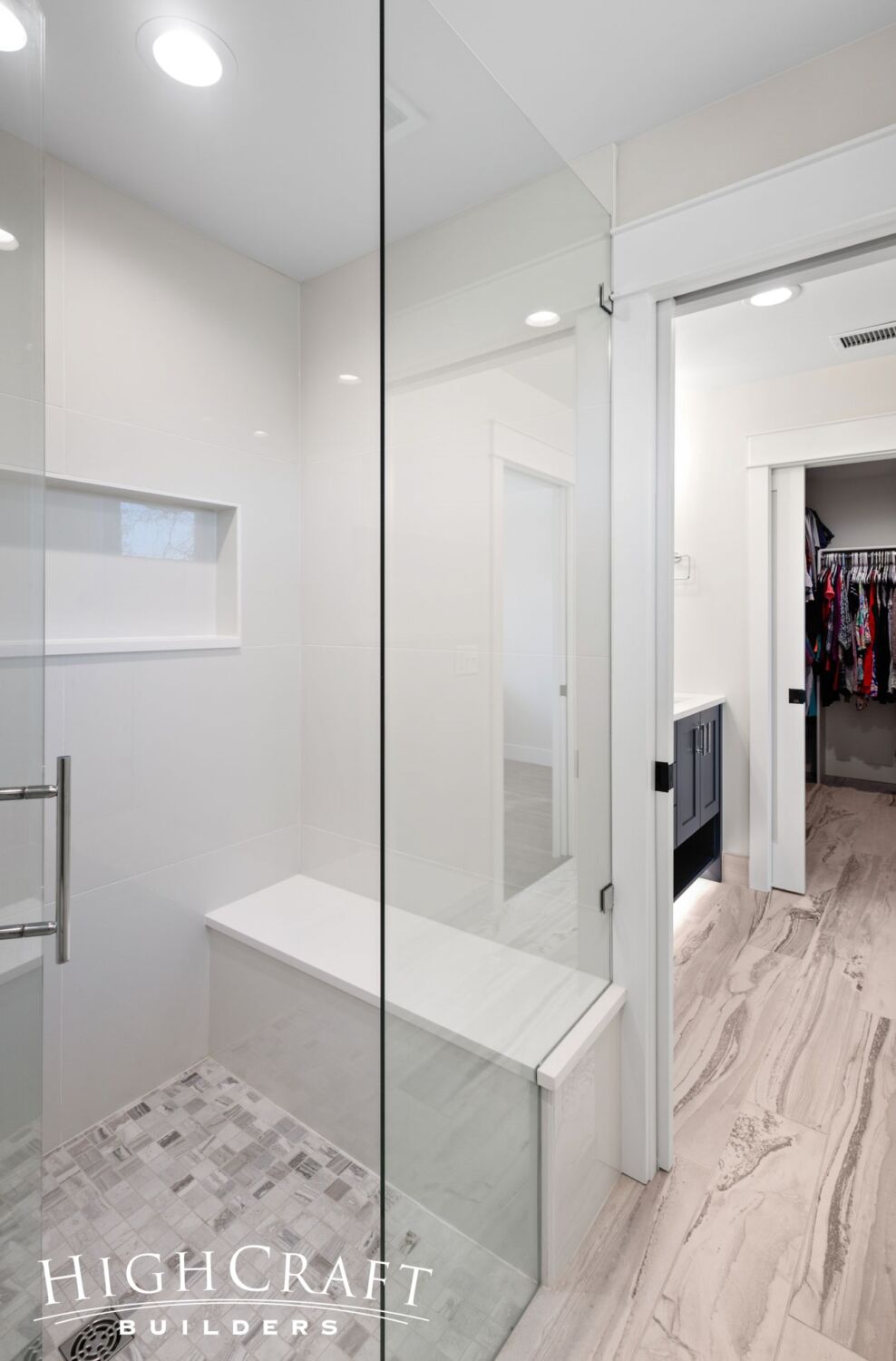
The modest addition to the back of the home created enough space for the larger shower, private commode, two-sink vanity and walk-in master closet.
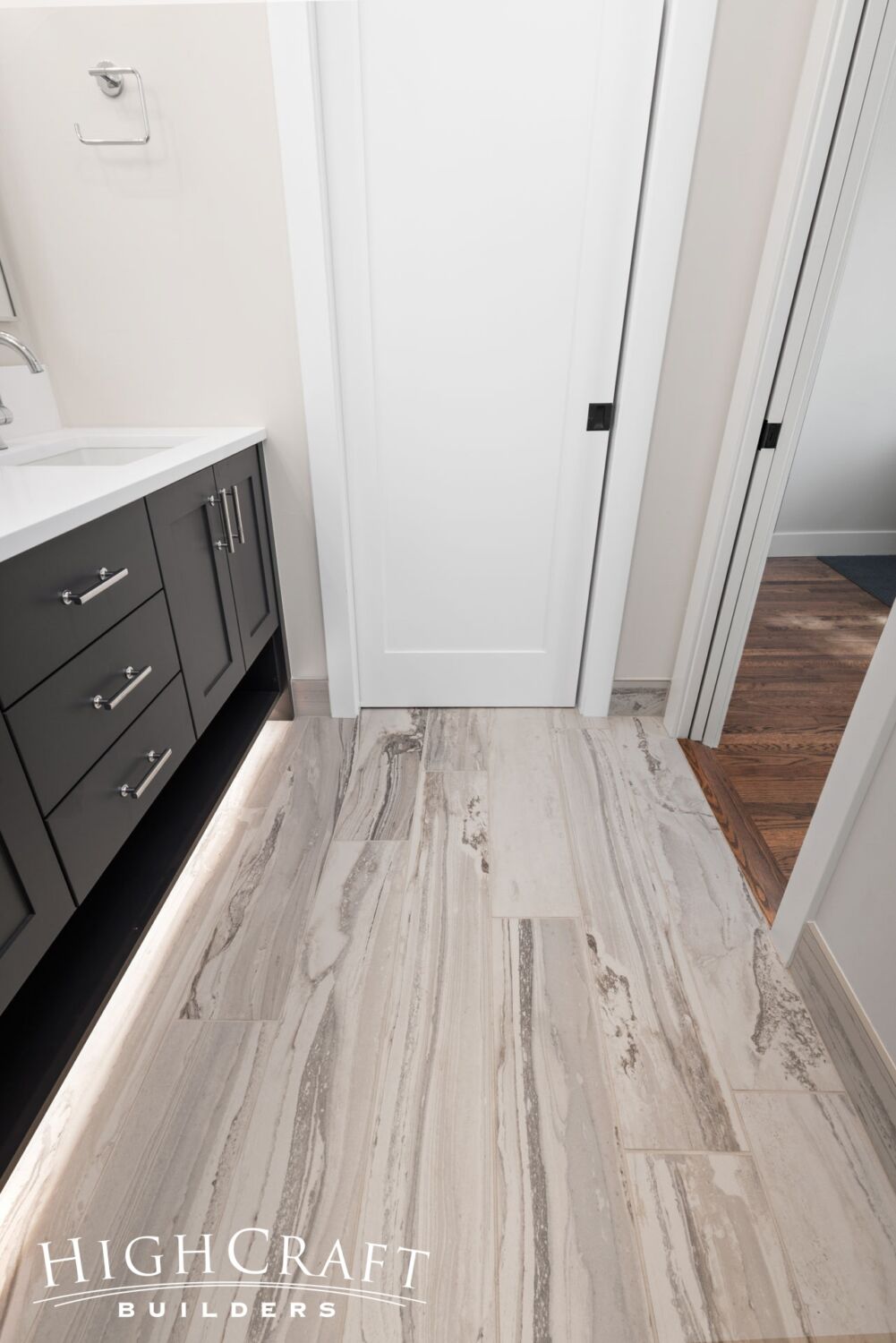
Pocket doors between the bathroom zones ensure privacy as they maximize space.
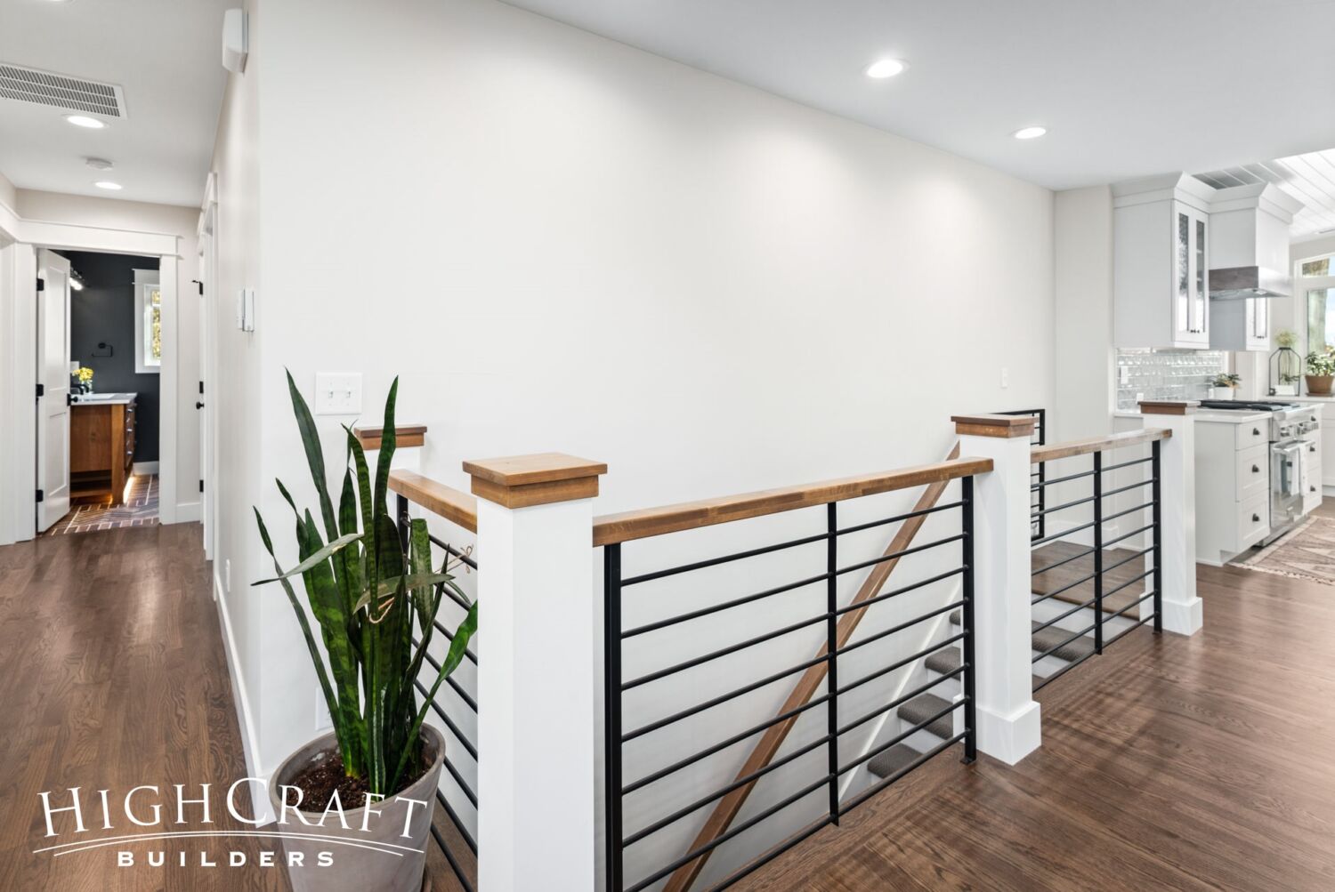
Stairs to Basement
The stairs to the basement incorporate both traditional elements (wooden newel posts, grab rails and caps) and modern touches (metal balusters) in its design.
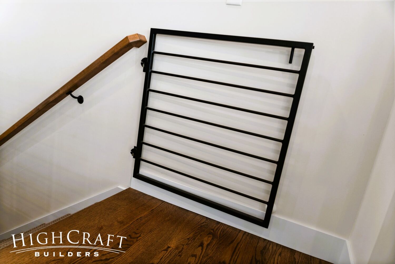
And if needed, the gate at the top of the stairs helps contain Birdie to the main floor.
Walk-Out Basement
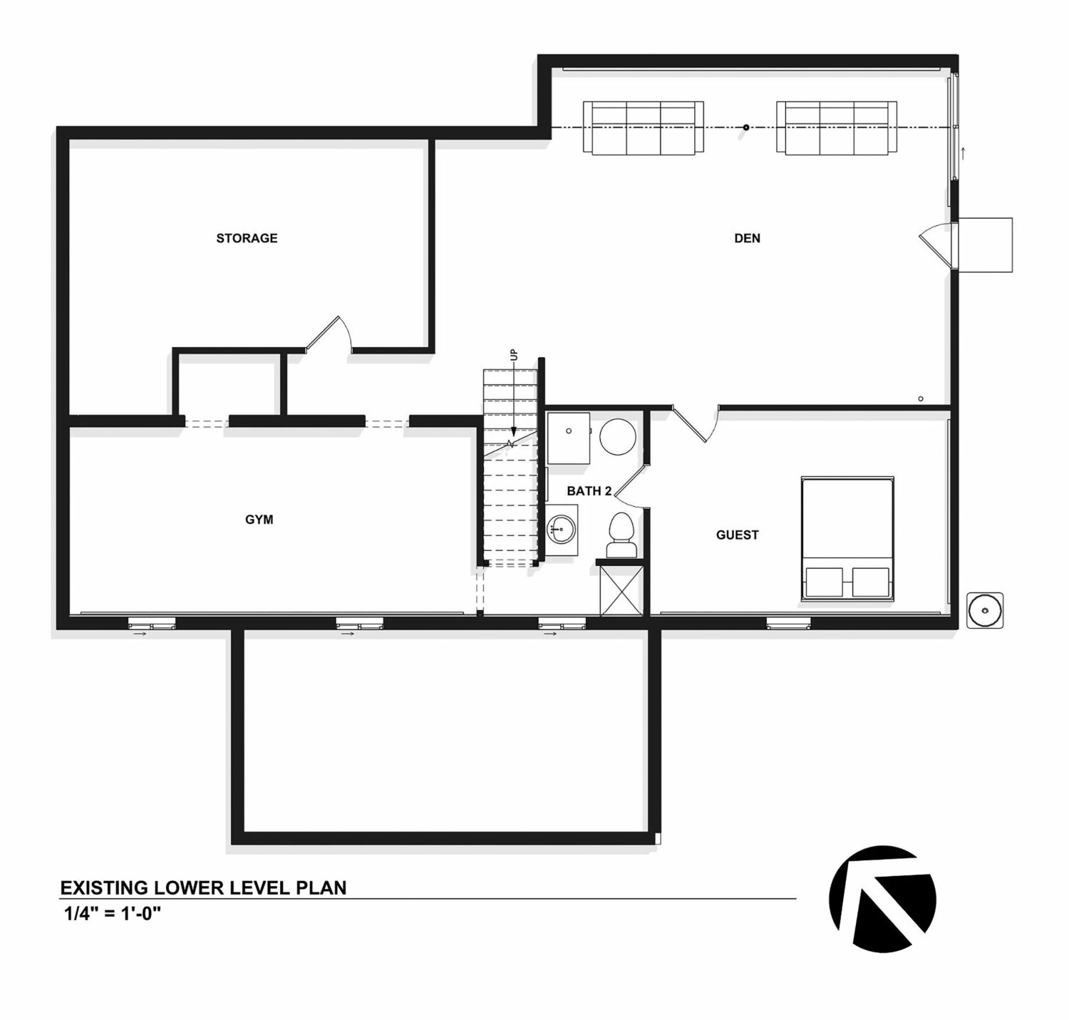
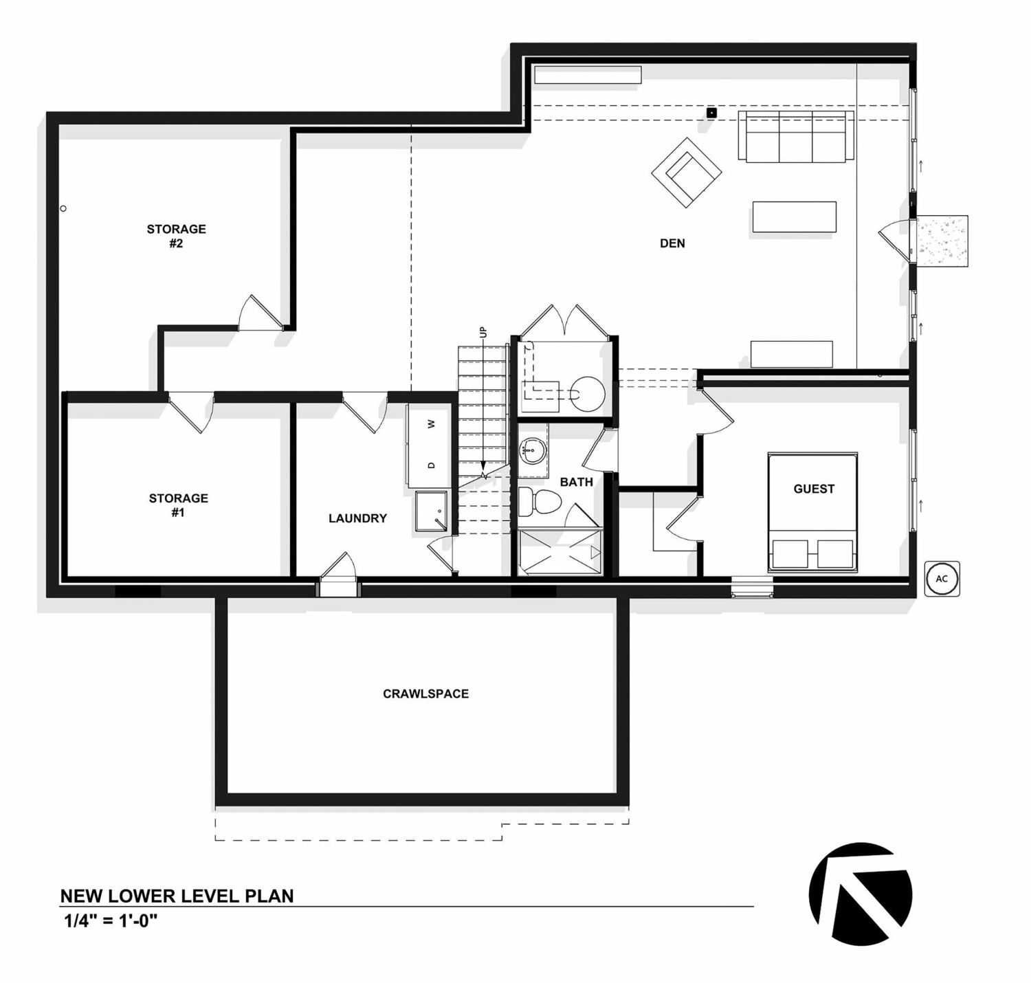
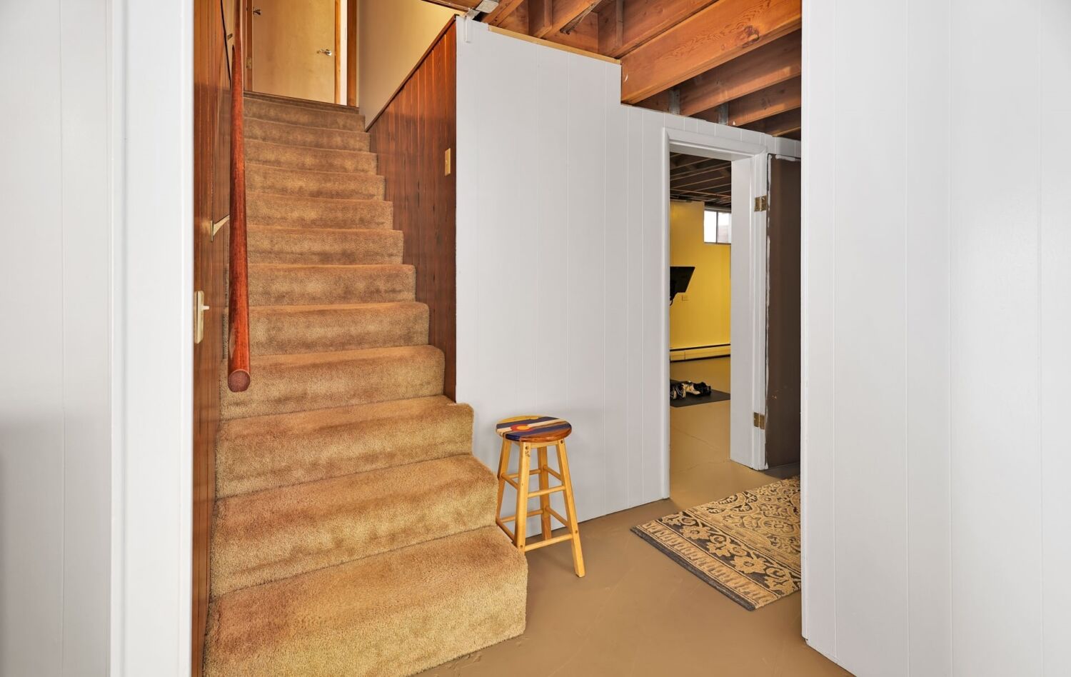
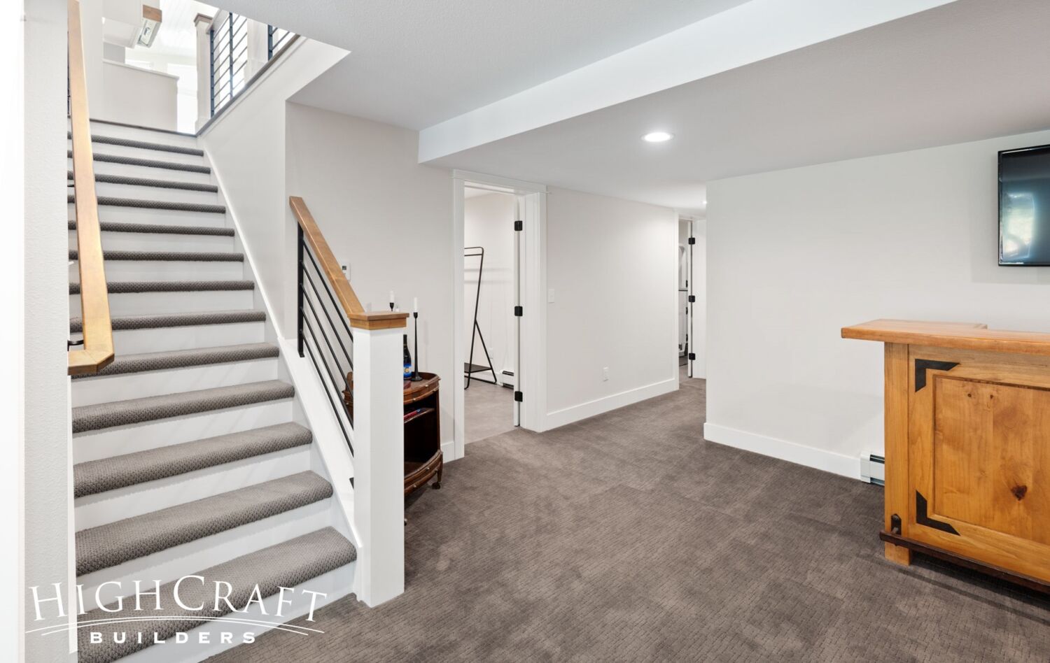
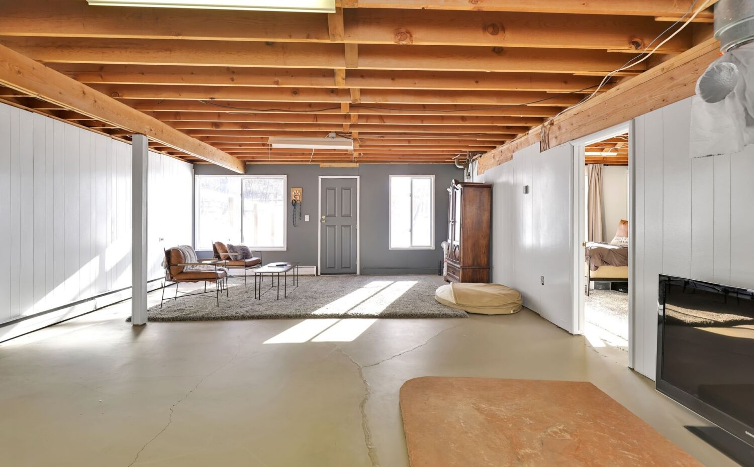
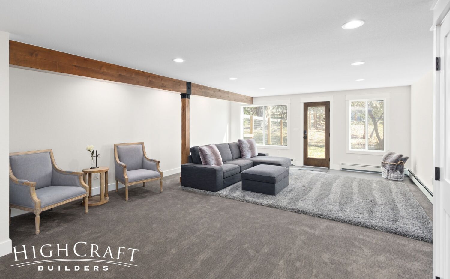
Although the basement footprint remained exactly the same, we updated the floorplan to better fit Jeff and Ally’s needs.
Major changes include the addition of two new closets, and reclaiming square footage from the home gym to create a laundry room. We also reduced the size of the unfinished storage area to give the den added space for a bar.
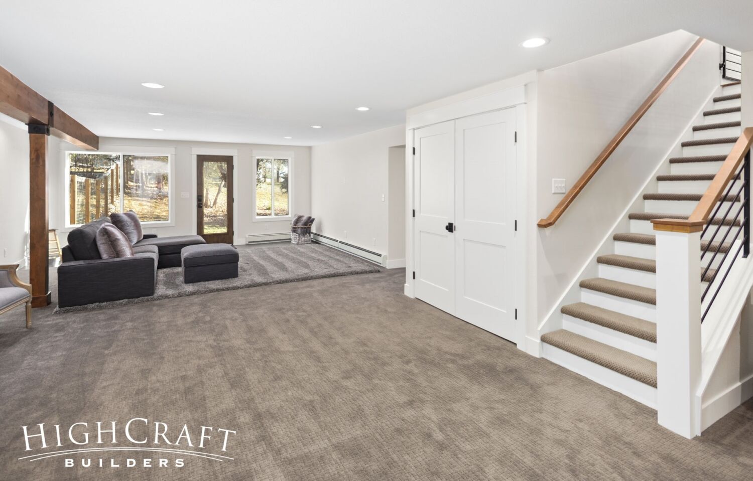
A wider staircase opens to the finished basement (above, right). The updated HVAC system is easy to access through the French doors of the new mechanical closet.
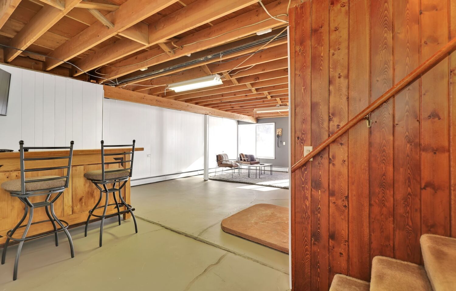
The basement is so much more inviting after the remodel (above, right).
“I really like the timberwork,” says HighCraft project manager Matt Roessner.
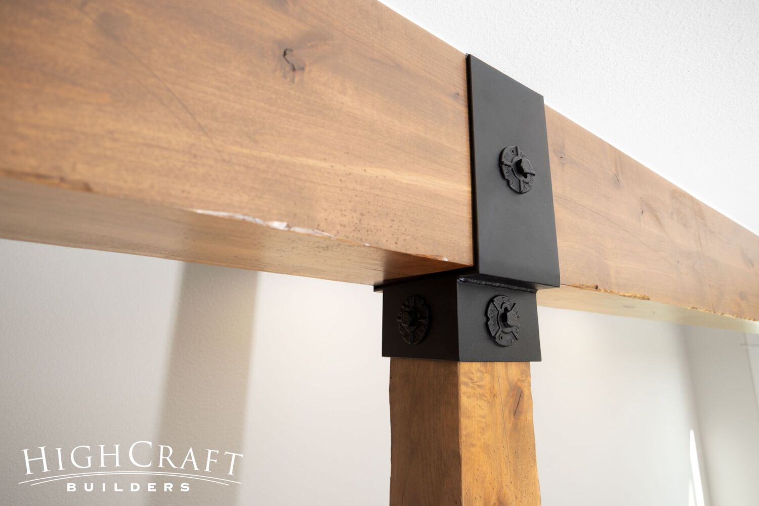
“The distressing of the knotty alder and the hardware used on the timbers, on the front porch and in the basement … is very cool.”
Read the project manager Q&A in Part 5 of this remodeling series.
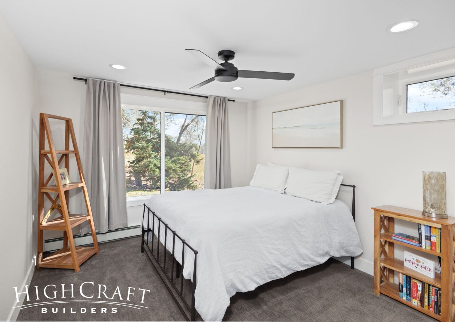
“There’s always been a bedroom and bathroom in the basement, but not really nice enough to have guests stay down there,” Ally said in Part 4 of the series. With a fully remodeled basement “it feels like we’re gaining those rooms even though the count is staying the same.”
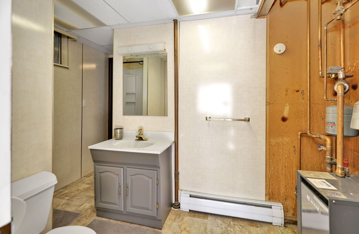
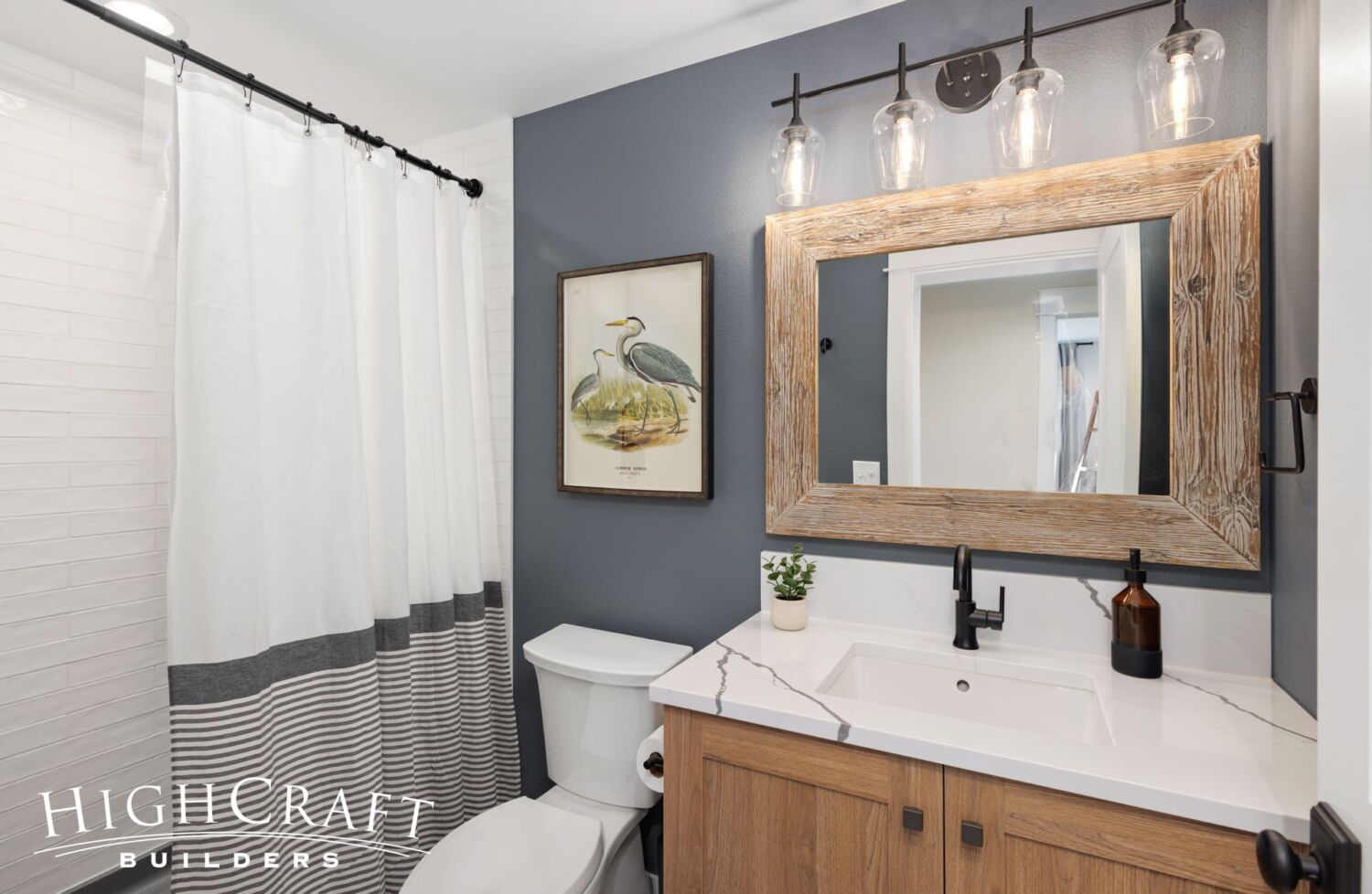
The original basement bathroom (above, left) was exposed to the home’s old mechanical system. The updated bathroom (above, right) enjoys an improved layout and beautiful finishes.
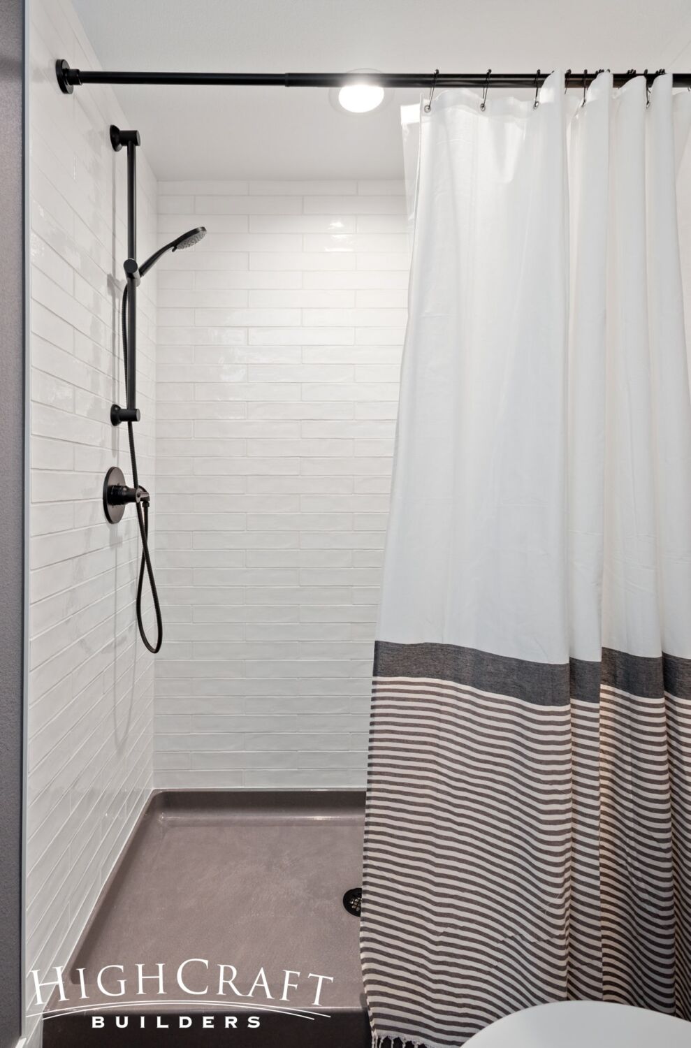
The new basement bathroom, with its fully tiled shower stall, is definitely ready for guests.
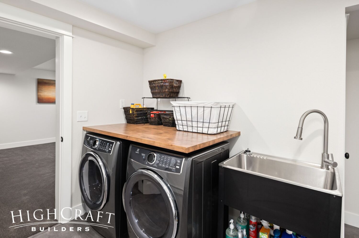
Jeff and Ally enjoy their new laundry room with handy utility sink.
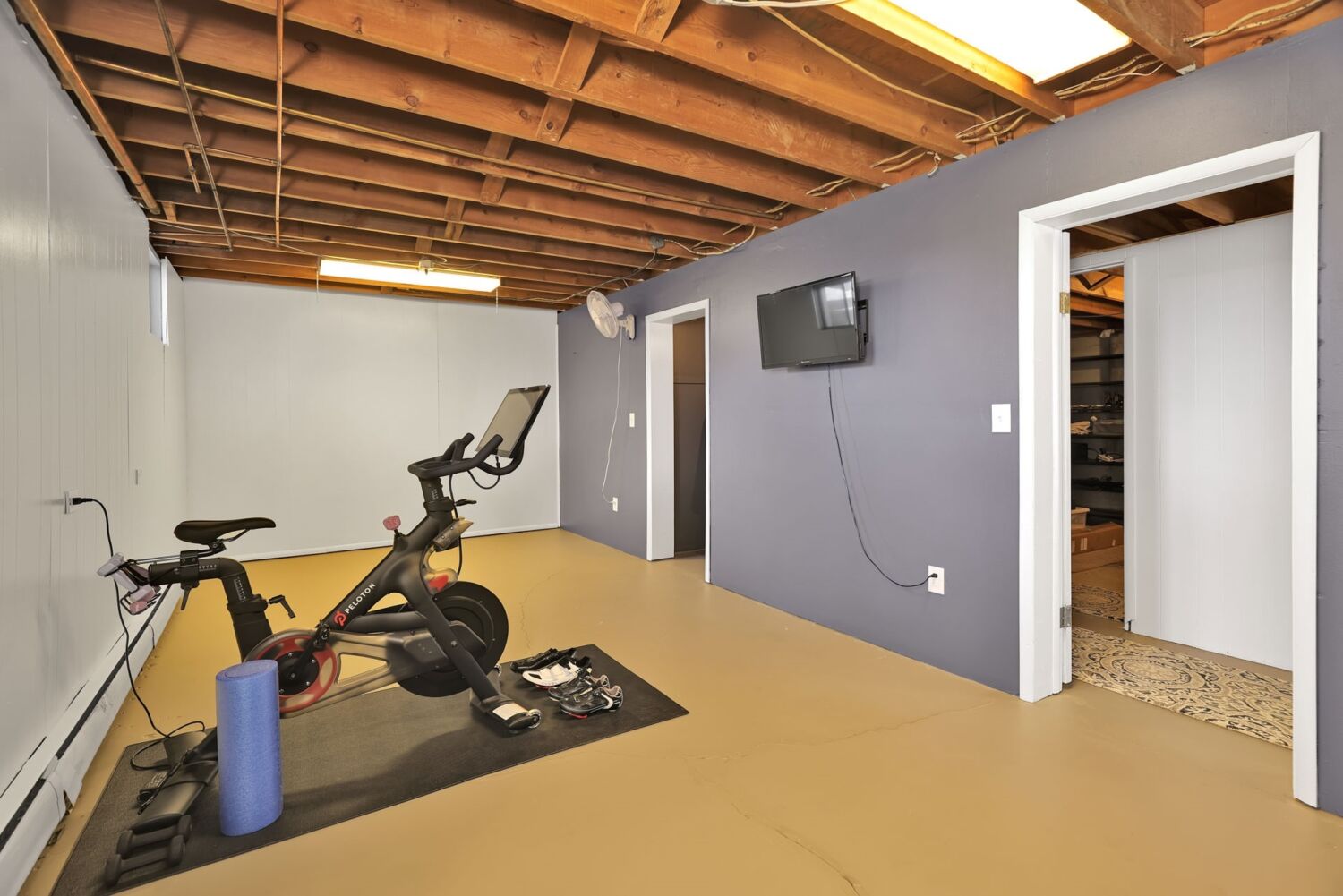
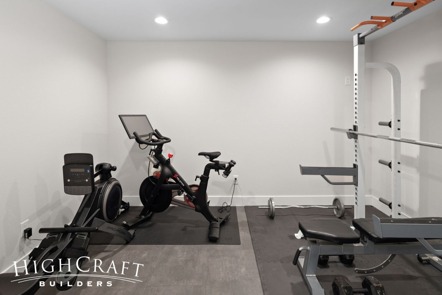
And the updated home gym (above, right) is so much more inviting that the original unfinished space (above, left).
When asked to identify the top traits of their ideal remodeling contractor, Ally says, “Quality of work. Attention to detail. Reputation.” She adds that HighCraft delivered on all three. “I really wouldn’t work with anyone else. All of the value is there.”
~~~
We want to thank our wonderful clients, Jeff and Ally, who generously shared their home and their remodeling story in our blog. To see construction photos and read about the homeowners’ remodeling journey, be sure to check out earlier posts in our series “1960s Ranch Remodel.”
Part 1 – Jeff and Ally’s remodeling must-haves + demo and framing
Part 2 – drywall progress + architect Q&A
Part 3 – neighborhood history + refinishing the floors
Part 4 – tile and cabinetry installation
Part 5 – project manager Q&A
Part 6 – interior designer Q&A
Whether you build new construction, or remodel what you have, HighCraft’s experienced design-build team is here to help with your project, large or small. Contact HighCraft with questions or to schedule a free consultation.
